Become a MacRumors Supporter for $50/year with no ads, ability to filter front page stories, and private forums.
Originally posted by ArtMan617
It's pretty nice, but it looks a little too industrial and cold for Apple's user-friendly reputation...what program did you make it in?

-ArtMan617

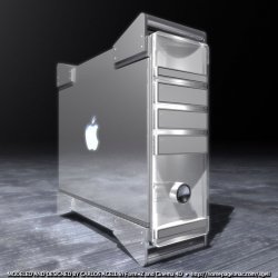
i guess is as industrial as the TiBook ( i have one and i love the cold and industrial look ) and the Xserve, i am pretty sure that the new towers will follow the same look polished-brunished metal materials and go toward a minimal art style.

the tower was modeled in FormZ, the first picture was rendered in Cinema 4D, the second one since its just a Study was rendered in FormZ

thx for your comment:)
 
just another update!

I think im getting closer ( maybe closer to be completely bored this Saturday evening :p )
 

Attachments

  • elph g5.jpg
    elph g5.jpg
    80.3 KB · Views: 273
>just another update!
Hats off to ya' man. You must be the most bored person on the whole forums. Congratulations! :p :D

I like how futuristic it seems, but I still am not found of the green lights. Why would you need a green light anyways? It's not like these are big and loud Lacie drives? :rolleyes: :p

Everything else looks too modern to be true. Job well done. :cool:
 
Originally posted by King Cobra
>just another update!
Hats off to ya' man. You must be the most bored person on the whole forums. Congratulations! :p :D

I like how futuristic it seems, but I still am not found of the green lights. Why would you need a green light anyways? It's not like these are big and loud Lacie drives? :rolleyes: :p

Everything else looks too modern to be true. Job well done. :cool:


well King.. at least now look futuristic and modern instead of been creepy PCish.. thats an advance :)

thx for your support dude, but now i have a doubt, i have to choose between this two signatures:
-Great Macrumors MockUp Master or
-the Most Bored person on the MacRumors Forums :D

damn! its a hard desission :p
 
Mac/PC Design Theory

This is kinda late in the thread, but just my silly little viewpoint:
I think PC manufacturers either "overdesign" or "underdesign". Overdesign would be when you have this weird slightly rounded curvy thing with bulges everywhere (like the HP tower or many other PCs... ick, remember the old packard-bell mouse? gives me shudders..), or you have underdesign, which is your stupid plain box. Macs have always had just the right amount of design. They don't look all bulgy and awkward, and they're always worth looking at (unlike those plain metal boxes). Macs are always elegant, with ingenious design. (There's a reason why Apple wins pretty much every design award out there, hehe...)

Well then, as Forrest Gump said, "and that's all I have to say... about that..." :D

btw, that last mockup looks kewl.. cept I'd be afraid to lay a finger on it cuz it'd show up like bill gates at a macworld :) and, it looks like it belongs on a commercial jet or something, like all those food racks and things, hehe.. it could be the pilot! there we go.. no need for pilots anymore, just don't press that power button ;D
 
Re: Mac/PC Design Theory

Originally posted by blufire
This is kinda late in the thread, but just my silly little viewpoint:
I think PC manufacturers either "overdesign" or "underdesign". Overdesign would be when you have this weird slightly rounded curvy thing with bulges everywhere (like the HP tower or many other PCs... ick, remember the old packard-bell mouse? gives me shudders..), or you have underdesign, which is your stupid plain box. Macs have always had just the right amount of design. They don't look all bulgy and awkward, and they're always worth looking at (unlike those plain metal boxes). Macs are always elegant, with ingenious design. (There's a reason why Apple wins pretty much every design award out there, hehe...)


Thx Blue! and welcome to MacRumors, really nice comment on Apple Designs, i totally agree with u :)
 
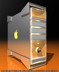
what about some color

looking at that ugly fake case of the supposed new PowerMac, Ive been thinking that im starting to miss some color in Apple products, everything is getting quite cold, so why no to put some color in this mock up. What do u think guys?

mmm.. think in a Orange Pro Mouse ... weird but cool , i think:D
 

Attachments

  • new tower color.jpg
    new tower color.jpg
    76 KB · Views: 211
Just my opinion :)

Ugly? Personally, I like the new case :) It fits pretty well with apple's recent move towards metallic/white enclosures, like the TiBook... with the aluminum power button.. I think it looks sweet :) That 7 lb heatsink in the diagram looks.. interesting.. lol! However, I don't see how this picture could have come out without Apple being on their butts already.. they're slowing down ;D But anyway, yeah, can't wait to get one ;)
 
Excellent design vitruvius!

I had a question about the lower front. Seems to be a concave design with protruding power button and speaker. Is that a shadow I see on the power button or is there a flat plexi covering over the concave frame that causes the light to fall like that on the button housing?

thanks,

RL
 
Re: Excellent design vitruvius!

Originally posted by RogueLdr
I had a question about the lower front. Seems to be a concave design with protruding power button and speaker. Is that a shadow I see on the power button or is there a flat plexi covering over the concave frame that causes the light to fall like that on the button housing?

thanks,

RL

wellcome to MacRumors Rogue ! hey great attention to detail!

yes indeed, the front piece is a thick translucid polycarbonate-Plexiglass slab, the front face is flat but the back face is convex and is placed over a concave piece of colored-textured polycarbonate ( the texture is similar to the CD case of one of the PetShop Boys album, that orange one with the circles) the bays, the speaker and power button intersect tjose two pieces. thx for your question i do this kind of work for people like u, who dont miss a detail:D
 
Are you going for an Xserve sort of hard drive at the top? Or is that the power panel for the machine?

Also, was kind of wondering how the box would look with a less reflective surface, a'la TiBook. Don't get me wrong, I love the reflective look, just thinking on a practical note, the new mac would look dirty alot!

Anyway, I look forward to seeing more of your designs.

RL
 
that's a good point, a couple finger marks and its all a mess. If Apple does go with metal - and I imagine they will - the brushed aluminun would be my bet - titanium for a shell on the tower might be a bit much.

And they use a really simple texture on their .mac website - 2 minutes playing in photoshop I came up with a similar one
 

Attachments

  • ba.jpg
    ba.jpg
    6.7 KB · Views: 145
vitruvius should apply for a job as an artist at apple designing their new products, he'dd be pretty good at that i'dd think :D
 
Originally posted by SilvorX
vitruvius should apply for a job as an artist at apple designing their new products, he'dd be pretty good at that i'dd think :D

what are u talking about? im ALREADY working at Apple and this are REAL prototypes! :eek:


(well... thats a nice dream):rolleyes:
thx for the support dude!
 
Originally posted by vitruvius


what are u talking about? im ALREADY working at Apple and this are REAL prototypes! :eek:


(well... thats a nice dream):rolleyes:
thx for the support dude!
lol :D
u know if u did apply for the job, all the mr members would support u 110% :D
 
New case design

It's a bit boxy, but it sure beats current PM case for functionality.

Try something little curvy for those handles or smooth the supports out more into the case.

Keep it up. We need more prototypers like you!!!:D


Now where's that dremel...I know it's here somewhere...My PM is getting some grinding tonight~
 
Register on MacRumors! This sidebar will go away, and you'll see fewer ads.