Become a MacRumors Supporter for $50/year with no ads, ability to filter front page stories, and private forums.

techlover828

macrumors 68020
Original poster
Jun 28, 2007
2,358
2
Maine
Hey,

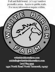
I'm 15 and I just made my first add on my macbook pro and illustrator. My stepmom owns a horse farm and my soccer team does an add book so she let me make an add for her. Let me know what you think and give me some suggestions! (I havn't sent it in yet so there is time to change things!)

Thanks for looking!

BTW: it is centered I just had to crop it so now it doesn't look centered, sorry


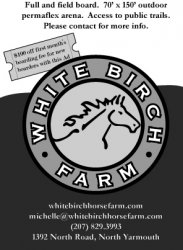
edit: go to the next page to see the final ad.
 

Attachments

  • WhiteBirchFarm for adbook.jpg
    WhiteBirchFarm for adbook.jpg
    108.9 KB · Views: 140

prs986

macrumors regular
Aug 16, 2007
105
1
Central CA, USA
Nice job! I like the logo. I have 2 suggestions. One is try a different font for the copy text. The font in the logo is good, modern and fits the horse illustration. So try a font that is more modern, maybe a sans serif font? the other suggestion is put the circle logo on top and put the text that is on top under the logo.......if that made any sense. lol. Those are my suggestions. otherwise very good job!
 

Santa Rosa

macrumors 65816
Aug 22, 2007
1,051
0
Indiana
Maybe an ever so slight increase of space between the main logo and the two sections of text. Maybe worth a quick tinker to see what that looks like?

Other than that great job looks really really good!! :apple:
 

bld44

macrumors 6502
Apr 21, 2007
404
0
The gray background curve behind the logo is different on the right side. Make it symmetrical.

EDIT: And center the logo.
 

techlover828

macrumors 68020
Original poster
Jun 28, 2007
2,358
2
Maine
The gray background curve behind the logo is different on the right side. Make it symmetrical.

EDIT: And center the logo.

I mentioned that it was because of the crop I had to do in photoshop

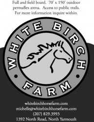
here is an updated one, let me know what you think. I didn't see sans sheriff in illustrator, any other good fonts?
 

Attachments

  • WhiteBirchFarm for adbook modern.jpg
    WhiteBirchFarm for adbook modern.jpg
    102.4 KB · Views: 75

a cat *miaow*

macrumors regular
Jun 12, 2007
217
0
Hi, I think you have the balance a little out between graphics and text.
The logo should be much smaller - I know you've designed it, and i think it looks nice but it's not really that important on the ad. What you're actually advertising is the important bit, so make the text bigger (also as said before a sans-serif would probs work better.)
Good work with the logo:)
 

prs986

macrumors regular
Aug 16, 2007
105
1
Central CA, USA
I didn't see sans sheriff in illustrator, any other good fonts?


A sans serif font is not a font, its a type of font. there is serif and sans serif. here is an example of both.

Serif

and

Sans Serif

a serif are the little curves at the corners and ends of letters. Like you see in the font Times New Roman.

a sans serif font are the ones without the serif....hence the name sans serif.

If you want a classic, old style look, go with a serif font. but if your looking for a more mordern look, like your ad, go with a sans serif. Hope this helps!
 

techlover828

macrumors 68020
Original poster
Jun 28, 2007
2,358
2
Maine
A sans serif font is not a font, its a type of font. there is serif and sans serif. here is an example of both.

Serif

and

Sans Serif

a serif are the little curves at the corners and ends of letters. Like you see in the font Times New Roman.

a sans serif font are the ones without the serif....hence the name sans serif.

If you want a classic, old style look, go with a serif font. but if your looking for a more mordern look, like your ad, go with a sans serif. Hope this helps!

Thanks, any recommendations on actual fonts?
 

motulist

macrumors 601
Dec 2, 2003
4,234
611
I'm no graphics professional, but I think it'd look nice if the letters themselves (or at least the top and bottom surfaces of them) were bent along the curve as well.
 

psycoswimmer

macrumors 65816
Sep 27, 2006
1,302
1
USA
Thanks, any recommendations on actual fonts?

Helvetica is nice looking.

It's really nice, but see how it looks with the logo a little smaller. And you should really try to make the curve behind the logo even on both sides.

Also, you might want to take off the address and stuff, if that is the real info.
 

techlover828

macrumors 68020
Original poster
Jun 28, 2007
2,358
2
Maine
Helvetica is nice looking.

It's really nice, but see how it looks with the logo a little smaller. And you should really try to make the curve behind the logo even on both sides.

Also, you might want to take off the address and stuff, if that is the real info. Speaking of that, should there be a comma between North Road and North Yarmouth?

ya, its fake
 

motulist

macrumors 601
Dec 2, 2003
4,234
611
As an example of what I mean by bending the font, here's a very (VERY!) quick and ugly mock up of what I'm talking about. I very sloppily bent the letter E to approximate the curve.
 

Attachments

  • WhiteBirchFarm for adbook.jpg
    WhiteBirchFarm for adbook.jpg
    96.3 KB · Views: 63

angelwatt

Moderator emeritus
Aug 16, 2005
7,852
9
USA
Where will this ad (not "add" by the way) will displayed? Poster, newspaper, web site, etc.? If printed, how large, approximately?

To me the text at the top doesn't get my attention in comparison to the logo and text at the bottom. Not sure what I'd do to fix this off hand, maybe a very light grey rather than white, but I'd have to see to know if that helps. Also, I think it might be nice if you gave the logo somewhat of a shadow to pull it off the page.

And like others have said, it looks nice. Bravo.
 

CanadaRAM

macrumors G5
Just from a content point of view, it will make a difference where the ad will be viewed.

If it is in a riding magazine/newsletter, then all is good.

But if it is in a general publication newspaper or magazine or in a soccer program, then it needs more context for the general audience.

You would have to explicitly say Horse boarding --- the word Farm has too many other possible meanings (maybe "Stable" you could get away with it, but not Farm)

Those who are not in the riding world won't understand "Full and Field Board". Likewise, "Permaflex" means nothing to people outside of riding. "All-weather" might be better for a general audience, if that's what the benefit is of permaflex.

What does "For more information inquire within" mean for the reader? Look within the soccer newsletter? Search their souls for enlightenment? ;)

Make sure that your call to action is understandable, and that clear instructions are given: "For more information call Michelle at 555-1212" would be better. Or 'Call for a free tour' or ... whatever will be appropriate for your prospective customers.

Question -- is boarding the primary business? If the farm does rentals for trail rides, or lessons, it would be important to say so, because there are far more prospective customers for lessons than there are for boarding.


Don't get discouraged - this is a classic case of the copywriter being too close to the business, and assuming that their audience has the same experience and knowledge as they do. First of all, figure out who your audiences are. Then, put yourself in their shoes and figure out what THEY want/need to know before being interested in doing business with you.
 

DesignerOnMac

macrumors 6502a
Jul 23, 2007
827
65
Ad are meant to inform

here is an updated one, let me know what you think. I didn't see sans sheriff in illustrator, any other good fonts?

I think the logo is okay especially since your 15. However, an ad i supposed to educate the reader! You have no text in your ad, just a logo. What is done at the horse farm? Breeding? Riding lessons? Boarding? Studding? Horseback Riding Lessons? What style of Riding if any? You have some info at the top of the logo, but it is too small and unreadable.

I would see this and logo and have no clue as to what the farm does!

The outline of the horse is too weak, and the name of the farm, the letters are too far apart.

Some suggestions for you.
 

techlover828

macrumors 68020
Original poster
Jun 28, 2007
2,358
2
Maine
Hey guys, thanks for all of your comments. I actually didn't write what it says, my step-mom did. Your right though, it needs to just flat out say "accepting boarders now" or something like that. I'll see what I can do to get her to change what to say, my dad will probably have some suggestions. Thanks for all of your help. I'm glad you guys like it.
 

Roy Hobbs

macrumors 68000
Apr 29, 2005
1,860
286
Hey,

I'm 15 and I just made my first add on my macbook pro. My stepmom owns a horse farm and my soccer team does an add book so she let me make an add for her. Let me know what you think and give me some suggestions! (I havn't sent it in yet so there is time to change things!)

Thanks for looking!

BTW: it is centered I just had to crop it so now it doesn't look centered, sorry

If this is a print ad, "inquire within" seems silly.
 

oscuh

macrumors 6502
Apr 27, 2007
314
0
Michigan
for being 15, this is quite good. Better work than I've seen from a litany of "designers" who've been in the field for 15 years ...

Beyond that, not too much more I can add, except do NOT use Comic Sans or you'll be instantly expelled from the design community and mocked until the day you die :p
 

techlover828

macrumors 68020
Original poster
Jun 28, 2007
2,358
2
Maine
Hey guys,

thanks for all of your help. I finished the ad. It probably could have been better, but I had to send it in by today to get it in the adbook. thanks for all of your input :)
 

Attachments

  • WhiteBirchFarm for adbook.jpg
    WhiteBirchFarm for adbook.jpg
    99.5 KB · Views: 77
Register on MacRumors! This sidebar will go away, and you'll see fewer ads.