I like it, windows aero might be back.
Apple today announced a complete redesign of all of its major software platforms called "Liquid Glass."
Announced simultaneously for iOS, iPadOS, macOS, watchOS, tvOS, visionOS, and CarPlay, Liquid Glass forms a new universal design language for the first time. At its WWDC keynote address, Apple's software chief Craig Federighi said "Apple Silicon has become dramatically more powerful enabling software, materials and experiences we once could only dream of."
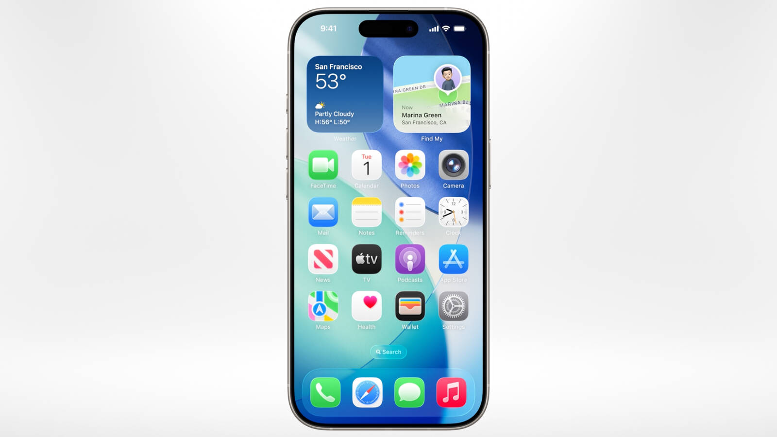
Inspired by visionOS, Liquid Glass is layered throughout the system and features rounded corners have been matched to the curved screens of the devices. It behaves just like glass in the real world and morphs when you need more options or move between views.
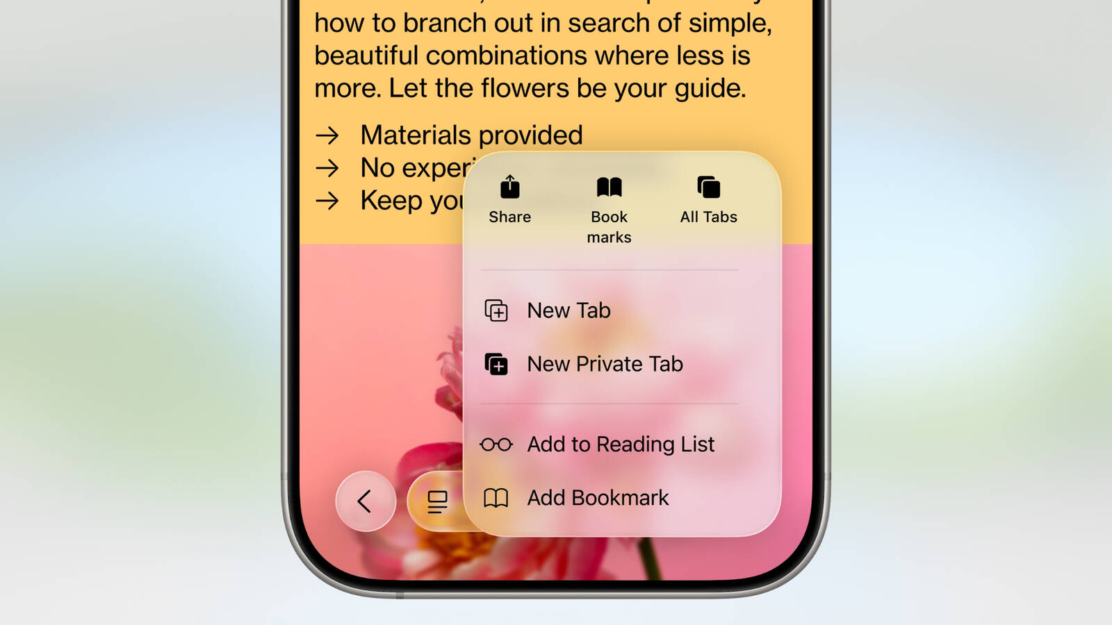
App icons have been totally redesigned with multiple layers of Liquid Glass, and there is a new clear look that sits alongside light mode and dark mode. Apple also showcased design changes to the Camera app, Photos, Safari, Phone, FaceTime, and more.
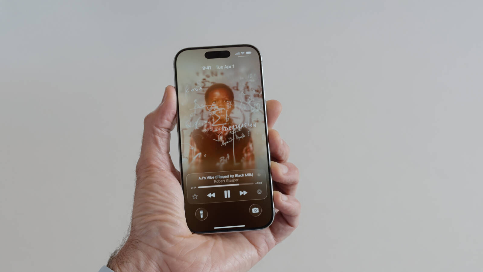
The Lock Screen now features options for a clock that dynamically changes in size depending on how much space is available, 3D photos, and more. Animated album art can now take up the entire Lock Screen. Apple says the new Liquid Glass design language sets the stage for years to come.
More to follow...
Article Link: Apple Announces All-New 'Liquid Glass' Software Redesign
Got a tip for us?
Let us know
Become a MacRumors Supporter for $50/year with no ads, ability to filter front page stories, and private forums.
Apple Announces All-New 'Liquid Glass' Software Redesign Across iOS 26 and More
- Thread starter MacRumors
- Start date
- Sort by reaction score
You are using an out of date browser. It may not display this or other websites correctly.
You should upgrade or use an alternative browser.
You should upgrade or use an alternative browser.


Apple Glass, from the same people that brought you the amazing Apple Intelligence and Genmoji...

The message notifications look very difficult to read on the Lock Screen with Liquid Glass background. I can’t imagine my dad reading this stuff.
This makes Windows Vista look good…. 🤮
Come on…that’s a readability nightmare. God forbid you have any kind of complex background.

Cool but I really just want my phone to do the basics quicker and faster ...more than pacifying me with new shiny bubbly glassy touchy.
The refraction effects when content scrolls under the glass are kind of neat from an eye candy perspective but I hope Apple turns down the transparency or ups the blur a bit for useability.
It looks awful. Why would they do that?! Oh dear...
Come on…that’s a readability nightmare. God forbid you have any kind of complex background.
View attachment 2517556
Apple: You're backgrounding it wrong.
So Apple has adopted the 1990s Windows naming scheme and the 2000s Windows UI. Interesting decisions.
It seems a rather minor redesign. Most people won’t even notice there was a redesign at all. iOS needed something much more radical, this does very little to refresh a very old and tired look. Apple seems to be incapable to innovate, even in GUI design which used to be its bread and butter.
more its original Aqua....So Apple has adopted the 1990s Windows naming scheme and the 2000s Windows UI. Interesting decisions.
I like it. It is better than before. Icon refresh specifically nice, camera icon is lovely, straight comeback to skeuomorphic days. Finally, I got a bit of iOS 6 back. Thinking about whether should I run public beta when it becomes available😃
As long as they have an adjustment for the opacity, I'm good with most of the functionality.
I think it is just the start and they will do more changes in coming years. This one is rather transitional so people won’t be confused by radical new stuff and there won’t be too much contrastIt seems a rather minor redesign. Most people won’t even notice there was a redesign at all. iOS needed something much more radical, this does very little to refresh a very old and tired look. Apple seems to be incapable to innovate, even in GUI design which used to be its bread and butter.
Man, this looks so much like Aqua that it instantly looks dated.
Why oh why does it feel like the default bevel/emboss option in photoshop? Reminds me so much of the early days of photoshop for some reason.
But I'm hopeful it looks better on the actual phones 🤞🏾
But I'm hopeful it looks better on the actual phones 🤞🏾
You and me both.I saw liquid glass.
I want skeuomorphism back.
The Skeuomorphism look was peak Apple, pre iOS 7 and pre MacOS Big Sur. After that they ruined everything in my opinion, really disliked the cartoony highlighter coloured icons. They also added so much unnecessary inertia to the UI, everything has to 'fly' and have visual effects and animations. I wish iOS looked like it used to wayyy back.
Last edited:
If change just for the sake of change didn’t happen, we would still be driving cars that looked like they did in the 80s.
A lot of the changes to the design of cars are related to technological advancements and progressive reforms, not just for the "sake of change". We have changes for the sake of comfort, safety, efficiency, etc, changes that make it better.
But yes they also do cosmetic changes like tweaking the look of the same generation cause they need to sell something new and different.
Yup. Readability is my top concern right now. For a company steeped in accessibility, I'm a bit confused. I'm struggling to read a lot of those menu controls. Oh well, let's see what actually ships.Undistracted focus on the most important calls blablabla...
...while showing off a user interface that's distractingly cluttered and hard to read:
View attachment 2517542
As a UI-Ux designer this is horrific. Straining to read text on an underblurred background.
It also does nothing to solve the myriad of existing problems that NC has had for ages.
I’ve seen dribbble posts with better ergos. I’m guessing 60% of their more talented coders left during Covid? I don’t even know what universe I’m in anymore.
Most importantly, did they add the number row to the stock keyboard, and a dedicated universale back button, gesture back swipe. They need to do that, before a new "glass" restyle to iOS.
Register on MacRumors! This sidebar will go away, and you'll see fewer ads.