Now that's what I call a Mac nut!Originally posted by SubGothius
I want a couple of those in real metal to replace the manufacturer's logos on my car.
Got a tip for us?
Let us know
Become a MacRumors Supporter for $50/year with no ads, ability to filter front page stories, and private forums.
Apple Doin' the Logo-Motion: Apple looks poised to refresh ...
- Thread starter MacBytes
- Start date
- Sort by reaction score
You are using an out of date browser. It may not display this or other websites correctly.
You should upgrade or use an alternative browser.
You should upgrade or use an alternative browser.
Whatever they change it too (IF they change it), you will hate it, cause it's usually a bad omen...Originally posted by j33pd0g
I wish they'd change the rainbow beachball to something... well... something a little less beachbally. Maybe a panthercow.
Hrmph.
A crack in the apple is what that looks like. Thumbs down, dudes.
The chrome looks hot; the swoosh does not.
A crack in the apple is what that looks like. Thumbs down, dudes.
The chrome looks hot; the swoosh does not.
The swoosh is a reflection. If there was no swoosh, it wouldn't look right, because chrome is reflective.
you asked for it!
Here is the official dogcow webpage:
http://developer.apple.com/products/techsupport/dogcow/
Here is the official dogcow webpage:
http://developer.apple.com/products/techsupport/dogcow/
i like the logo cause it reminds me of my departed iMac G4. that chrome apple was my favorite part of the design
Am I the only one that's noticed...
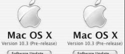
Am I the only one that's noticed...but it doesn't look to me that the words Mac OS X are in the usual Myriad font. It looks more like Lucida Sans Bold, which is similar, but not Apple's font.
I'd expect it to look more like this:

Anyone else agree?
If so, might this be a fake?
Am I the only one that's noticed...but it doesn't look to me that the words Mac OS X are in the usual Myriad font. It looks more like Lucida Sans Bold, which is similar, but not Apple's font.
I'd expect it to look more like this:
Anyone else agree?
If so, might this be a fake?
The silvery Apple logo is old hat. I've seen a few official Apple documents like receipts that have them on them. And recently, the Apple logo on the bag I got from Tysons Corner Apple store is also silvery. One could say Apple has gone all Aluminum/Titanium.
Watch out, the next iPod will be made of Aluminum!
I will say this much. Considering how aircraft are painted so frequently, I wonder if anyone has decided to mod the Aluminum Powerbooks yet.
Watch out, the next iPod will be made of Aluminum!
I will say this much. Considering how aircraft are painted so frequently, I wonder if anyone has decided to mod the Aluminum Powerbooks yet.
Re: Am I the only one that's noticed...
Hmmmmm the *usual* Myriad font? 'About this Mac' in my problem free 10.2.8 shows a serif kind of font (I don't know which specifically). Maybe that's why 10.2.8 behaves so shoddy on some Macs, it's a fake too! Arrrrgggggh!
M.
Originally posted by ant_s
Am I the only one that's noticed...but it doesn't look to me that the words Mac OS X are in the usual Myriad font. It looks more like Lucida Sans Bold, which is similar, but not Apple's font.
I'd expect it to look more like this:
Anyone else agree?
If so, might this be a fake?
Hmmmmm the *usual* Myriad font? 'About this Mac' in my problem free 10.2.8 shows a serif kind of font (I don't know which specifically). Maybe that's why 10.2.8 behaves so shoddy on some Macs, it's a fake too! Arrrrgggggh!
M.
Originally posted by bennetsaysargh
he's still moof in my heart
Well, that's what he/she/it said, apparenlty. They even have a soundfile of the little beast saying moof on the Apple site for Clarus. It sounds like a cow, that's interupted halfway through its mooooo. LOL
(a loving pat on the nose? walked into a fence? a unsuccessfully suppressed sneeze?)M.
PS: BTW I think she a he. A she would have been Clara, not Clarus, wouldn't (s)he?
Originally posted by iHack
Well, that's what he/she/it said, apparenlty. They even have a soundfile of the little beast saying moof on the Apple site for Clarus. It sounds like a cow, that's interupted halfway through its mooooo. LOL
M.
PS: BTW I think she a he. A she would have been Clara, not Clarus, wouldn't (s)he?
From History of the Dogcow Part II:
For the "Moof!" sound we took a real cow and then Zz said "fff" into a MacRecorder; the "Foom!" is just the same sound played backwards.
Somewhere along the line I baptized the dogcow "Clarus." Of course she's a female, as are all cows; males would be referred to as dogbulls, but none exist because there are already bulldogs, and God doesn't like to have naming problems.
Re: you asked for it!
I find it hilarious that they would have an official page on the developper's connection website.Originally posted by lduncan
Here is the official dogcow webpage:
http://developer.apple.com/products/techsupport/dogcow/
I could be crazy here, but I'm pretty sure the swoosh is necessary to migrate from the shiny top to the not-as-shiny bottom. I know I can't be the only one who's noticed that above the swoosh is shiny and below it is rougher, more brushed.
Someone also mentioned that this logo is on the newer boxes of some iMacs, and that the shininess is reversed (shiny on bottom, rough on top). Can anyone confirm this?
Someone also mentioned that this logo is on the newer boxes of some iMacs, and that the shininess is reversed (shiny on bottom, rough on top). Can anyone confirm this?
jayscheuerle
macrumors 68020
The question isn't swoosh or no swoosh, it's the prominence of the swoosh.
Apparently, the swoosh was a bit more apparent than necessary. I'm sure Apple will make the swoosh less apparent so it blends in and doesn't distract from the apple shape.
Apparently, the swoosh was a bit more apparent than necessary. I'm sure Apple will make the swoosh less apparent so it blends in and doesn't distract from the apple shape.
I just checked the software that came with my iBook, and it's similar, but not the same as the logo found in 10.3. The seperation between smooth and rough is better, and it's less diagonal, and more horizontal.Originally posted by drjekyl
This logo isn't all that new. It's been on the front of the sotware CD's envelope for almost a year now. My buddies iBook came with this logo on his CD bundle. Check your own.
No swoosh.
Register on MacRumors! This sidebar will go away, and you'll see fewer ads.