Become a MacRumors Supporter for $50/year with no ads, ability to filter front page stories, and private forums.

MacRumors

macrumors bot
Original poster
Apr 12, 2001
68,621
39,492


With the fourth beta of iOS 26, Apple has again made changes to the Liquid Glass design that's available across the operating system, tweaking how the menus and buttons appear in apps.
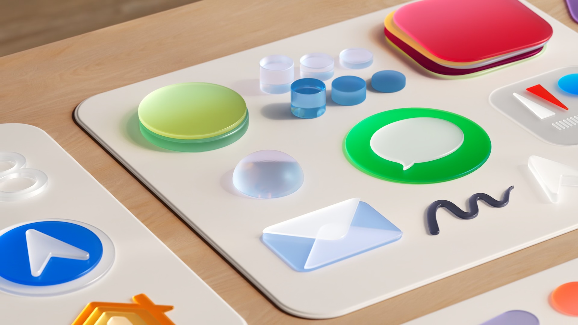
Liquid-Glass-Realistic.jpg

In response to criticism about too little Liquid Glass in beta 3, Apple has upped the translucency in several areas.
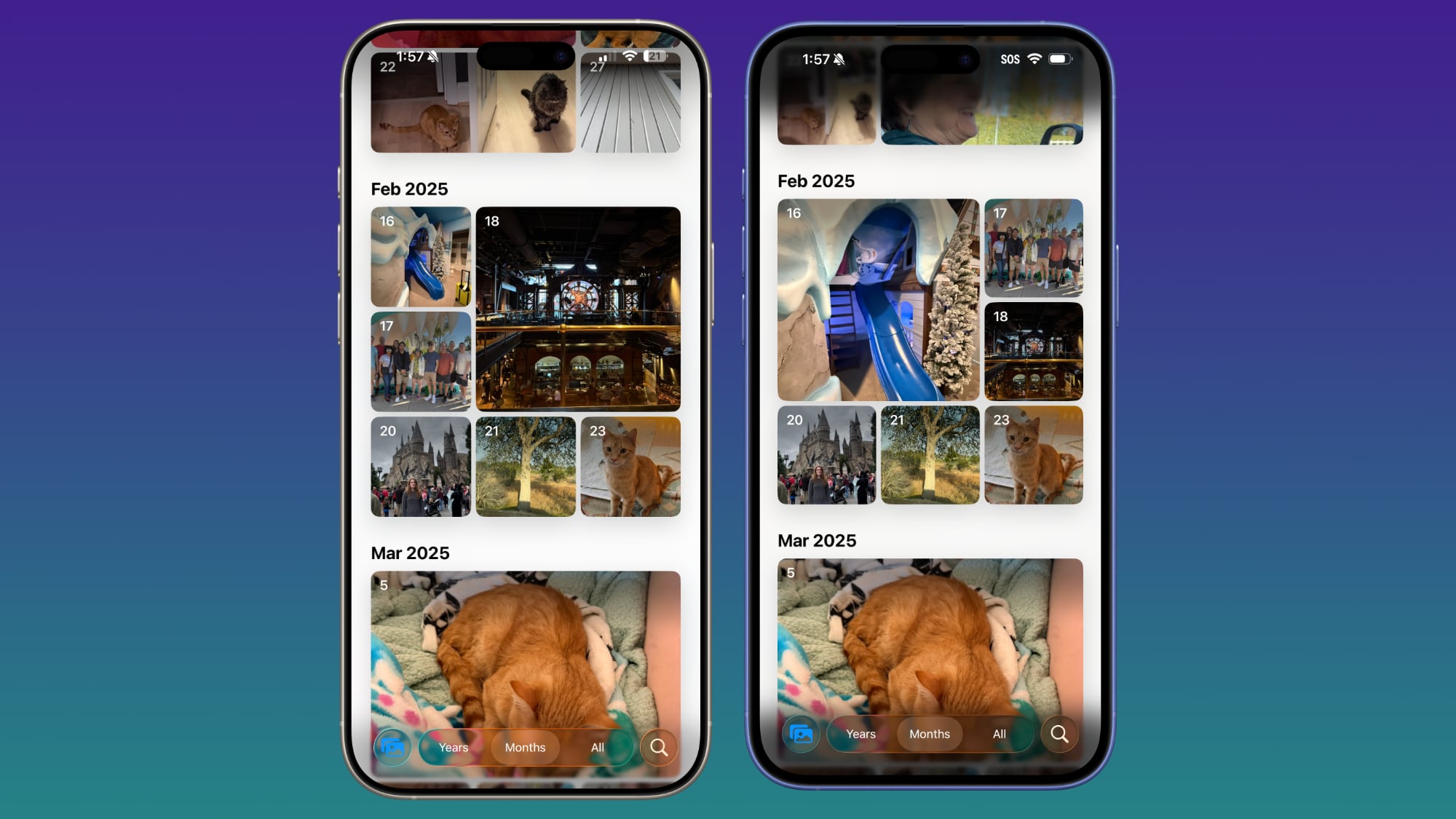
ios-26-beta-4-photos.jpg
Beta 4 on left, beta 3 on right


Navigation bars in apps like Photos, Music, the App Store, Podcasts, are slightly clearer, allowing more of the background color to show through.
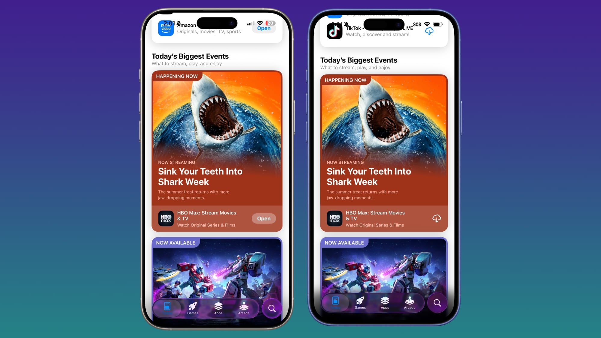
ios-26-beta-4-app-store.jpg
Beta 4 on left, beta 3 on right


Apple cut down on the frosted glass look, but the changes are small enough that text remains readable, so it appears to be more of a balance between beta 2 and beta 3.
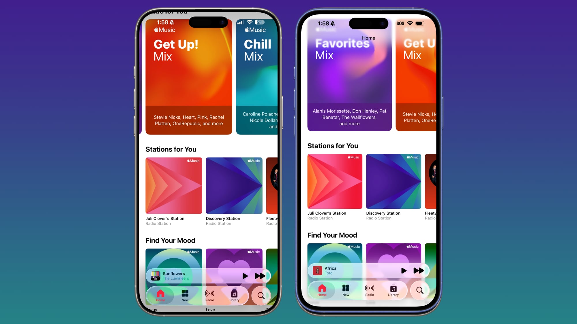
ios-26-b4-music.jpg
Beta 4 on left, beta 3 on right


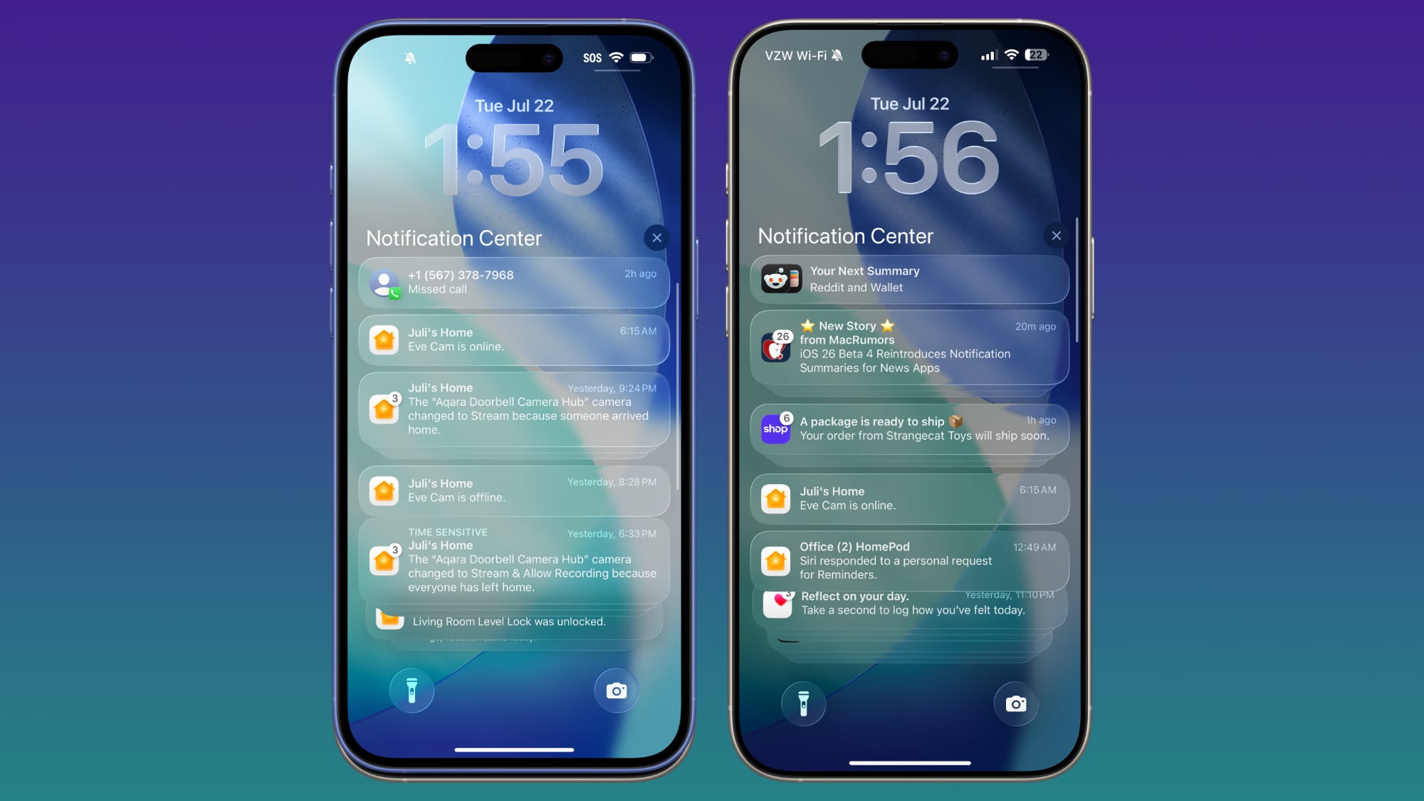
Control Center, the Lock Screen, and the Home Screen look largely the same, so most of the transparency changes are focused on app navigation bars and buttons. On the Lock Screen, though, the background darkens as you scroll through notifications.
ios-26-b4-lock-screen.jpg
Beta 4 on right, beta 3 on left


Apple will likely continue to make small changes to Liquid Glass based on user feedback, and we won't see the finalized version of the design until iOS 26 is released in the fall.

Article Link: Apple Improves Liquid Glass in iOS 26 Beta 4, Reversing Some Beta 3 Changes
 
Now that's more like it.
But how about realising one little known fact: "Please all, and you will please none."
You couldn't set unchangeable "this transparency" look that would be welcomed by all of your users. Some of them want opaque, some of them want full transparency, some of them would just like to be in the middle.
.
So how about adding one little three-steps slider for the transparency in the "Display & Brightness" setting? That would guarantee that you could please ALL users as they now have the control of how transparent your liquid glass would be.
 
they went backwards and made it worse
we need it to be frosted look so it has contrast and can be read when there are reflections.
this might actually be a reason I just do not upgrade and then do not buy another iPhone apple. This is that kinda deal breaker, readability is not a joking matter
 
This is worse than beta 3. What the hell is going on at Apple with these UI designers?! Readability is difficult with this nonsense "Liquid Glass" crap. I rather have frosted glass since it's more legible. And forget about the old people because they sure as hell will be having a difficult time reading stuff when iOS26 final comes out this fall. I already have everyone in the "elder" age group telling me it's difficult to see stuff now. Whoever's in charge of the design and UI department needs to be fired.
 
Both iOS and iPad OS keeps getting worse. Remember when both iPhones and iPad used iOS? That was much better, the interface was much cleaner and there was no need to learn to use another OS. Also now iOS 13, 14, 15, 16, 17, 18, 26, 27, 28... really Apple? Now iOS 26, not 19, is the nineteenth release of iOS. Steve wouldn't allow this mess.
 
Now that's more like it.
But how about realising one little known fact: "Please all, and you will please none."
You couldn't set unchangeable "this transparency" look that would be welcomed by all of your users. Some of them want opaque, some of them want full transparency, some of them would just like to be in the middle.
.
So how about adding one little three-steps slider for the transparency in the "Display & Brightness" setting? That would guarantee that you could please ALL users as they now have the control of how transparent your liquid glass would be.
And then instead of getting to design my app two times (for light and dark mode), I get to design my app six times (or more, if you include the Increase Contrast accessibility setting). Fun!
 
Register on MacRumors! This sidebar will go away, and you'll see fewer ads.