I don’t think so. I have ran Android 16 on the Pixel 9 Pro XL, including the QPR beta’s. Zero signs of Liquid Glass. It also is not logical, with the introduction of Material Express 3. Samsung, on the other hand, might do it, now that they are introducting glass icons.You might want to brace yourself but I've read that Android 16 could have Liquid Glass-like features. But I believe it can be turned off in Settings.
Got a tip for us?
Let us know
Become a MacRumors Supporter for $50/year with no ads, ability to filter front page stories, and private forums.
Apple Improves Liquid Glass in iOS 26 Beta 4, Reversing Some Beta 3 Changes
- Thread starter MacRumors
- Start date
- Sort by reaction score
You are using an out of date browser. It may not display this or other websites correctly.
You should upgrade or use an alternative browser.
You should upgrade or use an alternative browser.
I'm sure the effect can be turned off in Settings so it still looks like iOS 18.x. But I still want to ability to adjust the level of the transparency for people with poor vision.I hope iOS 26 can be reverted to iOS 18 (essentially) with a switch or two.
You KNOW Samsung will try to duplicate Liquid Glass with the next One UI version in 2026. And probably not implement it well, either.I don’t think so. I have ran Android 16 on the Pixel 9 Pro XL, including the QPR beta’s. Zero signs of Liquid Glass. It also is not logical, with the introduction of Material Express 3. Samsung, on the other hand, might do it, now that they are introducting glass icons.
My workaround has been to set my laptop's brightness to 100% whenever I need to find the active tab & background is like this. But that's no way to live a decent life :-(
I don't know what Apple's pre-occupation with translucency is when it comes to the Safari address bar, Favorites, and tabs. I have seen their 'explanation' of wanting to provide more space for content - but in this case, it's just the appearance of more space for content - at the real expense of usability.
I already had to give up my usual Dark Mode setting when I started using Tahoe - because in dark mode, the problem is even worse. It's a bit disconcerting how little usability testing seems to be going on at Apple these days.
As a follow-up to my original post: it looks like Apple re-introduced a checkbox in the Safari->Settings->Tabs that disables the color bleed-through from the active tab's web page. This solves my problem!
One of the reasons why I want a Pixel. I had a Pixel 9 Pro XL and it just had some issues with it being a bit too slow, but other than that it was good. I am eagerly waiting for the Pixel 10 Pro XL.You KNOW Samsung will try to duplicate Liquid Glass with One UI 8.0. And probably not implement it well, either.
If you reduce motion, it is exactly the way I like it, but I hate the fades.
'Liquid Glass' is such an unnecessary and unwanted update. It's simply change for the sake of change because the functional improvements from each iteration of iOS are minimal, at best.
It’s the perfect PR move to redirect attention away from Apple Intelligence.
It’s a “skin”, not a new design language. And a terrible one.
I have a very hard time getting on board with a multi-trillion dollar organization requiring the efforts of unpaid beta testers to discover faults in basic human interface guidelines.I mean literally the point of a beta is to identify issues that likely don't come up during development, this comment is seriously a joke right... right..
The point of a developer beta is for a vast demographic of people who are building their own applications and services on top of this operating system to file reports about inconsistencies and bugs.
It is not the point of an OS beta to figure out if a transparent UX element promotes or hinders the users' ability to interact with the device.
Please, can you show what this looks like in practice? Everyone keeps saying "just reduce transparency" but I have yet to see anyone show what this does.Regardless, it was added as a concession to those who didn’t like the added transparency at the time. People give these nonsensical arguments that transparency is bad and less legible, but then complain about using Reduce Transparency because it takes away too much transparency. If transparency = illegibility, then opaqueness = legibility. Reduce transparency should provide the best legibility and experience. Just use that?
This has to be how it ends up or it’ll be complaints on all sides.They need to introduce a slider in accessibility or during the initial setup so people can adjust it to how they like it. Beta 3 was def more readable but Beta 1/2/4 is prettier.
I think the response to each change is really proving how this was never a redesign, it’s just a coat of purely aesthetic paint. Which is kind of antithetical to good design
There are controls in accessibility that are meant to adjust for those who have difficulty seeing elements without high contrast. There simply no one setting that will appeal to every one, if you have already applied settings to address your individual requirements, Liquid Glass respects them.they went backwards and made it worse
we need it to be frosted look so it has contrast and can be read when there are reflections.
this might actually be a reason I just do not upgrade and then do not buy another iPhone apple. This is that kinda deal breaker, readability is not a joking matter
Who is it that you think we're talking about?No, they aren't lost
What do you want them to do, release something so half baked without extensive testing???
It's for things like that that beta testing exists in the 1st place
Apple is worth three trillion dollars. You think that with this kind of money they should be in a position where they require the public to beta test the user interfaces for their operating systems? This is a failure of the organization - more specifically, the user interface and management teams and Tim Cook - to observe glaring failures with the most basic human interface guidelines. Nothing we've seen so far should have made it past the sketchbook.
No. Waiting for the public to tell you if they can read the elements they're supposed to interact with is not at all what beta testing is for. This is supposed to be the phase where developers test their apps on the new OSs to report inconsistencies and bugs with the tools Apple provides them to build their software and applications.
It's a fun idea worth exploring but someone should have put the breaks on this a couple week after development. I do not understand how anyone with two eyeballs and a brain could approve this. If you showed me this image alone, I'd fire you for having such poor instincts and tell you you have no future in user interface development.This design is severely lacking in accessibility and exemplifies the concept of form over function. Design should prioritize simplicity and avoid being intrusive. This does not.
View attachment 2531028
View attachment 2531032
The paint is part of the redesign but it's not everything. Personally I'm really enjoying how information and menus are organized in 26 and the much better reachability for UI elements on big screens.This has to be how it ends up or it’ll be complaints on all sides.
I think the response to each change is really proving how this was never a redesign, it’s just a coat of purely aesthetic paint. Which is kind of antithetical to good design
As somebody that suffers from needing slightly higher contrast in text, I agree with you. Apple show how much accessibility really matters when their backs are against the wall to 'innovate'. This is a hail mary at trying to stay relevant and it missed the mark massively.they went backwards and made it worse
we need it to be frosted look so it has contrast and can be read when there are reflections.
this might actually be a reason I just do not upgrade and then do not buy another iPhone apple. This is that kinda deal breaker, readability is not a joking matter
There are some aspects of LG that I really like. For example, how the Customize button has a rim reflection from the background panel above it.
Really nice attention to detail
View attachment 2531315
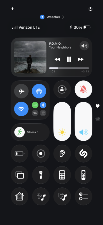
I hate to think how much those things are eating at my battery life.
Android doesn’t need to go those lengths to look good.
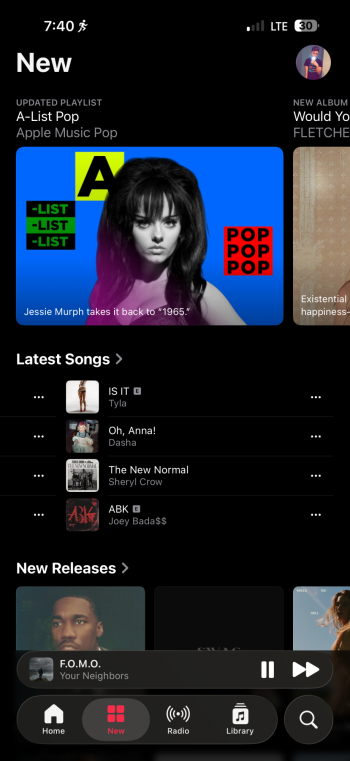
Meanwhile I open the weather app, and the toolbar buttons look like this
Last edited:
The transparency is inherently bad people aLeo exaggerate how “bad” Reduce Transparency is in iOS 26 (It’s the same effect as it is in iOS 18 and below; Translucent elements become opaque). If anything, they should be praising it. It still blocks out less of the content layer than iOS 18 and below. It will likely receive polish through the betas since some of it currently lacks padding. It’s a work in progress.Please, can you show what this looks like in practice? Everyone keeps saying "just reduce transparency" but I have yet to see anyone show what this does.
If transparency is bad, then less transparency should be good in any scenario. It’s all about accessibility right? In fact, Reduce Transparency should be an improvement over iOS 18 design because even that has blurred layers. Doesn’t that potentially cause legibility and accessibility issues too?? Apple should make a high contrast theme enabled by default 🤷♂️
Complaining to complain. You can see the UI elements, you can read the text. You just don’t like the UI free of blocky bars and colors other than dark gray, white, and system blue.
“But we want some transparency”
Okay, yes so do the people who like LG but we aren’t trying to take away your option to turn it off if you actually have issues reading. Most are just looking at screenshots and not even giving it a real chance.


Beta 4 feels great. Feels like in most places they’ve got the Liquid Glass looking perfect. I hope they don’t roll this back now.
No offense, but I think that looks bad. The "Customize" button no longer looks like a button, with only its top edge possessing a normal button outline. The simple solution would be to just give the rest of the button a slightly thicker, brighter outline than it has, but not as thick and bright as the button's upper outline, rather than "reflecting" the darkness to the left, right, and bottom of the button. This would still impart a glass-like appearance, since if the button is supposed to emulate glass, some of the light "entering" through its top edge should be able to go through it to its other edges and produce reflections there too.There are some aspects of LG that I really like. For example, how the Customize button has a rim reflection from the background panel above it.
Really nice attention to detail
View attachment 2531315
I see your point, but I don't know. While Liquid Glass's initial beta release as well as the subsequent betas contain puzzlingly obviously bad reductions in visibility of many foreground objects, mainly because the background bleeds through too much, and problems like text on many panes, buttons, etc. being too light or too dark for the background they're on, the variety of reactions to Liquid Glass, positive and negative ("I see everything perfectly!" vs. "I can't see a thing!"), shows that no working group at Apple could have figured out what tweaks to LG the public would find results in a nearly universally acceptable version. Releasing LG as a beta gives them the feedback on readability that Apple could never have achieved on its own.I have a very hard time getting on board with a multi-trillion dollar organization requiring the efforts of unpaid beta testers to discover faults in basic human interface guidelines.
The point of a developer beta is for a vast demographic of people who are building their own applications and services on top of this operating system to file reports about inconsistencies and bugs.
It is not the point of an OS beta to figure out if a transparent UX element promotes or hinders the users' ability to interact with the device.
I wouldn't be so sure about that.I'm sure the effect can be turned off in Settings so it still looks like iOS 18.x.
Yeah, that has to be one of the dumber things about the current version of Liquid Glass. Third-party app developers can at least control how far towards the top (and bottom) of the screen the content in their app will scroll, so at least they don't have to do it "the new Apple way" in their apps. It looks like this is another attempt by Apple to maximize active screen real estate, but at the sake of readability.What pisses me off are the time and icons in the top status area overlaying some of the app views with no background at all, making it look crappy and difficult to read.
Let's see what Developer Beta 5 does. Apple won't "freeze" the feature set until probably late August 2025, so you never know.I wouldn't be so sure about that.
Federico is saying it out loud.
More people need to be saying it out loud.

More people need to be saying it out loud.
If they can figure out how to patch discontinuity of panoramic camera, I’m sure they can do this minor optics simulation.It's not that easy. Even with a slider you need to have different levels of transparency that actually work otherwise it's pointless. Sliding options are no good if things are broken at all points along the slider.
I see your point, but I don't know. While Liquid Glass's initial beta release as well as the subsequent betas contain puzzlingly obviously bad reductions in visibility of many foreground objects, mainly because the background bleeds through too much, and problems like text on many panes, buttons, etc. being too light or too dark for the background they're on, the variety of reactions to Liquid Glass, positive and negative ("I see everything perfectly!" vs. "I can't see a thing!"), shows that no working group at Apple could have figured out what tweaks to LG the public would find results in a nearly universally acceptable version. Releasing LG as a beta gives them the feedback on readability that Apple could never have achieved on its own.
Anyone claiming they can see things perfectly is lying. Human interface guidelines exist for a reason. These things are measurable.
Sure, you can push the boundaries of usability but for what reason would Apple, of all companies, push this to all of their devices to hundreds of millions of thousands of demographics?
I mean, there’s a post here today about enabling clear app icons on the Home Screen. I don’t know why anyone would choose to make something measurably harder to use but I’m genuinely glad for them that they have that option. I won’t judge anyone for their stupidity but you can’t convince me they’re not.
To push something like this as a mandate to millions of people without the choice is not something any company should ever even consider doing. Especially one worth trillions of dollars with, I’m sure, departments dedicated to usability.
Someone is asleep at the wheel. If you’re a fan of Apple, this should be one of the final indicators over many recent years that they have lost direction.
Register on MacRumors! This sidebar will go away, and you'll see fewer ads.

