Become a MacRumors Supporter for $50/year with no ads, ability to filter front page stories, and private forums.

Rogifan

macrumors Penryn
Original poster
Nov 14, 2011
24,134
31,182
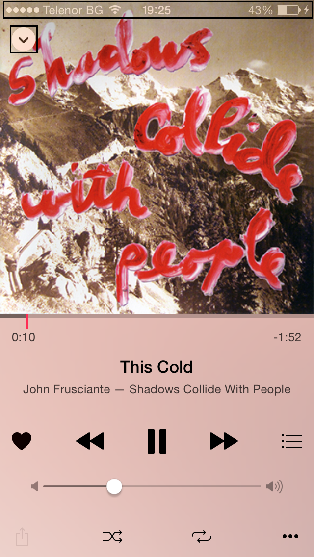
The main interface of Apple Music is white/very light gray with pink accents. But when you select artists, songs, albums, playlists etc. the UI colors change to adapt to the artwork. Yet the bottom section with the mini player and Music sections doesn't change it stays white and pink. In some cases this doesn't look bad, in others it looks awful (see below). I think the bottom section should adjust to match the color scheme of the top section. So if the top section is black and orange or green and gold the bottom section should be as well.

2lbclly.jpg

al2f5k.jpg

xkr37o.jpg


Also in some instances the back and search icons are really hard to read. Apple needs to adjust the artwork to make sure both of those are clearly visible. And perhaps the status bar needs to go too as it just clutters the interface.

2v0d8cj.jpg
 

_Refurbished_

macrumors 68020
Mar 23, 2007
2,333
3,013
I don't think it looks bad. I think it would be more confusing if the control colors kept changing with each song. This would be really ugly if you were quickly shuffling through music.
 

devinthomas

macrumors regular
Mar 16, 2013
210
235
I don't think it looks bad. I think it would be more confusing if the control colors kept changing with each song. This would be really ugly if you were quickly shuffling through music.
It's as simple as animating the color changes and I think it would be more consistent. Just have the pink change to match the accent color used for tabs/back & search from the visible page.

A nice sweeping fade in the direction of whatever you select to change. Light and dark UI changing might be jarring but I see the case for it.

Honestly, I think it should use the dark UI by default with a grey accent color to match the Apple Music advertisements and website.
 

Rogifan

macrumors Penryn
Original poster
Nov 14, 2011
24,134
31,182
Something else that needs to be tweaked is how music not available on Apple Music is shown. It's grayed out but still not easy to tell that it's unavailable to stream. Another thing confusing with the navigation is say you navigate to one of your playlists and start playing a song and then navigate someplace else. It's not really intuitive how to get back to the playlist. It looks like it's the list icon off to the right of the play/pause/forward controls but it's not completely intitutive what that icon is for.

One thing that is cool though is adjusting the first track in a playlist as it changes the color of the UI based on the album art.
 
Last edited:

hlfway2anywhere

Cancelled
Jul 15, 2006
1,544
2,338
Something else that needs to be tweaked is how music not available on Apple Music is shown. It's grayed out but still not easy to tell that it's unavailable to stream. Another thing confusing with the navigation is say you navigate to one of your playlists and start playing a song and then navigate someplace else. It's not really intuitive how to get back to the playlist. It looks like it's the list icon off to the right of the play/pause/forward controls but it's not completely intitutive what that icon is for.

One thing that is cool though is adjusting the first track in a playlist as it changes the color of the UI based on the album art.
here's a secret -- tap on the bar with the song title in it within that three-dot menu and it'll take you to the song within the playlist or album.
 

Rogifan

macrumors Penryn
Original poster
Nov 14, 2011
24,134
31,182
It's as simple as animating the color changes and I think it would be more consistent. Just have the pink change to match the accent color used for tabs/back & search from the visible page.

A nice sweeping fade in the direction of whatever you select to change. Light and dark UI changing might be jarring but I see the case for it.

Honestly, I think it should use the dark UI by default with a grey accent color to match the Apple Music advertisements and website.
I agree with dark UI. But for me it's really about having a consistent color scheme across the entire screen. If the top 3/4 of my screen is black and gold then having the bottom 1/4 white and hot pink doesn't look right.

Spotify's mini player adjusts to the color of the album art and when you move to the next song it smoothly transitions into whatever the next songs album art color is. So if the album are is pink the player is pink and if you tap on it it brings up the full cover art and the UI color matches. One thing I like about the Spotify interface is you can swipe left and right on the mini player to get the next or previous song in a playlist. When I'm using Apple Music I keep swiping on the miniplayer forgetting it doesn't do this.

I do love that you can rearrange playlists to get the UI colors you want. Right now I have one playlist rocking different shades of purple and another one that is ocean blue. And when I get sick of those colors I just move a different song to the top and the UI colors change. Love it.
 

Rogifan

macrumors Penryn
Original poster
Nov 14, 2011
24,134
31,182
I agree with this comment from a Sky News first look at Apple Music.

It doesn’t feel like Apple has redesigned the music listening experience from ground up, but bundled together a wish-list of features. It’s quite easy to get lost.

It does seem like Apple just decided to take bits and pieces from different services and cobble them together under one big massive app. For You has playlists intermixed with albums. New also has playlists (it seems like both For You and New playlists are curated) but they're mixed in with top charts and new releases. Then there's Radio which has stations. I'm guessing the stations are basically algorithmic playlists? And then of course within My Music you can create your own playlists which sit along side your iTunes library. I have a feeling had Apple decided to start from scratch (and not just follow the bloated model of iTunes) Apple Music would look quite a bit different.
 

Rogifan

macrumors Penryn
Original poster
Nov 14, 2011
24,134
31,182
Wow I just counted and the New section of the Music app has 15 different subsections and it can be filtered by 22 different genres. That's nuts!
  • New Music
  • Hot Tracks
  • Recent Releases
  • Top Songs
  • Hot Albums
  • Discovered on Connect: Audio
  • Discovered on Connect: Video
  • Apple Music Editors Playlists
  • Playlists based on Activities
  • Curated Playlists (from Rolling Stone, Pitchfork etc.)
  • Recommended Music Videos
  • Summertime Playlists
  • New Artists
  • Spotlight on Sia
  • Alternative Essentials
 

DigitriX

macrumors member
Jun 18, 2013
31
11
27xntza.jpg


This has to be fixed as well.

The artwork should be lowered and the 'back' button should go. Most of us are pulling the cover down anyway...

The current look is awful...
 
Register on MacRumors! This sidebar will go away, and you'll see fewer ads.