Become a MacRumors Supporter for $50/year with no ads, ability to filter front page stories, and private forums.

MacRumors

macrumors bot
Original poster
Apr 12, 2001
69,850
41,259


Apple updated the logo and name for its Apple TV streaming service today, and it looks like Apple One might be next. On the revamped Apple TV website, there's a new, more colorful Apple One logo available.
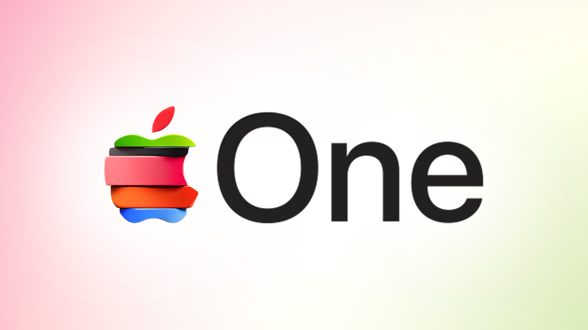
apple_one__cpqesecbv342-upscaled-feature.jpg

The logo features an Apple icon that's split into six slices, and each slice includes the color that Apple uses for one of the services included in Apple One Premium.

Apple One is Apple's paid service that combines several subscriptions in a single bundle price. Apple hadn't designed a recognizable logo for Apple One until now, and the new design still hasn't been added to the standalone Apple One website.

Since Apple is rebranding the Apple TV streaming service, it makes sense for the company to also push the Apple One subscription bundle. Apple One is priced at $19.95 per month for the individual plan, which includes 50GB of iCloud+ storage, Apple TV, Apple Music, and Apple Arcade.

The $25.95 per month Family option offers the same services with 200GB of iCloud+ storage and access for up to five people, while the $37.95 per month Premier plan includes access to 2TB of iCloud+ storage, Apple TV, Apple Music, Apple Arcade, Apple News+, and Apple Fitness+. Apple's bundles offer savings ranging from $12 per month to $32 per month.

Article Link: Apple One Gets New Colorful Logo Following Apple TV Rebrand
 
Last edited:
  • Love
Reactions: arc of the universe
At first I thought I was looking at the Apple rainbow logo then I realized it's a desecrated rainbow logo.

It doesn't even make any sense.
The "wedges" seem to be larger and smaller in a way that never would have been a single Apple cut into slices.

And why is the bottom one seemingly tapered in at the edges?

I swear, between things like this and some of the Liquid Glass stuff, they have "designers" just jerking around with filters and effects in graphics software.

There is no coherence to any of this.
 
Last edited:
It looks like what happens when a child attempts to assemble a Fisher-Price toy without understanding how it all goes together. Either that or something from the old Gumby series.

The "wedges" seem to be larger and smaller in a way that never would have been a single Apple cut into slices.
Maybe they'll change sizes depending on the width of the pie chart slices we see during the quarterly reports.
 
it makes a lot more sense in full context. unpopular opinion, i guess, but i kind of love it.

View attachment 2575776
I like the idea, just not the execution. It’s good enough for an invite or something but not a logo that will stick around

The slices are pretty lopsided, and I don’t like how they’re different thicknesses. It’s too heavy on the red/orange, esp with the leaf on top also being red. It could have been a perfect call back to the rainbow logo, but this is not great as-is imo
 
This is apparently what happens when you hire designers with questionable track records, or lacking any eye for "good taste".
Honest question: do you remember (or think) we would have seen "stories" like this 10 years ago? Or 5 years ago?
We are being fed every single bit and piece nowadays, this in my mind is an absolute "non-story", and yet here we are clicking and typing ... good for MR I suppose.
 
Honest question: do you remember (or think) we would have seen "stories" like this 10 years ago? Or 5 years ago?
We are being fed every single bit and piece nowadays, this in my mind is an absolute "non-story", and yet here we are clicking and typing ... good for MR I suppose.

Probably not -- fair point.

I still think it's unattractive though, FWIW 😂 ✌️
 
  • Angry
Reactions: eveluvsrainbows
Register on MacRumors! This sidebar will go away, and you'll see fewer ads.