I like it. Why can’t yall find something you like and go enjoy it!
That's a bit of a red herring.
We are commenting on how we feel about this particular bit of branding.
"Other things we like and enjoy" are not related.
I like it. Why can’t yall find something you like and go enjoy it!

Im saying to talk about things you like. I think it’s pretty clear. No herrings, red or otherwise. But someone’s always gotta be a contrarian, I suppose. That’s why there will always be edgy teens at hot topic!That's a bit of a red herring.
We are commenting on how we feel about this particular bit of branding.
"Other things we like and enjoy" are not related.
I like it. Why can’t yall find something you like and go enjoy it!
I like Liquid Glass, too! If I didn’t I’d just switch phones. It’s not a big deal.It doesn't feel right as a singular logo. The Apple icon and word "One" are not synergetic. This is feeling a lack of cohesiveness across the company, which is worrying.
As for the constant complaints about Liquid Glass, I disagree. Tweaks already exist to address the issues that people had early on. Overall, Liquid Glass is a great upgrade to the UI across all devices.
The iPhone 17 Pro is pretty nice looking to be honest.Liquid Glass, the iPhone 17 Pros and now this. Has the Apple design team swallowed a fugly pill?
Aww man. I was just telling a friend how much I love the new office logos! I think they are so sleek and cool! Makes me to get all wild up in a spreadsheet!At least it is not as bad as the new Microsoft Office logos that give no hint as to what product they represent.
There's no disputing taste. I think it may be the ugliest phone Apple has made in a decade more or less.The iPhone 17 Pro is pretty nice looking to be honest.
Every time I have needed to use Office since upgrading I have to work too hard to make sure I am launching the right thing.Aww man. I was just telling a friend how much I love the new office logos! I think they are so sleek and cool! Makes me to get all wild up in a spreadsheet!
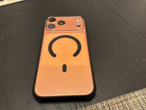
I personally think my Orange iPhone 17 Pro Max is better looking than my Natural Ti 16 Pro Max was. The thing that is an eyesore to me that Jobs would not have allowed is Apple’s clear case with the terrible white area hiding the fact that the Apple logo is no longer centered with the MagSafe. They should have just not offered an Apple branded clear case instead of releasing that thing. The sleek phone is the Air, which I bet would have sold better had they put a second camera on it. I was tempted to get an Air instead of the Pro.There's no disputing taste. I think it may be the ugliest phone Apple has made in a decade more or less.
I have a six-month old 16 Pro. If the current design is still around when I replace it, I'll be switching to Android.
Every time I have needed to use Office since upgrading I have to work too hard to make sure I am launching the right thing.
The logo on its own doesn't convey any meaning. Nothing memorable or beautiful this year except iPhone Air.There is no coherence to any of this.
Thank you. This non-story can be locked now lol 😂This isn’t true. They’ve been using this “logo” in ads for Apple One for years.
See this ad uploaded on YouTube over 3 years ago:
And another one posted over a year ago:
That is to reflect 5 services the Europeans get.Ummm, that's 5 slices and the leaf. Not 6 slices.