Become a MacRumors Supporter for $50/year with no ads, ability to filter front page stories, and private forums.
i especially love the view of tv shows and movies. almost seems like i'm taking a look from inside the store

2quhpw8.png

That does look awesome. One of the things I was looking forward to was a better UI for displaying all your movies/TV shows.
 
Yeesh.

Not an enormous fan of this update.

Like:
+ "Up next". Hold alt and click the "+" next to song to add it to the 'up next' queue.
+ Matched colours. It even seems to match the text colours!
+ Quick genius suggestions from the popup menu

Text colours:

Screen Shot 2012-11-29 at 19.31.00.png

Don't like:

- No dark background option for the main content section.
- Left/right arrows skip songs. Gets in the way as you navigate. You should have to hold down CMD and left/right to skip, IMO.
- It's slow. At first scrolling was really slow, but that was probably because it was downloading artwork from iTunes match. However, there are other parts of the UI that always lag unacceptably - one such example is when trying to add songs to a playlist.
- No ability to select multiple artists from the left column in artist view.
- Columns in the album view should try to match disks when they can. Right now I'm seeing an album with 3 disks - the first column goes from 1-14 and includes track 1 from the second disk. The second column goes from 2-14 on that disk and includes tracks 1 and 2 from the third disk. It looks wrong.
- Have to click items in the popup menu for songs. Simply hovering over "Genius suggestions" or "Add to" doesn't expand those items, because they appear in-place.
- Have to click buttons to go next/previous for banner items on the store. I'd expect that I could two-finger-drag left/right to scroll through them.
- Double-clicking a song while other songs are playing brings up a popup dialog (really, Apple?!)
- Still no love for books. Why do they even include it?

Poor layout for multiple disks:
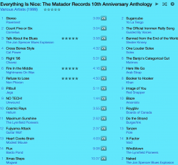
Screen Shot 2012-11-29 at 19.40.22.png

Oh, I'll add that this is on a RMBP 2.6/16

EDIT: OK, scrolling and animations seem much snappier when in windowed mode. In full-screen mode it's really slow. Slower than iTunes 10 for sure.
 
Last edited:
Anyone worked out how to have 'grid view' in 'artist' view under music? The ipad does it, and itunes 11 shows a grid view when under 'Albums, but when clicking 'artists' it seems to show it in a list now!
 
It feels very Linux-like, and am not sure if that's a good thing. Many aspects are clean and polished, like when you open an album to choose a particular song in the music panel, but others elements stand out, like the bar indicating how full your iphone is. The less-polished elements look dirty and thrown-together. I also loathe how I can't select a dark grid background.

Wifi sync still isn't fixed. It doesn't even see my ipad anymore.

One thing is noticeably better: Scrolling through all that album art is now seamless.
 
Radio streams + Mini Player = buggy

Found one bug with radio streams.

After switching to the Mini Player, it doesn't seem possible to restart the stream after pausing it. A "Getting Stream" window appears that seems to be unresponsive to house clicks. Because it's modal, the entire application becomes unresponsive. I had to force-quit.
 
Love the new design. The album view is beautiful and so glad they didn't do skewmorphic. Can anyone tell me how to sync the podcast from my app on my phone with the podcast in itunes?
 
Hmm, don't seem to be able to open multiple iTunes windows any more.

In the old version, if you double-clicked an item in the Sidebar it would open in a new iTunes window, which was useful if you wanted to browse the Store and view your music/podcasts etc. at the same time.
 
No column browser for music (aka list view in tv shows).

BIG SUCK

Come on Apple - we don't want to load the album art for 5000-10000 albums - it takes WAY too long.
 
I got one glitch:

In TVshows using the "Shows" button when you select a show and then change the season the cover art does not change as expected...very sad.
 
I adore the new mini player, but the icons on the left are violating OSX conventions. I enjoy the change, but it feels like I'm running it in windows now. Nothing matches.

Double clicking the album art brings up a very quicktimeX-like player for those of us who enjoy the album art. Didn't they introduce that before and remove it later?
 
Register on MacRumors! This sidebar will go away, and you'll see fewer ads.