Become a MacRumors Supporter for $50/year with no ads, ability to filter front page stories, and private forums.


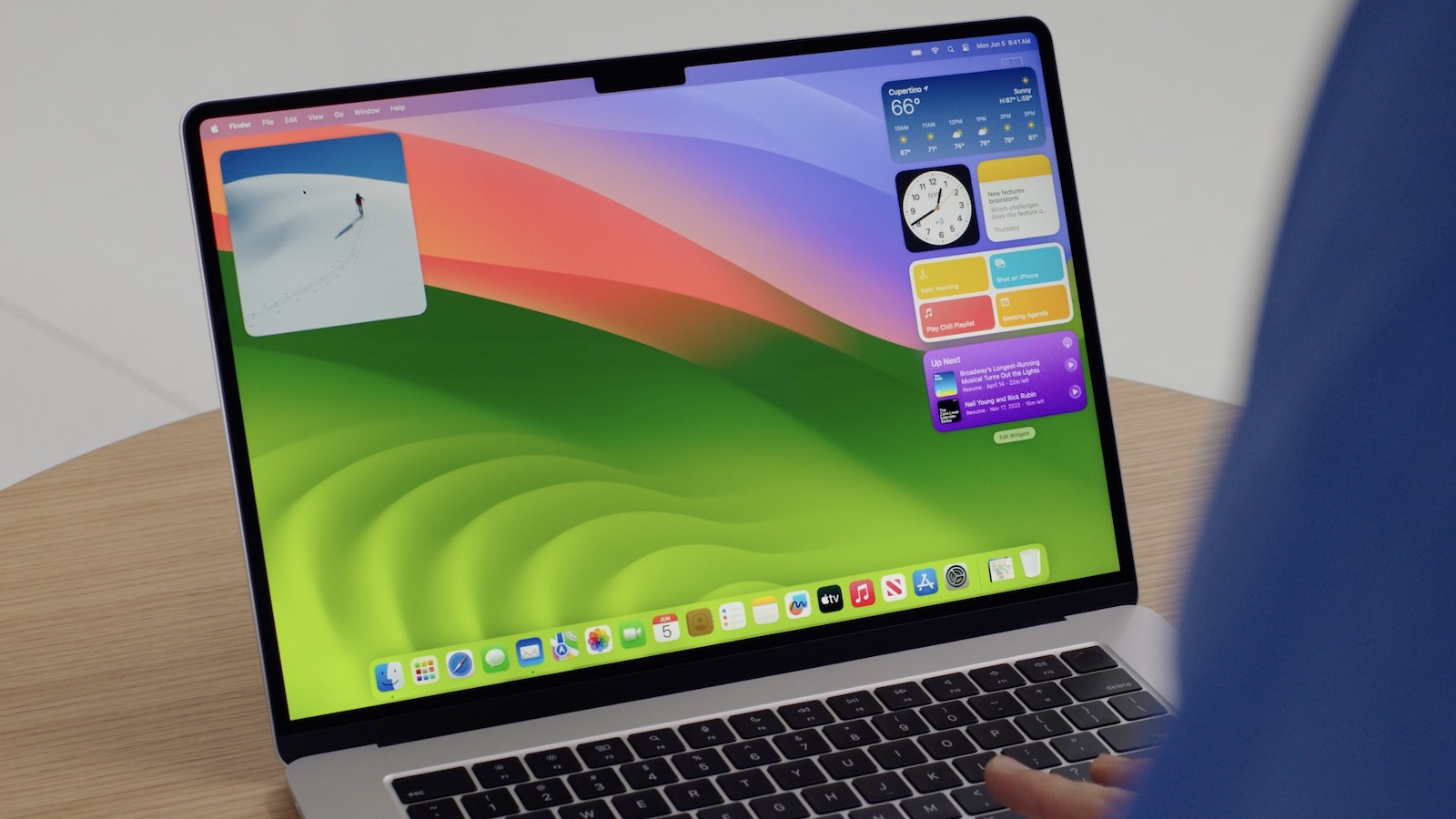
Apple today seeded the fourth beta of an upcoming macOS Sonoma 14.2 update to developers for testing purposes, with the software coming two weeks after Apple seeded the third beta of macOS Sonoma 14.2.

sonoma-desktop-wwdc.jpg

Registered developers can opt-in to the beta through the Software Update section of the System Settings app. Under Beta updates, toggle on the Sonoma Developer Beta. Note that an Apple ID associated with an Apple Developer account is required to get the beta.

macOS Sonoma 14.2 adds an Apple Music Favorites playlist that houses everything you've favorited, plus Apple added support for collaborative playlists. You can now share a playlist with multiple people, and each participant can add songs.

Shazam can also be added to the Control Center or menu bar on the Mac.

Stickers can be used to reply to iMessages when you long press on a chat bubble in the Messages app, and there's also now support for the extra-secure iMessage Contact Key Verification option.

Article Link: Apple Seeds Fourth Beta of macOS Sonoma 14.2 to Developers [Update: Public Beta Available]
Since I installed the last Beta (23C5055b) this morning the mail app does not show the search results anymore. Restarting my Macbook and the mail up does not solve the problem. The game app Red vs. Green runs terribly slowly. Any idea how to solve this?
 
Looking forward to the public beta. The current beta 3 is the first time I’ve experienced a bug whereas the Adobe cloud app that runs in the background (for app updates and such) caused a CPU core to constantly run at 100%
installed PB last night on my M1 MBA and the issue above seems to be fixed (thus far)
 
Anyone else experiencing an odd, never before seen (by me) issue with the Ruler in Microsoft Word? The small indicators of margins and tabs are missing on the ruler after updating to the newest beta (Version 14.2 Beta (23C5055b)). This was not an issue yesterday prior to the installation of the beta. Here's what I've done so far, all to no effect. Deleted MS Word and all its supporting files and reinstalled. Deleted the entirety of MS Office, all in conversation with a MS support tech. Rebooted. Reinstalled MS Office. Rebooted again in Safe Mode. Nothing has brought those tiny little indicators back, and they are so important for any editing and reformatting in Word!!! Anyone else seeing this?
 
Sonoma 14.2 beta 4 introduced a bug in Microsoft Word; when I select the Ruler (in the View menu), there are no margin or tab indicators on the ruler....as you can see on the attached screen shot, even though, in fact, there are several tabs placed in the selected paragraph, making formatting individual paragraphs much more difficult! This has been confirmed by several other users on the Microsoft forum, Mac users with Apple silicon and Intel processors. I have reported my experience both on the Microsoft and Apple Feedback apps...

b786040b-da52-40d2-895f-63444f5a975c.jpeg


BTW, I'm experiencing this on a MacBook Pro M1 Max, with 64 Gig RAM.
 
Did they fix/revert the change to “recently added” in Music only showing the last 60 entires?

A little birdy told me this ridiculous change was going to be reverted after complaints.
YES! They did. I had been meaning to install one of these betas onto an external drive to test it myself, and the MR staff having failed to put that into their coverage or answering your question directly, I caved in and tested it today.

And, lo and behold, it's back! But they made it revert back to an ugly top bar with no label, which didn't and won't serve any purpose, and I promptly sent them feedback on that as well, suggesting that they either remove it altogether, or add back the label they've actually introduced on the current, gimped version:

Captura de ecrã 2023-12-05, às 07.38.51.png
 
YES! They did. I had been meaning to install one of these betas onto an external drive to test it myself, and the MR staff having failed to put that into their coverage or answering your question directly, I caved in and tested it today.

And, lo and behold, it's back! But they made it revert back to an ugly top bar with no label, which didn't and won't serve any purpose, and I promptly sent them feedback on that as well, suggesting that they either remove it altogether, or add back the label they've actually introduced on the current, gimped version:

View attachment 2321130
I know, i'm so happy - I ran beta 4 with the change.

I actually don't mind the time frame being added instead of it just saying "recently added" it's quite nice to see how long ago I actually added something to the collection roughly.
 
  • Love
Reactions: Mainyehc
I know, i'm so happy - I ran beta 4 with the change.

I actually don't mind the time frame being added instead of it just saying "recently added" it's quite nice to see how long ago I actually added something to the collection roughly.
A million times this! Calling it “Recently Added” is, in hindsight, a bit of a misnomer…

There are two logical ways they could go about this: changing its name to something more logical, such as “All Albums” (taking it from Photos.app, where the similar view is “All Photos”), or, alternatively, adding this very same view to the “Albums” view, as a “Date Added” sorting option, and properly documenting it with some splash screen tutorial like they did with that intrusive, Stage Manager-related, “click on the desktop to reveal it” tutorial thing. That's the respectful way of doing it when a simple “What's new?” window won't cut it…

And, what's more, by doing the latter, they could then repurpose the “Recently Added” to a more interesting and algorithmically-generated “Recent Music” amalgamation… It could include both your recently added albums and tracks *and* recently played music, both from your offline library and Apple Music and Apple Classical listening habits, or even Apple Music Radio, soundtracks and songs from your latest Apple TV+ movies and shows, Shazam results (yes, even for people who DON'T subscribe to Apple Music, by cross-referencing those with our offline libraries; I don't care, I've already spent and keep spending thousands of €€ on this company anyway), the works.

That wouldn't shock me or insult me in the least, and I might actually prefer such a consolidated view as the default for my library (it would have to adjust itself accordingly if you didn't subscribe to Apple Music, of course, but I've already made my thoughts on the matter very clear), while still having the option to go back to the more conservative way of picking music I suspect I will be more comfortable with because it was either picked by me, suggested by friends, or predictably similar to what I already know.

This is the thing that Apple engineers have to get through their thick skulls: in UX, adding features, or enforcing some kind of feature-parity across OSes, doesn't always have to be a zero-sum game, and in this case, it most definitely didn't because there WAS a proper place to neatly tuck the feature into. They could even implement the “last-60-albums” view as the default for all I care, as long as they still gave us that sorting option (and working correctly, of course) under the grid-based Album View. It's RIGHT THERE for the taking, they just had (have?) to add it as an option. As a matter of fact, the fact that they never added it in the first place and just came up with it – considering how much of a venerable and flexible database iTunes always was, belatedly, if I must add – in the form of the beloved fully functional “Recently Added” is, in hindsight, dumbfounding.

Also also: if they added it as a sorting option and, on top of that, brought back CoverFlow, they would have a hit on their hands. And knowing Apple like I do, they just might, and get the latest batch of youngling vinyl lovers and bandcamp shoppers who don't know any better fawning over it, without realising it's actually nothing new. 😂
 
Last edited:
Register on MacRumors! This sidebar will go away, and you'll see fewer ads.