Become a MacRumors Supporter for $50/year with no ads, ability to filter front page stories, and private forums.

MacRumors

macrumors bot
Original poster
Apr 12, 2001
69,917
41,358


Apple is promoting the new Liquid Glass design in iOS 26, showing off the ways that third-party developers are embracing the aesthetic in their apps. On its developer website, Apple is featuring a visual gallery that demonstrates how "teams of all sizes" are creating Liquid Glass experiences.
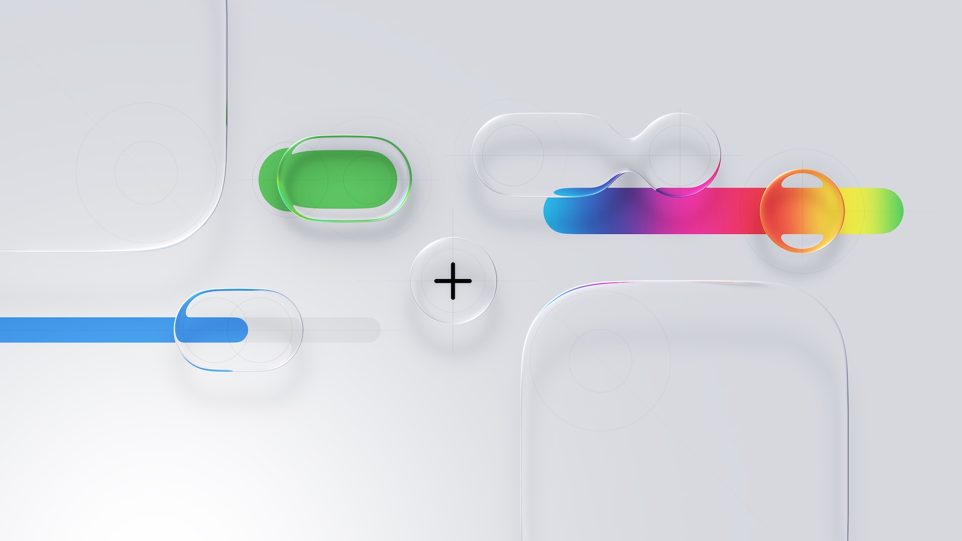
Liquid-Glass-General-Feature.jpg

The gallery features examples of Liquid Glass in apps for iPhone, iPad, Apple Watch, and Mac. Apple includes comparisons of how each app looked in iOS 18, and how it looks in iOS 26.

Apple's examples feature apps that have eliminated bottom navigation bars in favor of smaller navigation options, apps with Liquid Glass sliders and buttons, and apps using popovers.

Featured apps include Crumbl, Tide Guide, GrowPal, Lumy, Sky Guide, Linearity Curve Graphic Design, LTK, American Airlines, Lowe's, Photoroom, OmniFocus 4, CNN, Essayist, and Lucid Motors.

The design comparisons are best viewed on Apple's site, and are worth checking out if you're curious about how third-party apps are incorporating Liquid Glass.

Article Link: Apple Shares Liquid Glass Design Gallery
 
Ahh, am I just a curmudgeon? For the most part prefer the left-hand screenshots because they're less 'noisy' - a clear interaction zone with the icons. The right-hand animations are mostly floating, transparent lozenges. They visually flicker and are intermittently illegible.
 
Last edited:
I'm loving Liquid Glass more everyday. It just looks so refined and the refraction effects add so much visual interest compared to the "flat" textureless designs from the decade before.

The CNN comparison is a great example to me:
1762469635073.png


It's really nice to see the photos at the bottom extend fully downwards, bringing more color and life to the screen, rather than that large flat gray bar. A lot of people may argue this is not 100% "useful" or "necessary", but that's not the point. It looks and feels much nicer.
 
It was not worth moving a bunch of UI elements from the bottom to the top of the screen...

That was a developer choice, nothing to do with Apple or Liquid Glass directly. Send your feedback to the developer.

iOS 18 is so much cleaner.

This comparison makes it so obvious liquid glass adds nothing of value to the UX.

There's more usable screen space exposed. Look more closely at the examples.

Liquid Glass is more than a visual facelift. It offers elegant "morphing" of contextual controls that wasn't supported in earlier iterations of the UI.
 
Liquid Glass is a different UI design philosophy/approach. It is fundamentally different in how apps need to structure and display their information from the old UI.

Some may not like it because it is different from how we have been organizing information on the screen. Apple doesn’t make it clear that we, as users, need to update or change our understanding. And some of us don’t like change.

I wouldn’t be surprise this is a hint on how the AR design will be…
 
These honestly look horrendous, I havent met a person in real life who likes liquid glass. Know so many avoiding installing it on their devices.

In the comparisons on the Apple website, there's not one LG screen I prefer to the old screen, and several of them are harder to read, would force you to focus intensely on the, say, button and squint. Slick but a UI disaster.
 
I actually really love Liquid Glass. I can understand why people may not. But you cannot please everyone. I also think too many people listen to tech YouTubers.

Just here to say, I unapologetically love Liquid Glass. It has not only kept things fresh and introduced new dimension to the boring, flat UI we’ve been stuck with since iOS 7, but it is also absolutely gorgeous in itself and fascinating to see implemented across different apps. Big fan.

Add me to the Liquid Glass fan club. It's more impactful on iOS/iPadOS than MacOS but as a fresh coat of paint is really feels different to me. There will be glitches here and there and each .1 release will fix those things.

Is it the radical step forward that Apple is pitching? Of course not - that's just Apple's marketing guff. I'd go as far as saying that it's a step back in some ways, but I can live with that because it looks new and from time to time it's just nice to redecorate.
 
Some of those third party app examples are cool versus their iOS 18 versions but for me it shows there is a fine line between aesthetics and practicality/usability where readability on the iOS 26 version of apps is a big concern and you have to weigh what's more important, readability/usability or aesthetics AKA form over function and vice versa.
 
I looked at all examples in the gallery, and the usability degradation just makes me sad. Hopefully Apple will realize at some point that this isn’t a good design for people who just want to get 💩 done on their devices.
Usability degradation sums it up nicely.

Apple is merely demonstrating that they have doubled down and remain fully committed to this design. Productivity isn’t something they value as they continue to focus on attracting the easily amused, young and those with too much time on their hands.
 
I'm loving Liquid Glass more everyday. It just looks so refined and the refraction effects add so much visual interest compared to the "flat" textureless designs from the decade before.

The CNN comparison is a great example to me:
View attachment 2576860

It's really nice to see the photos at the bottom extend fully downwards, bringing more color and life to the screen, rather than that large flat gray bar. A lot of people may argue this is not 100% "useful" or "necessary", but that's not the point. It looks and feels much nicer.

I'm loving Liquid Glass more everyday.

I agree midkay.
 
For most of it (looking at you Tahoe Contacts app) I really like. It feels new and playful.

I'm however, disappointed at Apple for not enforcing it.

There are multi-million companies out there without even supporting dark mode icons in their apps.
Maybe it's harsh to small developers, but there should be a threshold when you are mandated to incorporate the liquid glass design into your app or face not approval.
 
Last edited:
Register on MacRumors! This sidebar will go away, and you'll see fewer ads.