GUNSTAR1
macrumors regular
So when can I have custom live wallpapers on the lock or Home Screen? At this point the cpu/battery consumption on the glass animation makes the efficiency counterpoint moot. The Live Photos option is a joke.
If so many people around you are avoiding it, then they aren’t even speaking from experience and just repeat what they’ve heard, opinions based on a few early beta screenshots. It makes no sense to me how someone can look at Apple’s examples and call them horrendous. Even for those who don’t like the transparency, there is something now and the SDKs for developers are more capable than ever.These honestly look horrendous, I havent met a person in real life who likes liquid glass. Know so many avoiding installing it on their devices.
I don't seem to remember owning a macOS 18
I have lived and worked in a cross platform environment for a very long time.I dislike Liquid Glass so much I plan on not ever upgrading and additionally choosing non-Apple operating systems and non-Apple hardware in my future purchases.
It's really nice to see the photos at the bottom extend fully downwards, bringing more color and life to the screen, rather than that large flat gray bar. A lot of people may argue this is not 100% "useful" or "necessary", but that's not the point. It looks and feels much nicer.
It’s really there! Apple becomes a joke. Sad.
Yes. It’s because on luiquid glass you have the bottom buttons and also some more at the top of the screen, and they are really bigAhh, am I just a curmudgeon? For the most part prefer the left-hand screenshots because they're less 'noisy' - a clear interaction zone with the icons. The right-hand animations are mostly floating transparent lozenges that visually flicker and are intermittently illegible.
Sure. Apple cannot admit they made mistake. They never do. And not after AI delay disaster. We will stay with GUI to fish for quite long until Apple slowly withdraw some design choices and improve usability in iOS 27 or later.The Lucid Motors comparison? Cleaner and sharper in IOS18. Why on god’s holy name did they extend LG to the Watch? It’s hard enough to see in daylight as it is.
Unfortunately it looks like Cupertino has become the new Soviet Union - walled off from the world and believing their own newspapers. One thing is certain - Apple is doubling down on LG. Those of us that don’t like it? Take your Cod Liver Oil little Billy and be grateful. I know it tastes like sh_t and your tummy hurts but - you’ll get better.


Well when you can't realistically grow mobile screen size taller or wider what do you do? You make it deeper of course. Logical and sort of brilliant, if complexity-forward.
Apple is promoting the new Liquid Glass design in iOS 26, showing off the ways that third-party developers are embracing the aesthetic in their apps. On its developer website, Apple is featuring a visual gallery that demonstrates how "teams of all sizes" are creating Liquid Glass experiences.
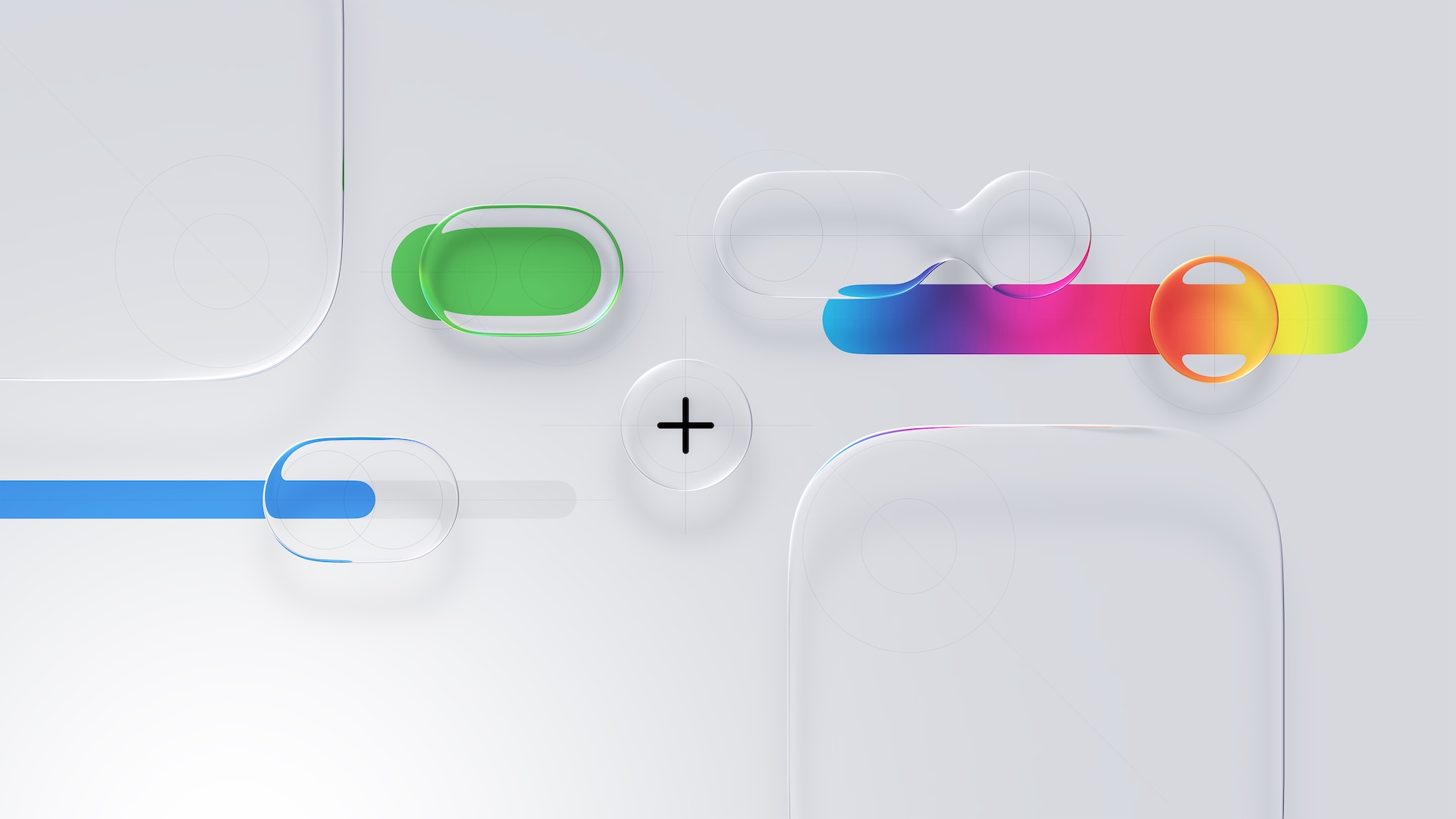
The gallery features examples of Liquid Glass in apps for iPhone, iPad, Apple Watch, and Mac. Apple includes comparisons of how each app looked in iOS 18, and how it looks in iOS 26.
Apple's examples feature apps that have eliminated bottom navigation bars in favor of smaller navigation options, apps with Liquid Glass sliders and buttons, and apps using popovers.
Featured apps include Crumbl, Tide Guide, GrowPal, Lumy, Sky Guide, Linearity Curve Graphic Design, LTK, American Airlines, Lowe's, Photoroom, OmniFocus 4, CNN, Essayist, and Lucid Motors.
The design comparisons are best viewed on Apple's site, and are worth checking out if you're curious about how third-party apps are incorporating Liquid Glass.
Article Link: Apple Shares Liquid Glass Design Gallery
Dead wrong. The form factor of the mobile phone has, in a matter of a few years, assumed the familiarity (it's key quality) of the toggle light switch we all look for near the doorway into a dark room. Liquid Glass injects a floating ephemeral elusive layer of reality which reduces clarity and focus, unfortunately. It's not as if naysayers are the new luddites but are curating a new thing. Count me in...or out...or there?Add me to the Liquid Glass fan club. It's more impactful on iOS/iPadOS than MacOS but as a fresh coat of paint is really feels different to me. There will be glitches here and there and each .1 release will fix those things.
Is it the radical step forward that Apple is pitching? Of course not - that's just Apple's marketing guff. I'd go as far as saying that it's a step back in some ways, but I can live with that because it looks new and from time to time it's just nice to redecorate.

