Apple TV users are not happy with design changes that Apple added to the Apple TV app with the launch of tvOS 16.2, iOS 16.2, iPadOS 16.2, and macOS Ventura 13.1, according to a number of complaints shared on Reddit.
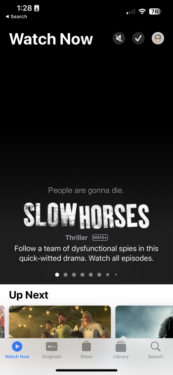
Apple with tvOS 16.2 and its sister updates demoted the "Up Next" section in the "Watch Now" tab of the Apple TV app, instead adding a large featured content section with no option to disable it. The previews also autoplay content with audio, much to the annoyance of Apple TV users. From Reddit user Sean310:
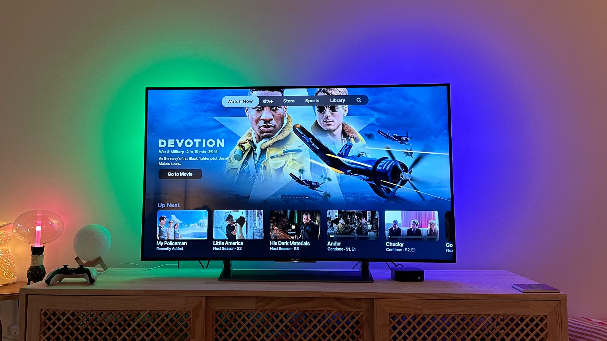
When tvOS 16.2 was being beta tested, there was a full "Featured" section that was shown above Up Next, but after a number of complaints, Apple changed the design. "Up Next" continues to be visible at the bottom of the Watch Now tab, but the majority of the interface is taken up by a rotating carousel featured shows and TV moves.I absolutely HATE the new format.
And they roll right into previews with audio. WTF Apple?
Up Next is tiny now & easily skipped over (on purpose).
And when you are on the Up Next row, the same Apple TV+ shows take up 85% of the screen below.
There is no way to toggle off the featured section or to revert to the interface that put more focus on Up Next, and as it transitions through content, Apple offers options to "Go to Show" or "Go to Movie" quick links. Though the interface change has been available since tvOS 16.2 was released on December 13, it appears the tvOS auto update function recently sent out the update on a more widespread basis. From Reddit user WikiWikiWhat:
Apple TV users have been complaining about these design tweaks since tvOS 16.2 was in testing, and Apple has not made an effort to offer options to swap back to the old interface. It is not clear if the uptick in complaints will sway the company, and for now, the interface is here to stay. It's also worth noting that these same design changes have also been implemented in the TV app for iPhones, iPads, and Macs.Same, mine updated last night and it's feels like a massive downstep. No longer feels like a premium product and more like a cheaper ad driven platform, would at least like the option to revert back to the old "up next" view at the very least
Article Link: Apple TV Users Complain About tvOS 16.2 'Watch Now' Redesign