

Become a MacRumors Supporter for $50/year with no ads, ability to filter front page stories, and private forums.

MacRumors

macrumors bot
Original poster


Apple has taken a new approach to its stock wallpapers with iOS 27 and macOS 27 Golden Gate, using variations of the same artwork across all platforms for the first time.
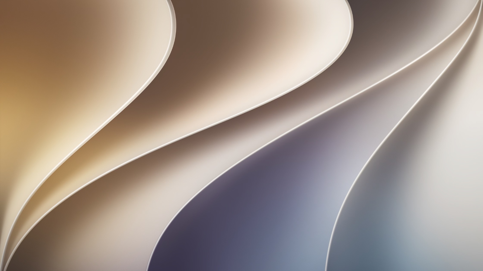
macos-golden-gate-wallpaper.jpg

In previous years, most platforms shipped with their own distinct wallpaper. This year, they all share a design called "Celosia," featuring sweeping, overlapping curves and soft shadows inspired by layered flower petals or folded paper. In Light mode, warm sandy gold blends into soft purple; Dark mode shifts to moody deep indigos with silvery-blue edges. The curved shapes also form a stylized "27," tying the design directly to the software version.

The iOS 27 and iPadOS 27 Celosia collection comes in three variants: a standard iOS 27 version, Dynamic, and Color, each with separate Light and Dark versions optimized for the Home Screen and Lock Screen. macOS 27 Golden Gate ships with dynamic wallpapers accessible only through the OS itself. Even CarPlay contains 14 Celosia wallpaper options in the first developer beta, spanning Light and Dark modes across Grey, Purple, Red, Teal, Blue, Brown, Dark Blue, and Green variants, plus a Hero option in both Light and Dark.

Article Link: Apple Unifies iOS 27, macOS, and Even CarPlay Wallpapers for First Time
 
  • Like
  • Haha
Reactions: Z-4195 and ikir
"Golden Gate" is a bridge to touch on the Mac. This wallpaper scheme also probably plays into the continuity features coming later this year with touch MacBook Pros.
 
  • Like
Reactions: jjm3
So Microsoft'ish....one look for all devices. I prefer the variety of the different styles and look between devices.
Definitely makes each device less “foreign” to the buyer… possibly making them more likely to buy other Apple devices. Not sure how I feel about it yet
 
2022 called and want their wallpaper back.

Not surprising to see Apple simplify to one wallpaper, as they continue to be less creative with their visuals. They also focused on features across platforms vs segmenting WWDC to iOS, MacOS, etc.

Site+Cover.webp
 
  • Like
Reactions: Dadcelo
Way too contrasty, whatever happened to subtlety and yes the SnowLeopard default is prime example of good non distracting tone range, even the Tahoe one looked better
 
  • Like
Reactions: jjm3 and benface
So from skimming the news, it seems all those of us without children really get from this new version is rearranged ("overhauled") menus that we have to re-learn.
 
Register on MacRumors! This sidebar will go away, and you'll see fewer ads.