Got a tip for us?
Let us know
Become a MacRumors Supporter for $50/year with no ads, ability to filter front page stories, and private forums.
Apple Unveils macOS Tahoe With Liquid Glass Design, Phone App, Live Translation, and More
- Thread starter MacRumors
- Start date
- Sort by reaction score
You are using an out of date browser. It may not display this or other websites correctly.
You should upgrade or use an alternative browser.
You should upgrade or use an alternative browser.
My first thought: oh, this looks so nice.
My second thought: hold on a second, this is the LIST view on Finder, why in the name of Steve does every item need so much padding? I hope this can be changed (or changes before release – unlikely – it does look pretty, only not too usable, but that obviously isn’t a big concern).
Wow, does this suck. Well, I’ll be looking for an app to bring color back to my desktop. I love Apple but I really get sick and tired of the constant “Let’s change everything just because we can, not because it was necessary” crap.
It's been there for like a decade now, if not longer.What if Apple removes that feature in Accessibility?
Where are the stripes?Aqua is back! Thanks Apple, great Job(s)
Yes, that's true. But they can remove it any time, if they want to.It's been there for like a decade now, if not longer.
On a positive note I was able to bump up my res to 1440p, one up, thanks to Tahoe’s UI literally being Fisher Price 🥲My first thought: oh, this looks so nice.
My second thought: hold on a second, this is the LIST view on Finder, why in the name of Steve does every item need so much padding? I hope this can be changed (or changes before release – unlikely – it does look pretty, only not too usable, but that obviously isn’t a big concern).
So, Apple is really just letting the Freeform app die on the Mac? Since its introduction there haven't been any updates, I was really hoping this time they would finally make it useful.
My assumption is that this is the Finder list view with the larger icons selected, and that you can still pick the smaller size icon and get a more compact view. (Though the type tracking on that Tahoe screenshot looks weirdly tight, and I hope they revisit that). I could also be completely wrong, but I hope not.My first thought: oh, this looks so nice.
My second thought: hold on a second, this is the LIST view on Finder, why in the name of Steve does every item need so much padding? I hope this can be changed (or changes before release – unlikely – it does look pretty, only not too usable, but that obviously isn’t a big concern).
You can get a list view that airy in Sonoma today if you pick those larger icons with the Show View Options (⌘J) panel:
Last edited:
The window border radii is just obnoxiously large. I just can't with this. Also, were people having a hard time finding UI elements, because they literally doubled them in size.
Did they literally fire every designer over COVID? This looks like an intern with a free freepik account.
Someone wake me up.
What's the third icon?View attachment 2518572
Did they literally fire every designer over COVID? This looks like an intern with a free freepik account.
Someone wake me up.
View attachment 2518572
Did they literally fire every designer over COVID? This looks like an intern with a free freepik account.
Someone wake me up.
It just all looks so childish.

After some trouble, I managed to install macOS Tahoe (in a VM) on my Mac with UTM. Personally, I find the look splendid; it reminds me of the futuristic Windows 12 concepts we saw on YouTube.
The new animations are really cool (for example, when opening apps and windows). It seems to me that this innovative Liquid Glass design will allow for better consistency and increased responsiveness across the entire Apple ecosystem. It's so fluid, even on a 4-core VM with 8GB of RAM!
I'm having a hard time going back to macOS 15.5 after having dabbled in that 🤣 Of course, design remains a matter of personal taste.
Apple has clearly struck again with this new OS... I can't wait to see if Windows will follow suit 😜
Attachments
The unicorn's endstation.What's the third icon?
If you look closer, you will find, that there is a magical unicorn, hiding in the grass. The location is indicated by the white arrow in the translucent orange circle.

Using computers has to be fun for todays generations. Are you an old fart, like myself? 😉It just all looks so childish.
Oh, dark mode looks MUCH better!I'm having a hard time going back to macOS 15.5 after having dabbled in that 🤣 Of course, design remains a matter of personal taste.
Not sure I'm dead keen on 'Windows Vista for Mac' as Liquid Glass GUI seems to be presenting itself as.
Even less keen so much energy is once again being spent to dumb'ify Mac down to better reflect that on iPhone - which uses an OS created for the 2007 iPod Touch.
Even less keen so much energy is once again being spent to dumb'ify Mac down to better reflect that on iPhone - which uses an OS created for the 2007 iPod Touch.
Last edited:
What resolution setting do you use?View attachment 2518565
The window border radii is just obnoxiously large. I just can't with this. Also, were people having a hard time finding UI elements, because they literally doubled them in size.
And I was one of the people unhappy with the UI, yeah. I could feel the extra cognitive load. To my eye the Finder elements have been cramped, which also makes the designs too hard to distinguish from each other. Rectangle 1 Rectangle 2?
Context menus, too. Their GUI is so old! It hasn't changed anything but the font in thirty years.
I would've been happy simply with a higher bound for font scaling, icon scaling, and spacing. But it was inevitable the language of iOS and iPadOS would eventually migrate to desktops and laptops.
I don’t know about all that but the glass UI was taken from visionOS which has nothing to do with desktops and macOS, so not sure what exactly you’re saying really.What resolution setting do you use?
And I was one of the people unhappy with the UI, yeah. I could feel the extra cognitive load. To my eye the Finder elements have been cramped, which also makes the designs too hard to distinguish from each other. Rectangle 1 Rectangle 2?
Context menus, too. Their GUI is so old! It hasn't changed anything but the font in thirty years.
I would've been happy simply with a higher bound for font scaling, icon scaling, and spacing. But it was inevitable the language of iOS and iPadOS would eventually migrate to desktops and laptops.
Apple introduces Mac OS X, again.....
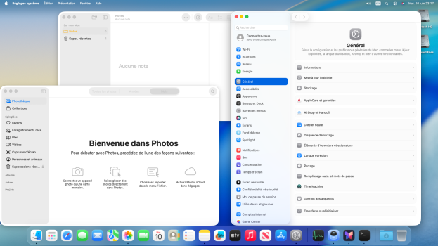
Apple has announced macOS Tahoe 26 at WWDC 2025, introducing a striking visual redesign alongside expanded Apple Intelligence capabilities and new Continuity features that further integrate Mac and iPhone workflows.

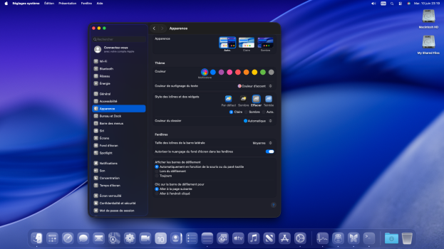
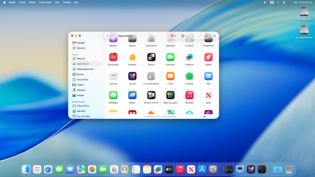
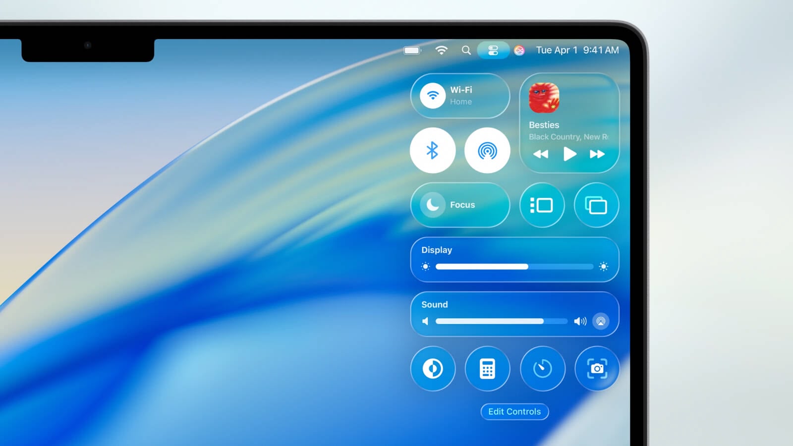
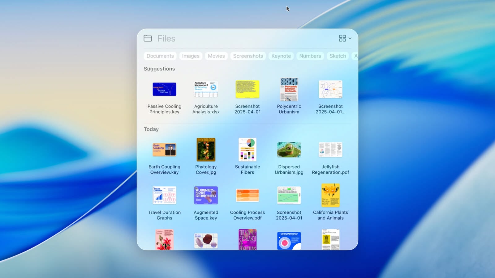
The update centers around what Apple calls a "gorgeous new design" built with Liquid Glass, a translucent material that reflects surrounding elements. The Dock, sidebars, and toolbars have been refined to emphasize content, while a completely transparent menu bar makes displays feel larger. Users gain extensive personalization options, including colorful app icon tints, customizable folder colors with emoji symbols, and enhanced Control Center layouts.
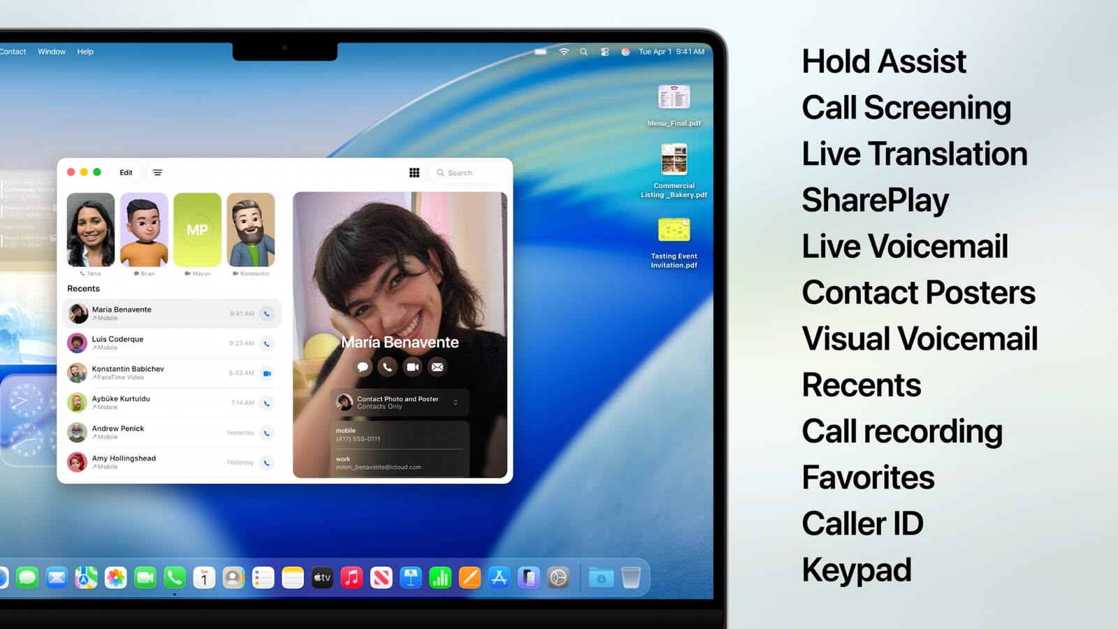
Continuity receives significant upgrades with the Phone app arriving on Mac, bringing familiar iPhone features like Recents, Contacts, and Voicemails. New capabilities include Call Screening, which automatically answers unknown calls and gathers caller information, and Hold Assist, allowing users to maintain their position in phone queues while continuing Mac work.
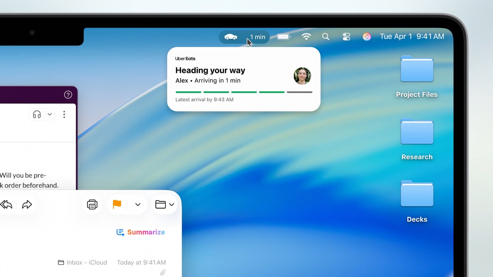
Live Activities from iPhone now appear in the Mac menu bar, displaying real-time updates for flights, ride-sharing, and sports scores. Clicking these activities opens iPhone Mirroring for additional details and actions.
Spotlight undergoes its most substantial update ever, intelligently ranking all search results together while introducing filtering options for specific file types. Users can now execute hundreds of actions directly from Spotlight – sending emails, creating notes, or playing podcasts – without switching apps. The feature learns user routines and surfaces personalized actions, plus introduces "quick keys" for rapid access to frequent tasks.
Apple Intelligence expands with Live Translation across Messages, FaceTime, and Phone calls, automatically translating conversations in real-time while maintaining privacy through on-device processing. Shortcuts become more powerful with intelligent actions that tap directly into Apple Intelligence models for complex automation.
Genmoji and Image Playground receive enhancements, allowing users to modify existing emoji and access new creative styles including oil painting and vector art through ChatGPT integration. Apple Intelligence can also identify action items from emails and websites, automatically organizing Reminders into manageable categories.
A new Apple Games app centralizes gaming experiences with personalized recommendations and social features. The Game Overlay provides quick access to system settings and friend interactions without leaving games, while Low Power Mode extends battery gaming sessions.
Additional updates include Safari's 50% faster loading speeds and four additional hours of video streaming battery life compared to Chrome, the Journal app arrives on Mac with multi-device sync, Messages comes with backgrounds and polls, and accessibility improvements include Magnifier and Braille Access enhancements.
macOS Tahoe 26 enters developer beta today, with public beta availability next month and general release planned for fall 2025.
Article Link: Apple Unveils macOS Tahoe With Liquid Glass Design, Phone App, Live Translation, and More

Register on MacRumors! This sidebar will go away, and you'll see fewer ads.