Become a MacRumors Supporter for $50/year with no ads, ability to filter front page stories, and private forums.

MacRumors

macrumors bot
Original poster
Apr 12, 2001
68,146
38,924


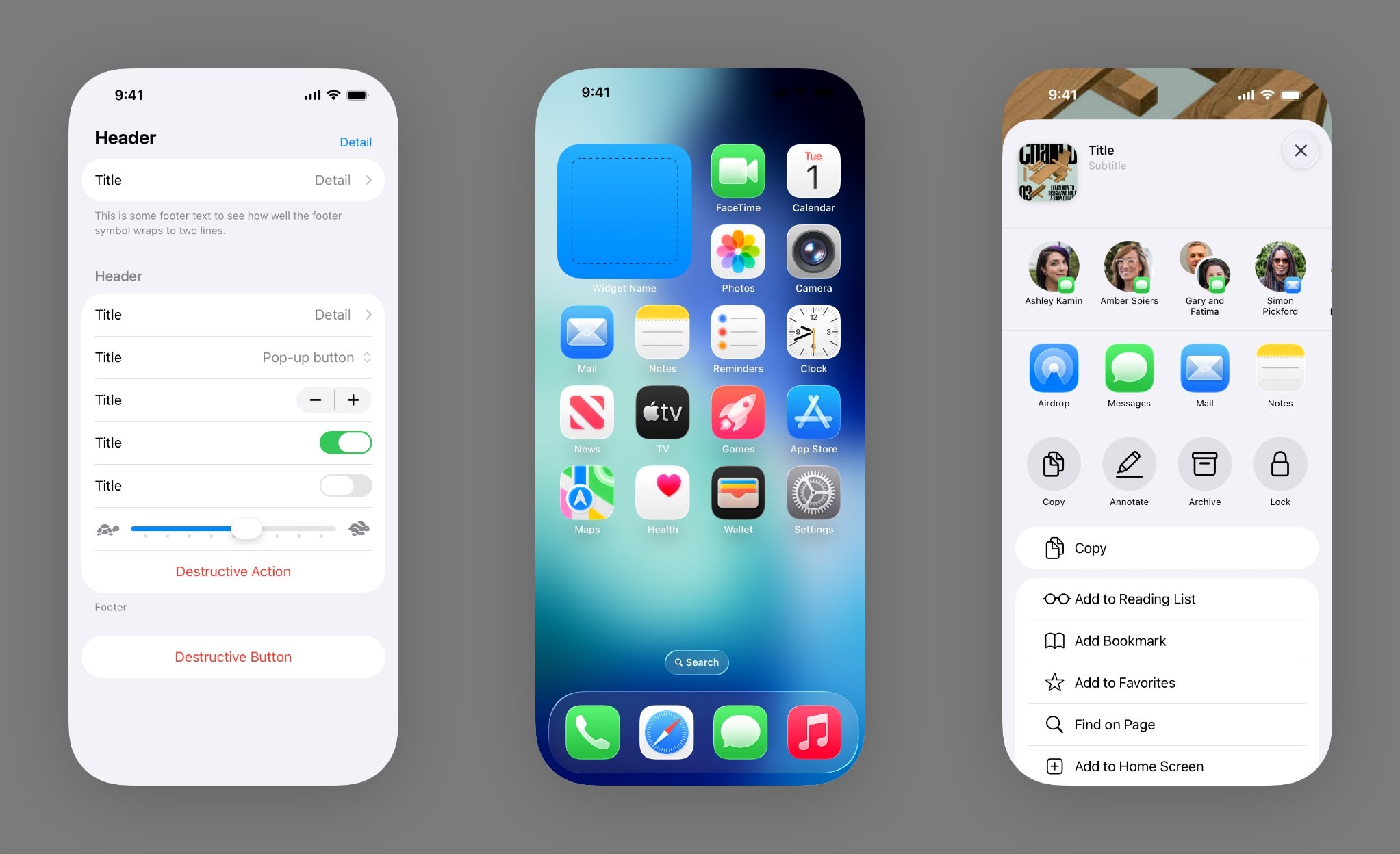
Apple has released updated design resources for developers and designers working on projects for iOS 26, iPadOS 26, and macOS Tahoe 26, following the company's introduction of its new "Liquid Glass" design language at WWDC 2025.
iOS26-Sketch-Library-small_2x.jpg

The updated files, available on the Apple Design Resources website, include iOS 26, iPadOS 26 and macOS Tahoe 26 Sketch Library and App Icon Templates (available for Sketch, Photoshop, and Illustrator).

Liquid Glass is Apple's new translucent material that reflects and refracts its surroundings, while dynamically transforming to help bring greater focus to content across system controls, navigation elements, app icons, and widgets. The design represents the most significant visual overhaul since iOS 7.

The resource library includes UI elements ranging from action sheets and keyboards to the redesigned tab bars that shrink when scrolling to maintain content focus. Apple's macOS Tahoe 26 resources feature updated elements like arrow buttons, color wells, and redesigned window controls that complement the translucent aesthetic. Apple has not yet released resources for tvOS 26, visionOS 26, or watchOS 26.

Article Link: Apple Updates Design Resources for iOS 26 Liquid Glass Interface
 
Don't have time to look, but I hope there is a nice version with accessibility enabled. I really don't want to have to squint at "mostly clear UI elements" and I'm not even "that old".

This glass UI "sounds cool" but to me the concept is hostile to anyone with poor vision, or even regular vision people without their glasses (ie looking at phone during bed, non-prescription sunglasses, at beach, etc.)

It's a non issue. People are talking about it as if everything was glass reflective transparent and what not. I've used the beta in the past two days and I can barely notice the difference compared to iOS 18. It's more or less the same.
 
Last edited:
I am hopeful that, much like iOS 7 evolved from the first beta to the release version, we’ll see the same here. I am praying for that. The blurriness in colors and icons, and the illegibility with glass overlaid over other UI elements are specifically the areas that I hope they quickly resolve. I do not have vision challenges and even I found it quite jarring. The current designs of the back/pause/forward elements in video overlayed over the video content is a good example of what not to do. Same is true of the current control center design. I am surprised we have not seen many posts calling out the lead designer by name. Jony had his faults (form over function, obsession with thinness) but I feel like he would have never made such mistakes. If anything, his software sin was initially introducing iOS7 with the very thinnest of font treatments (surprise, surprise).
 
I can’t wait to see how this evolves over the next couple of years. I think it will look sick on the 20th anniversary iPhone. We will be years (WWDC 2027 - iOS 28) into the design by then.
 
I am hopeful that, much like iOS 7 evolved from the first beta to the release version, we’ll see the same here. I am praying for that. The blurriness in colors and icons, and the illegibility with glass overlaid over other UI elements are specifically the areas that I hope they quickly resolve. I do not have vision challenges and even I found it quite jarring. The current designs of the back/pause/forward elements in video overlayed over the video content is a good example of what not to do. Same is true of the current control center design. I am surprised we have not seen many posts calling out the lead designer by name. Jony had his faults (form over function, obsession with thinness) but I feel like he would have never made such mistakes. If anything, his software sin was initially introducing iOS7 with the very thinnest of font treatments (surprise, surprise).

I think it's certain that Apple will continue to refine the UI not just over the next three months before its release, but over the next several major iOS versions.

The hardest step is always creating something new.

It's much easier to edit and iterate on something that already exists.
 
It's a non issue. People are talking about it as if everything was not glass reflective transparent and what not. I've used the beta in the past two days and I can barely notice the difference compared to iOS 18. It's more or less the same.

I wouldn't say it's a non-issue. While I use dark mode, I found light mode to be distracting.
 
The resource videos are worth a watch and so Apple. It's a beautiful design language. Liquid Glass will set them apart from the rest for a little while, even if others are closing in on, or, getting ahead of them in hardware design. Some of the elements are just pure Aqua porn. I hope they don't change, or reduce the effects, and instead give others sliders to increase 'frosting'.
 
  • Like
Reactions: winxmac and Shifts
It might well be the result - I don't know. Either way, I'd be curious to know how compliant Apple is with their own design principles
I tried the developer beta, a lot of their liquid buttons and bars conflict with text contents. Also, there is no way their new notifications and light clear app icon customization pass contrast ratios. But I assume they will fix that before September. Probably by leaning toward a more “frosted glass” effect than translucide for large boxes, and maybe play with the opacity.
 
A year later and some apps like sky news in the uk still don’t even have a dark icon
 
  • Like
Reactions: winxmac
I tried the developer beta, a lot of their liquid buttons and bars conflict with text contents. Also, there is no way their new notifications and light clear app icon customization pass contrast ratios. But I assume they will fix that before September. Probably by leaning toward a more “frosted glass” effect than translucide for large boxes, and maybe play with the opacity.
there is already a fixed version in iOS 26 beta in the form of Safari
 
  • Like
Reactions: patlee2000
For me, I just think for all of the possible design outcomes, inspiration out there across all kinds of designs, this is the best they could do? I am sure they had a 3-5 year pipelines and this design was the best one? I have not used the beta, but from the images, it really hurts my eyes trying to read the text on those backgrounds.
 
I wonder what’s the rationale behind the elongated toggles and slider handles. Just to make it look different I guess?

Duh. With a circle you likely cover the element with your finger, with an oblong shape that balloons in size when you touch it there’s room for it to morph into a glass blob big enough so the user can more readily appreciate how brilliant LG is.
 
  • Haha
Reactions: winxmac and klasma
I think we're in for a long period of Apps that don't get updated for this new look.

Big cross platform companies/apps come to mind.
 
  • Like
Reactions: winxmac
Register on MacRumors! This sidebar will go away, and you'll see fewer ads.