Become a MacRumors Supporter for $50/year with no ads, ability to filter front page stories, and private forums.
I wish they'd dial back the corner rounding.

That adds nothing other than pruning the areas that can be used at the corners and thus pushing more content inward.

Ultimately it continues to slightly steal from overall useful area on often already small screens.
 
The sole purpose of the Liquid💩 design, which looks like an android mod coded in 10 days, was to distract you from the fact that Apple still hasn't figured AI yet
The entire conference was around how LiquidSh!t flows onto all Apple devices, creating an unifying experience...of nothing
 
Some thoughts after using the beta.

I find it interesting how everyone says iOS 26 looks like crap while obviously comparing it to what they're used to - iOS 18 (or the general iOS 7 design era). I compare it to iOS 6, and just like everything after iOS 6, iOS still looks like crap. It's still very much the same neon-coloured design with lots of white screens, it still hurts my eyes just like iOS 7 and everything subsequent did. The same way people hated iOS 7 for all sorts of reasons and were able to move on and got used to it (unlike me, a grumpy old man who just wants the good old days back), will eventually get used to it too. It's not bad, but it's not good.

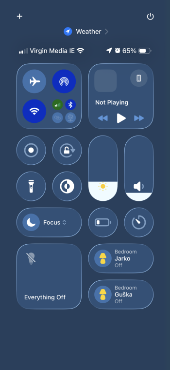
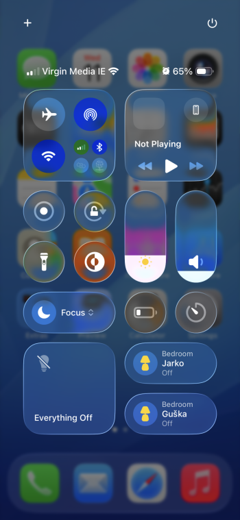
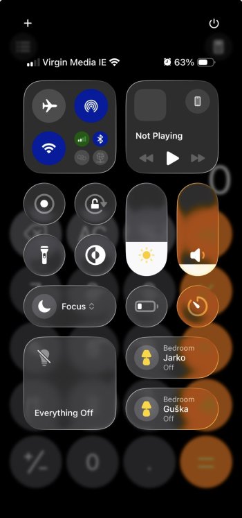
I was hoping Apple would step out of the puddle they stepped in with Ive's iOS 7 design, but no...after two days of using it, I don't even notice the "glass" elements anymore and still have the same exact issues with this UI as I had with the ones prior. It looks bad, neon, too bright, oversaturated, lots of unnecessary movements, millions of settings, it used to be idiot-friendly and now I couldn't figure out how to close a tab in Safari after 20+ years of using OSX and 18 years of using iOS.

I really, really miss the design and simplicity of iOS 6, and I'm super grateful for the community that keeps it alive and still functional. While iOS continues to be a disaster, a complete mess, it's nice that Apple makes products that last a really long time and can be used even 10-15 years later.

Apple, if you're reading this, get rid of the corp-opportunitists who seek compensation raise on their annual performance reviews and come up with dumb ideas that get implemented because of whom they know in the company and not because of what they do, and get your UI back to the level it had when Jobs passed. It went downhill since then, even if your profits didn't. People keep buying your products based on a promise, not anymore because of your OS, which used to be your main selling point.
 
would be interesting if someone fed these design resources into chatGPT and asked it to analyze how well iOS 26 adheres to Apple's own Human Interface Guidelines
You know what would be interesting? If someone analyzed how well iOS 26 adheres to Apple's own Human Interface Guidelines, instead of lazily feeding the information to an erratic language model as if our species had already lost its ability to reason and think critically.
 
I like the new camera & clock icon. Wish they would’ve changed the photos icon too

Probably unrelated to you but gave me another thought regarding my earlier post - the new camera icon just shows that someone at Apple knows what we want. I feel like whoever came up with that icon just doesn't know enough people at Apple to get their design ideology to spread across the OS, instead someone who is not a good designer but good at butt kissing got their way, and here we go...
 
It's a non issue. People are talking about it as if everything was glass reflective transparent and what not. I've used the beta in the past two days and I can barely notice the difference compared to iOS 18. It's more or less the same.
Can you read your notifications? Or see the control center clearly? I think it’s too difficult for a lot of users. The goal of an operating system is to enable easy interaction with the system Not make it more difficult and that seems to be the case here. Have not read a lot of positive users either on X.com . Hope it will change.
 
  • Like
Reactions: klasma and winxmac
Can you read your notifications? Or see the control center clearly? I think it’s too difficult for a lot of users. The goal of an operating system is to enable easy interaction with the system Not make it more difficult and that seems to be the case here. Have not read a lot of positive users either on X.com . Hope it will change.

I can, yes. Regarding control center, you can enable “reduce transparency” if you have issues. Here’s the control center pulled from home screen with and without transparency reduction. I’m not defending the design, it could be done better, but majority of the people critically commenting in all sorts of stuff on the internet blow it out of proportions. I’ll add another screenshot from Safari where the effects make no real difference.
 

Attachments

  • IMG_5194.png
    IMG_5194.png
    289.4 KB · Views: 25
  • IMG_5193.png
    IMG_5193.png
    1 MB · Views: 24
  • IMG_5195.png
    IMG_5195.png
    617.6 KB · Views: 25
  • Like
Reactions: Philip_S
The “envelope” is truly mystifying. Maybe the designers have never seen a classic envelope in real life?

The Camera icon is now inconsistent with the ones in Control Center and on the lock screen, though.
Their view is too far up their glassholes. Those camera icons need updating too so.
 
I can, yes. Regarding control center, you can enable “reduce transparency” if you have issues. Here’s the control center pulled from home screen with and without transparency reduction. I’m not defending the design, it could be done better, but majority of the people critically commenting in all sorts of stuff on the internet blow it out of proportions. I’ll add another screenshot from Safari where the effects make no real difference.

I dislike all of this ... bleh 😑
 
  • Like
Reactions: thiscatisfat
I can, yes. Regarding control center, you can enable “reduce transparency” if you have issues. Here’s the control center pulled from home screen with and without transparency reduction. I’m not defending the design, it could be done better, but majority of the people critically commenting in all sorts of stuff on the internet blow it out of proportions. I’ll add another screenshot from Safari where the effects make no real difference.
Your example is turning off the feature though. Doesn't this prove those people have a point?
 
  • Like
Reactions: onenorth
Your example is turning off the feature though. Doesn't this prove those people have a point?

It probably does, yes. It's a bad UI design overall, but not as bad as people make it out to be. I just wanted to point out that if you don't like it, turn it off, just like you turn off all the bright white stuff by enabling dark mode, or how you disable vibrations, or sounds... The majority of people should see the control center without issues. Like if you can’t tell a button in the foreground from the background you already have issues bigger than this design.
 

Attachments

  • IMG_5196.jpeg
    IMG_5196.jpeg
    128.3 KB · Views: 21
  • IMG_5197.png
    IMG_5197.png
    988.3 KB · Views: 21
  • IMG_5199.png
    IMG_5199.png
    829.8 KB · Views: 20
It probably does, yes. It's a bad UI design overall, but not as bad as people make it out to be. I just wanted to point out that if you don't like it, turn it off, just like you turn off all the bright white stuff by enabling dark mode, or how you disable vibrations, or sounds... The majority of people should see the control center without issues. Like if you can’t tell a button in the foreground from the background you already have issues bigger than this design.
You don't necessarily need to blame the user. Users have different levels of visual sensitivity, not just eyesight. If it was visually more clear before these changes than there's a good argument to be made that this design is a step in the wrong direction. While it's very good users can tone it down with that setting, and those users should do so, I do wish Apple had put their focus elsewhere personally.
 
It probably does, yes. It's a bad UI design overall, but not as bad as people make it out to be. I just wanted to point out that if you don't like it, turn it off, just like you turn off all the bright white stuff by enabling dark mode, or how you disable vibrations, or sounds... The majority of people should see the control center without issues. Like if you can’t tell a button in the foreground from the background you already have issues bigger than this design.
I don't understand the benefit of transparency or how it improves the UI. There is no need for my brain to process blurred and obfuscated information that is layered underneath the active controls. It is just clutter that my brain has to filter out. What am I missing here?
 
I don't understand the benefit of transparency or how it improves the UI. There is no need for my brain to process blurred and obfuscated information that is layered underneath the active controls. It is just clutter that my brain has to filter out. What am I missing here?

To be completely honest, I feel like this whole iOS7-based design is overstimulating. That's why I love iOS 6 so much, it's so nice to look at and use.
 
Please provide design assets for Adobe XD too. It's not dead yet, and its so much more intuitive (to me at least) than Figma or Sketch).

Come to think of it, its weird that they have provided assets for Sketch and not Figma. I get that as an XD user I'm a minority, but I thought Figma has a lot more users than Sketch. That seems like a pretty big oversight. Or is it that they haven't worked out how to get the liquid-glass material to look right in Figma?
 
I don't understand the benefit of transparency or how it improves the UI.

The battle between UX and UI. UX is all about making something as intuitive as possible for users.
UI is about making something look pretty. Good UI does this in a way that enhances the UX and doesn't detract from it.

The transparency aesthetic here is all about UI and, judging by the launch video, risks harming the UX by making text harder to read. I think if they are willing to compromise a little and make tweaks that enhance the contrast (e.g. increasing the blur applied to background items, apply a shadow to the glass elements to darken the background and increase contrast of icons and text) then this could be a really good modernisation of Apple's software design language and I do like the look, but as it is right now I think its falling a bit short on usability.
 
Probably unrelated to you but gave me another thought regarding my earlier post - the new camera icon just shows that someone at Apple knows what we want. I feel like whoever came up with that icon just doesn't know enough people at Apple to get their design ideology to spread across the OS, instead someone who is not a good designer but good at butt kissing got their way, and here we go...
It looks good. Like iOS 6 but slightly updated. Looking at mine on 17 it looks so bland. They’re about due to change the look of the icons it’s old already
 
You know what would be interesting? If someone analyzed how well iOS 26 adheres to Apple's own Human Interface Guidelines, instead of lazily feeding the information to an erratic language model as if our species had already lost its ability to reason and think critically.

sure would, but requires someone with expertise and the willingness to do it. I lack both :)
 
Register on MacRumors! This sidebar will go away, and you'll see fewer ads.