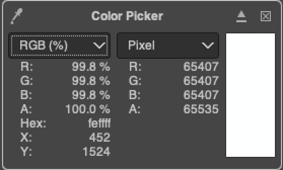
Not sure if this is an iOS 16 thing and if “HDR” would be the right word, but some of the UI is clearly brighter than the other pure whites, which is surely OLED specific, unless Apple is using EDR just for this effect.
Ex. 1: The share sheet has this “HDR” where the list of actions is slightly brighter than the pure white of the AirDrop, Reminders, and Notes icon above it.
Ex. 2: This one is incredibly noticeable, in Mail, the banner “Found in Sent Messages” is super bright which makes the pure white background of the Mail app look grey.
I also tested this with taking a screenshot of the app, and when I view the screenshot in Photos, all the whites are matching.
Interestingly, when I tap the thumbnail after taking a screenshot, the UI still shows the HDR UI, but not in Photos.
When I go to the app switcher, all the whites match. When I open the app from the app switcher, the UI fades in the HDR UI, like an HDR video would.


