Become a MacRumors Supporter for $50/year with no ads, ability to filter front page stories, and private forums.

MacRumors

macrumors bot
Original poster
Apr 12, 2001
68,530
39,366


Apple has always emphasized the depth of thought that goes into the design of its products. In the foreword to Designed by Apple in California, a photo book released by the company in 2016, Jony Ive explains how Apple strives "to define objects that appear effortless" and "so simple, coherent and inevitable that there could be no rational alternative."

Questionable-Design-Decisions.jpg

But every once in a while even Apple gets it wrong, and a tech company's coherent rationale for the way a product should be designed can translate into end-user irritation, or even a customer's personal hell. Here we take a look back at a handful of Apple's most questionable design decisions in recent memory. See if you agree, and let us know in the comments of any other Apple products that you think didn't live up to their billing.

1. Magic Mouse 2

magicmouse2-1.jpg

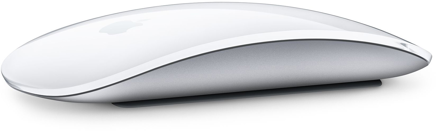
Announced way back in 2015, the Magic Mouse 2 was heralded at its launch as yet another Apple innovation, due to its touch-sensitive surface that can recognize swipes and gestures as well as clicks. On the face of it, the sleek curves and glossy, seamless top surface of Apple's mouse makes it come across as a paragon of Apple design, until you come to charge it.

In an oft-queried decision, Apple opted to put the charging port on the underside of the Magic Mouse 2, suggesting to many that it had sacrificed usability for design. Arguably, Apple could have located the port on the front edge of the mouse, like most other wired and wireless mice, which would have allowed users to charge it while using it at the same time. But no.


In October 2023, eight years later, Apple announced the latest iMac, which boasts various neat functional design tweaks, like the Ethernet port in the charging brick, for instance. The Magic Mouse 2 comes included with the new iMacs and even sports several colors to match the all-in-one machines, but Apple still expects users to flip over their mouse and plug in a (now also dated) Lightning cable, which makes it not only unusable but also slightly pathetic-looking.

Apple's Magic Mouse 2 originally went on sale in the United States for $79 and that's the same price you'll pay for it today.

2. Apple/Siri Remote (2015-2021)

Siri-Remote.jpg

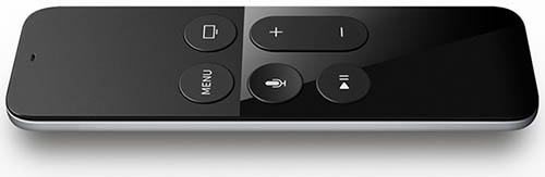
It's hard to downplay the amount of venom that's been aimed at the original Siri Remote since Apple first included it with the Apple TV in 2015, and if you never got to use the thing, that might seem a bit harsh.

After all, it had a clickable touchpad at the top that responded to swipes and gestures for navigating tvOS, and two uncomplicated columns of buttons clearly positioned below for controlling media playback. It even had an accelerometer and doubled as a game controller.

All good, you might think. But in practice, most users agreed it was an absolute clanger and an ergonomic disaster. The consensus was that Apple's Remote design was too small and too thin, which meant when it wasn't making your hands look worryingly huge it had gotten lost down the back of the sofa or between the cushions.

Then there was its non-intuitive button layout, which could be gauged best by the level of frustration that attended mistakenly pressing the Siri button to get back to the menu. Even now, few will have forgotten the very high sensitivity of the glass touchpad that sometimes made onscreen navigation a bit like watching Olympic curling.


All of this of course assumed you hadn't been holding it backwards, which almost every user did on at least a weekly basis. Thanks to its uncompromising symmetry, one end of the remote was practically indistinguishable from the other in low light. Not only that, the remote only came in black and had no backlighting to speak of, as though Apple had intentionally set out to make locating it in the dark an essential part of your weeknight entertainment.

In a move that likely saddened no-one, Apple banished the Siri Remote to the annals of tech history in 2021 when it unveiled the latest Apple TV 4K and a much-improved, all-new Siri Remote with a new clickpad interface offering five-way navigation.

3. Apple Pencil (1st Gen)

apple_pencil_white.jpg


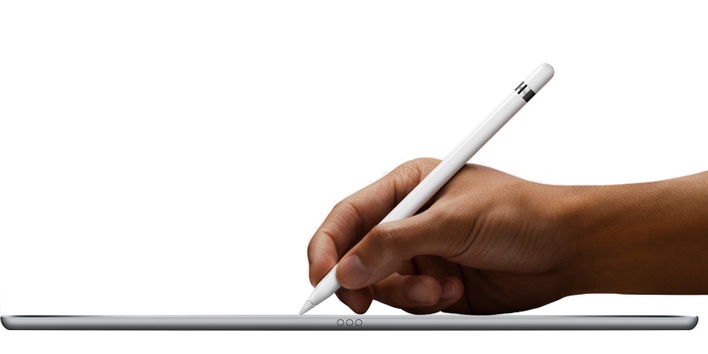
Another device that falls into the goofy-looking-when-charging category is the first-generation Apple Pencil, which was released in 2015, the same year as the Magic Mouse 2. Apple built a male Lightning connector under the cap that allows it to be plugged into an iPad for power, which sort of makes sense if you think about it.

In most situations when the Apple Pencil runs out of power, there's an iPad right there to plug it into, and to be fair, it charges pretty fast, offering around 30 minutes of usage after being plugged in for only 15 seconds. In that sense, it just works. But there's no getting around the fact that also just looks weird.


This could arguably be a case of Apple choosing function over form, but it doesn't appear to have taken into account the potential damage that could be inflicted on both devices if you accidentally wack the pencil on something when it's... Click here to read rest of article

Article Link: Apple's Most Questionable Design Decisions in Recent Memory
 
Last edited:
Nope, love the magic mouse, even when it seems to be passed away during charging, loved the siri remote, although the much needed protection-case is 3 times it's weight. And never, ever, ever touch the Mac Pro!

The bra-case however..
 
But then you couldn't use it either while charging. Also the Magic Mouse charging situation is such a none issue in real life, unless you're dumb enough to ignore the low battery warning for days or weeks. ?‍♂️
Yeah I agree it's a non-issue. I've not been bothered by it. But MagSafe might make it 'look nicer' when charging, which seems to matter.
 
Jony Ive also worked at Apple during the 1990s when Apple had some of its most utilitarian products.

I don't know if he personally designed it, but the Power Mac G3 all in one (Molar Mac) had the same translucent plastic (on the top at least) that would later define the iMac:


Except the iMac was the complete opposite, a sealed machine, like the very first Mac.

The Molar Mac was hideous in comparison but much more utilitarian. That design was not inevitable such that it had no rational alternatives. No design is. But there are predictable designs. I would say Apple's design now is so focused on a type of purity that it's quite predictable and you don't need their designers to anticipate how the product will look and function. It's much easier to anticipate the next iMac than it would be something utilitarian like the Molar Mac, or even something that was not modular but quite unique like the iMac G4. The iMac G4 wasn't utilitarian in terms of expansion like the Molar Mac, but Apple has probably never produced a display with better ergonomics.

You could say the change had more to do with Steve Jobs returning, but there were always odd exceptions. The blue and white Power Mac G3 tower and subsequent towers and the Power Mac G4 Cube were very easy to access. The hard drive on some of the MacBooks was also easy to access.

Over time, it's clear the trend changed more and more to sealed consumer electronics, not meant to be thought of as traditional personal computers. And the design has become inevitably formulaic and predictable.
 
Jony Ive explains how the company strives "to define objects that appear effortless" and "so simple, coherent and inevitable that there could be no rational alternative."

Most industrial designers doodle a first draft of what a new product could look like if they weren't constrained by practical usability concerns, then sit down and get to work on drafts for the real product. Johnny Ive always shipped his first draft.
 
Last edited:
"Can't innovate, my ass," remarked Apple's Phil Schiller during the announcement of the redesigned Mac Proin 2013. It was a moment of on-stage hubris that would go down in Apple lore, on par with Steve Jobs' "You're holding it wrong"
One difference being that Phil Schiller said that, but Steve Jobs never did (he said, or wrote rather, “just avoid holding it that way”, if I recall). So the latter is not really quote.
 
1. The mouse is great to use and the charging method is a non-issue in real life. If it does while using it, plug it in for a few minutes and take a break. Or, plan ahead so you charge while not on the computer.
2. I have family members who struggled with that remote but I loved it. It was simple and easy to use.
3. Worked well and the charging method was clever. If you didn’t want to stick it out of your device, you could use the adapter.
4. No real opinion here on my part.
5. It was and still is my favorite keyboard to type on. I never had problems but I know there were reliability issues.
6. The turbine design is amazing and efficient. It’s a great computer for many professionals but the lack of internal expansion is an issue for some people. The current more modular design is functionally better.
 
I completely agree with 5 out of 6 items on the list, but I don’t know why so many people have issues with the previous Apple/Siri remote. I absolutely love it and got used to it from the jump. I guess I’m in the minority but I think it works really well. The only other Apple remote I used was the white click-wheel but moving on from that one wasn’t an issue.
 
To all of you hypocrite saying you like the Magic Mouse and charging it is a non-issue. You need to get better lying… ? it’s a complete failure when it’s completely inoperable due to charging. I can’t think of a single other product that has that issue aside from Apple Pencil 1.
 
What about all those iMacs? They're missing on this list.

- USB ports are on the back. The user has to awkwardly plug in a USB stick on the back or buy an adapter.
- Ergonomics: The iMac's display is not height-adjustable and thus cannot be set to an optimal height.
- Ergonomics: The display of the iMac is reflective (glossy).
- The iMac usually doesn't have a good cooling system due to its design. Current: Compare the iMac m1 with the mac Mini. Mac Mini cooling is better (cooler and quieter).
- The iMac is an all-in-one computer: This is a problem in itself. If one part is defective or outdated, it affects the entire iMac.
- and so on.
 
Never had a problem with the Pencil charging from my iPad. Clever solution for its time, no need for a charging cable.
That's a good point: "clever solution for its time" [emphasis mine].

I too have an iPad Pro that uses the original Apple Pencil. I don't quite recall whether induction charging for devices that small were available back then, but I don't think so? Or, at least it wasn't common?
 
I completely agree with 5 out of 6 items on the list, but I don’t know why so many people have issues with the previous Apple/Siri remote. I absolutely love it and got used to it from the jump. I guess I’m in the minority but I think it works really well. The only other Apple remote I used was the white click-wheel but moving on from that one wasn’t an issue.
I'm not a fan of the Apple Siri Remote and we have one. It's workable, but for people with less dexterity, it's a bit of a problem to use. Also, it's a bit on the thin side which makes it hard to grasp for many people.
 
Register on MacRumors! This sidebar will go away, and you'll see fewer ads.