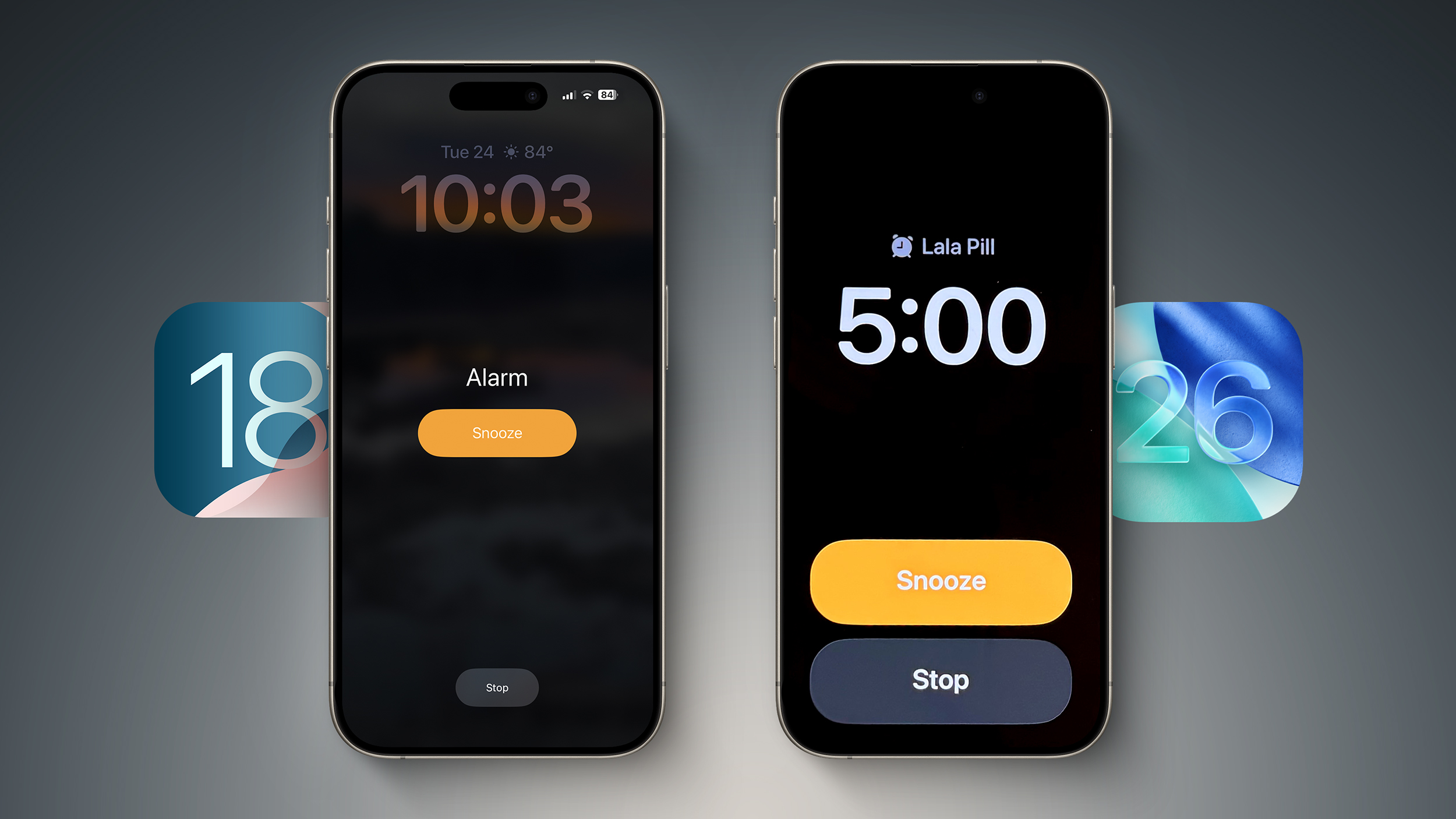
In the iOS 26 beta, Apple has redesigned the alarm screen in the Clock app, giving it a cleaner look with a larger time display and significantly bigger buttons. When the alarm goes off, you'll now see two large, equal-sized buttons for Stop and Snooze placed side by side at the bottom of the screen.

Alarm screen in iOS 18 (left) versus iOS 26 beta 2
While the redesign fits with Apple's broader visual refresh in iOS 26, it also seems to address a problem the company had already solved: reducing the chances of you hitting Stop instead of Snooze when you're half-awake and fumbling for your phone. Ironically, internal testing once showed that making both buttons the same size actually made that mistake more likely.
According to Jack Fields, a former Apple engineer and head writer at Kernel Extension, the new layout contradicts internal research he was involved in during his time at the company. That testing included a version of the Clock app that logged user interactions to a heat map, tracking exactly where people tapped the screen upon waking.
"It was recording where our sleepy hands were smacking around on the screen in order to see how accurate we were in turning off the alarms," says Fields. What they found was perhaps counterintuitive: when Stop and Snooze were made the same size and placed close together, users were 30% more likely to hit Stop by accident. In other words, it actually increased the chances of oversleeping.
That's why recent versions of iOS feature a prominent, centered Snooze button and a much smaller Stop button tucked further down the screen. "By making the Stop button such a small hit target, it ensures you're awake enough to actually stop it," Fields explains.
"This new design is... interesting," he adds. "It goes against any studies I was a part of, so I'm curious what data they have to support the change. It's terrifyingly large now."
It's worth remembering this is beta software, and Apple could tweak the layout before the final release. But for now, the update makes you wonder whether a more symmetrical, simplified UI is always better, or (at least in this case) is it more likely to make you tap the wrong thing, just faster?
In a related change you may have missed, Apple also now allows users to customize snooze length, choosing a length of time between 1 minute and 15 minutes. (Previously, tapping snooze always snoozed an alarm for nine minutes.) Now that's a change we can certainly get behind.
Article Link: Apple's New Alarm Design in iOS 26 Might Make You Oversleep

