Got a tip for us?
Let us know
Become a MacRumors Supporter for $50/year with no ads, ability to filter front page stories, and private forums.
Apple's New Alarm Design in iOS 26 Might Make You Oversleep
- Thread starter MacRumors
- Start date
- Sort by reaction score
You are using an out of date browser. It may not display this or other websites correctly.
You should upgrade or use an alternative browser.
You should upgrade or use an alternative browser.
Make “stop” a slide/switch, not a button.
Even with the old layout, I’ve hit “stop” accidentally. Requiring more deliberate input would likely solve the issue for most – with either layout.
You're making that "creative person" who thought the interface should be unreadably translucent cry!
Some folks do not wake quickly and like the luxury of multiple wakeup calls. A single alarm call is less than ideal for those [many] folks. Setting multiple alarms is an option; but turning off multiple alarms is a PITA if one gets up on the first ring or after a single snooze alarm.I don't understand why the Snooze button... ...Don't people already set an alarm for the latest possible time they think they'll have to sleep?
And for many folks AM variability is an option. I may have an alarm set for 0600 every day and often get up right at the 0600 alarm. But if I worked late I may choose to hit snooze a few times, waking slowly.
Having the snooze button in the middle of the iPhone is good UI; it means one does not need to know which end of the phone is up to hit snooze. Stop should be harder to hit, because one does not want to stop unless one is now awake. Once up and about and wearing corrective lenses differentiating stop from snooze is simple. The new layout as seen in the Beta is terrible UI; if the phone is upside down [relative to the sleeping user] the stop/snooze positions interchange.
Note that for some users [me] the phone might be in any crazy relative position. E.g. on the bed somewhere random after falling asleep while listening to an audio book.
Last edited:
Sometimes my iPhone is on silent and the volume is turned down. The alarm will go off, yet it will make no noise.

Sure it is. But final is only the start. There is final final design, the real final final design, pleasemakethisthefinal final design, ihatethisproject final design and so on.I‘m pretty sure sure this isn’t the final design.
The easy solution is to not have a life that requires you set an alarm.The easy solution is to get up when you alert goes off and turn off the option to show the snooze button.
See how silly it sounds when I do to you what you did to other people who don't have the same skills/abilities/energy that you have?
I just disable snooze altogether – the alarm is simply my first and last chance to get up.
I love the new design on this, but does anyone else have problem with using volume buttons for snooze? It just stops the alarm, doesn’t ring again when I click the volume button. I’m pretty sure volume button for snooze works on iOS 18.
Edit: Volume buttons snooze works correctly now
Edit: Volume buttons snooze works correctly now
Last edited:
I guess the reason it doesn't make sense to me is that I don't use the Snooze button. I feel like it just ends up giving you an extra 10 minutes (or whatever) of crappy sleep that might have been more useful had you just woken up 10 minutes later.Some folks do not wake quickly and like the luxury of multiple wakeup calls. A single alarm call is less than ideal for those [many] folks. Setting multiple alarms is an option; but turning off multiple alarms is a PITA if one gets up on the first ring or after a single snooze alarm.
And for many folks AM variability is an option. I may have an alarm set for 0600 every day and often get up right at the 0600 alarm. But if I worked late I may choose to hit snooze a few times, waking slowly.
Having the snooze button in the middle of the iPhone is good UI; it means one does not need to know which end of the phone is up to hit snooze. Stop should be harder to hit, because one does not want to stop unless one is now awake. Once up and about and wearing corrective lenses differentiating stop from snooze is simple. The new layout as seen in the Beta is terrible UI; if the phone is upside down [relative to the sleeping user] the stop/snooze positions interchange.
Note that for some users [me] the phone might be in any crazy relative position. E.g. on the bed somewhere random after falling asleep while listening to an audio book.
I also only used 7am as an example. I travel as part of my job, wake up at odd hours all over the world and also nap a lot at equally odd hours because of the job. When I set an alarm, it's always at the latest I can possibly wake up and still have time to get ready/eat before I need to get going again. To me, the Snooze but isn't really useful, but I'm more annoyed by the fact that it's the highlighted button in the UI. When I need to turn the alarm off, I never really want to be fooled into pressing Snooze and have it go off again 5 minutes later. I feel like it should be the other way around but, again, it's probably because I never want to "snooze".
Possible to hit snooze now since they are close to each other too. Maybe Apple will keep some gap between the two buttons in the future versions of the beta.
Here's an idea. Have the buttons far apart but also let users choose which button is big. I don't want to snooze, because I often wake up my partner if the alarm goes off a 2nd time.
In the iOS 26 beta, Apple has redesigned the alarm screen in the Clock app, giving it a cleaner look with a larger time display and significantly bigger buttons. When the alarm goes off, you'll now see two large, equal-sized buttons for Stop and Snooze placed side by side at the bottom of the screen.
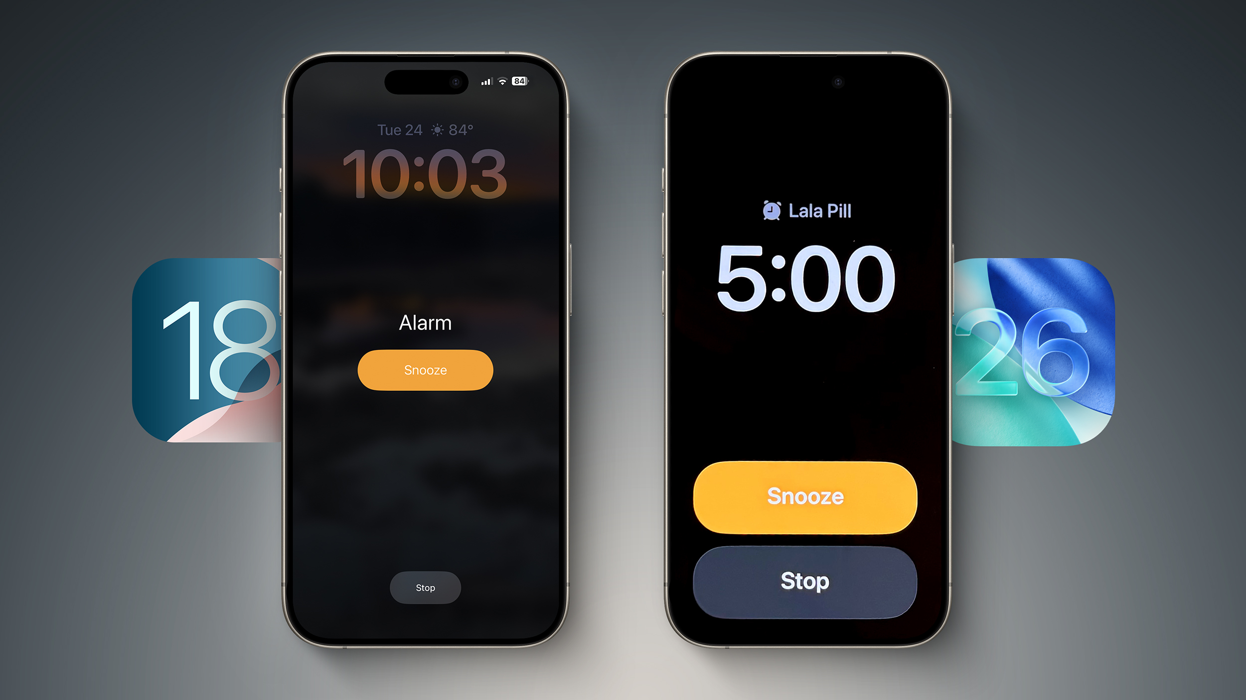
Alarm screen in iOS 18 (left) versus iOS 26 beta 2
While the redesign fits with Apple's broader visual refresh in iOS 26, it also seems to address a problem the company had already solved: reducing the chances of you hitting Stop instead of Snooze when you're half-awake and fumbling for your phone. Ironically, internal testing once showed that making both buttons the same size actually made that mistake more likely.
According to Jack Fields, a former Apple engineer and head writer at Kernel Extension, the new layout contradicts internal research he was involved in during his time at the company. That testing included a version of the Clock app that logged user interactions to a heat map, tracking exactly where people tapped the screen upon waking.
"It was recording where our sleepy hands were smacking around on the screen in order to see how accurate we were in turning off the alarms," says Fields. What they found was perhaps counterintuitive: when Stop and Snooze were made the same size and placed close together, users were 30% more likely to hit Stop by accident. In other words, it actually increased the chances of oversleeping.
That's why recent versions of iOS feature a prominent, centered Snooze button and a much smaller Stop button tucked further down the screen. "By making the Stop button such a small hit target, it ensures you're awake enough to actually stop it," Fields explains.
"This new design is... interesting," he adds. "It goes against any studies I was a part of, so I'm curious what data they have to support the change. It's terrifyingly large now."
It's worth remembering this is beta software, and Apple could tweak the layout before the final release. But for now, the update makes you wonder whether a more symmetrical, simplified UI is always better, or (at least in this case) is it more likely to make you tap the wrong thing, just faster?
In a related change you may have missed, Apple also now allows users to customize snooze length, choosing a length of time between 1 minute and 15 minutes. (Previously, tapping snooze always snoozed an alarm for nine minutes.) Now that's a change we can certainly get behind.
Article Link: Apple's New Alarm Design in iOS 26 Might Make You Oversleep

I can believe that could cause problems but why don’t they keep the same size and just separate them by having one at the top/middle of the screen?
Several times in the last few weeks when I intended to hit snooze on my apple watch with WatchOS26 beta it instead ended the alarm. After I overslept twice, I realized something must have changed but I don't recall exactly how it looked before. Since then, its stopped a few times even when I was very intentional about hitting snooze. Glad to see I am not alone in this!
I could be wrong but I'm pretty sure that that's not what side by side means.equal-sized buttons for Stop and Snooze placed side by side at the bottom of the screen.
The simple fix would be to put one button at the top of the screen and the other at the bottom.. put everything else in the middle…
Have it require your passcode to turn the alarm off, and your reverse passcode to snooze!Make “stop” a slide/switch, not a button.
Seriously though that big orange button is the first thing you're likely to press when you're half awake. And esp. when Apple's own testing shows this is this case, why would they release it anyway??
Register on MacRumors! This sidebar will go away, and you'll see fewer ads.