Become a MacRumors Supporter for $50/year with no ads, ability to filter front page stories, and private forums.

MacRumors

macrumors bot
Original poster
Apr 12, 2001
67,728
38,262


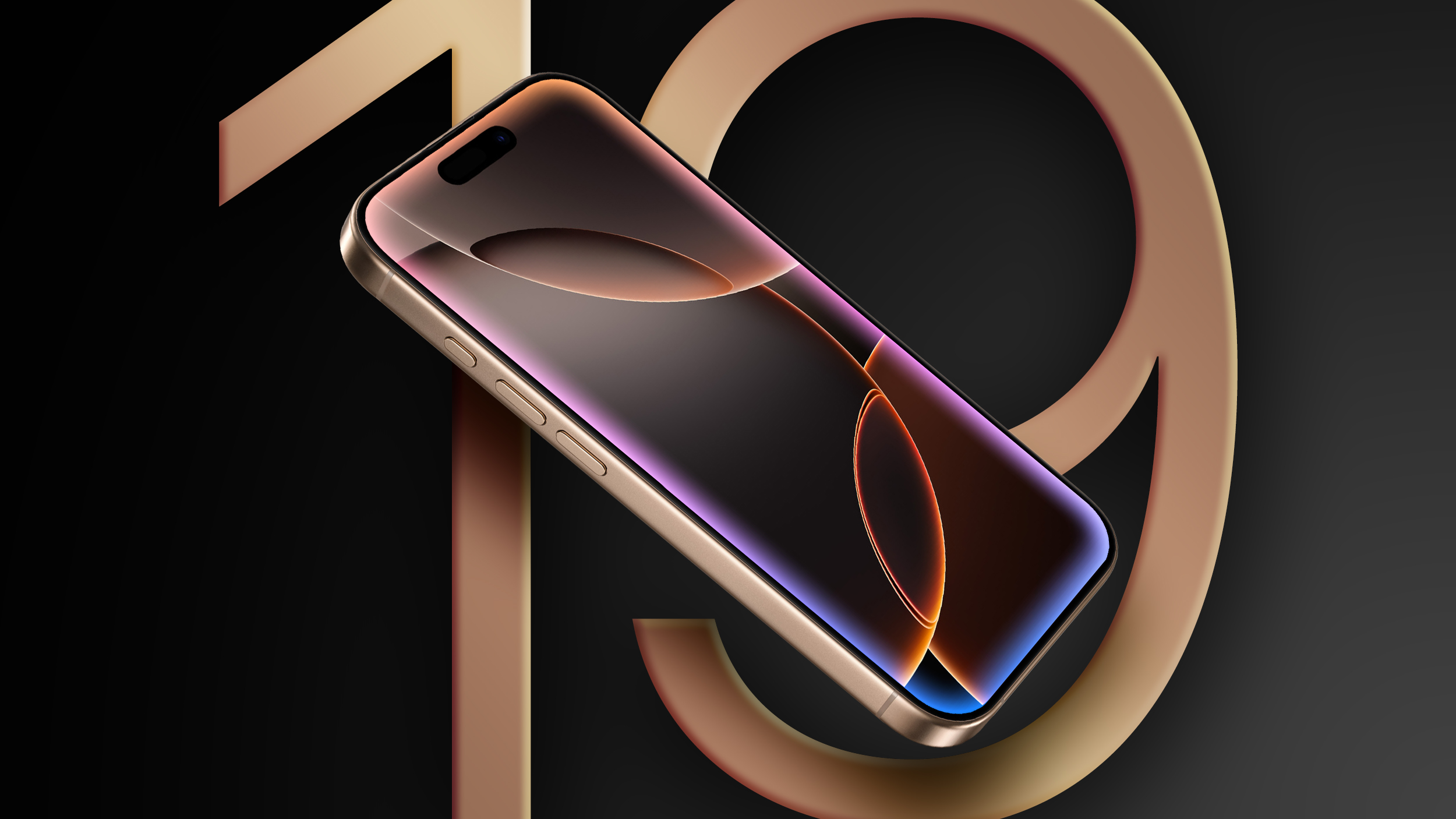
iOS 19 is rumored to feature a redesigned Camera app with visionOS-like menus and buttons, but the changes might go beyond that.
iOS-19-Roundup-Feature.jpg

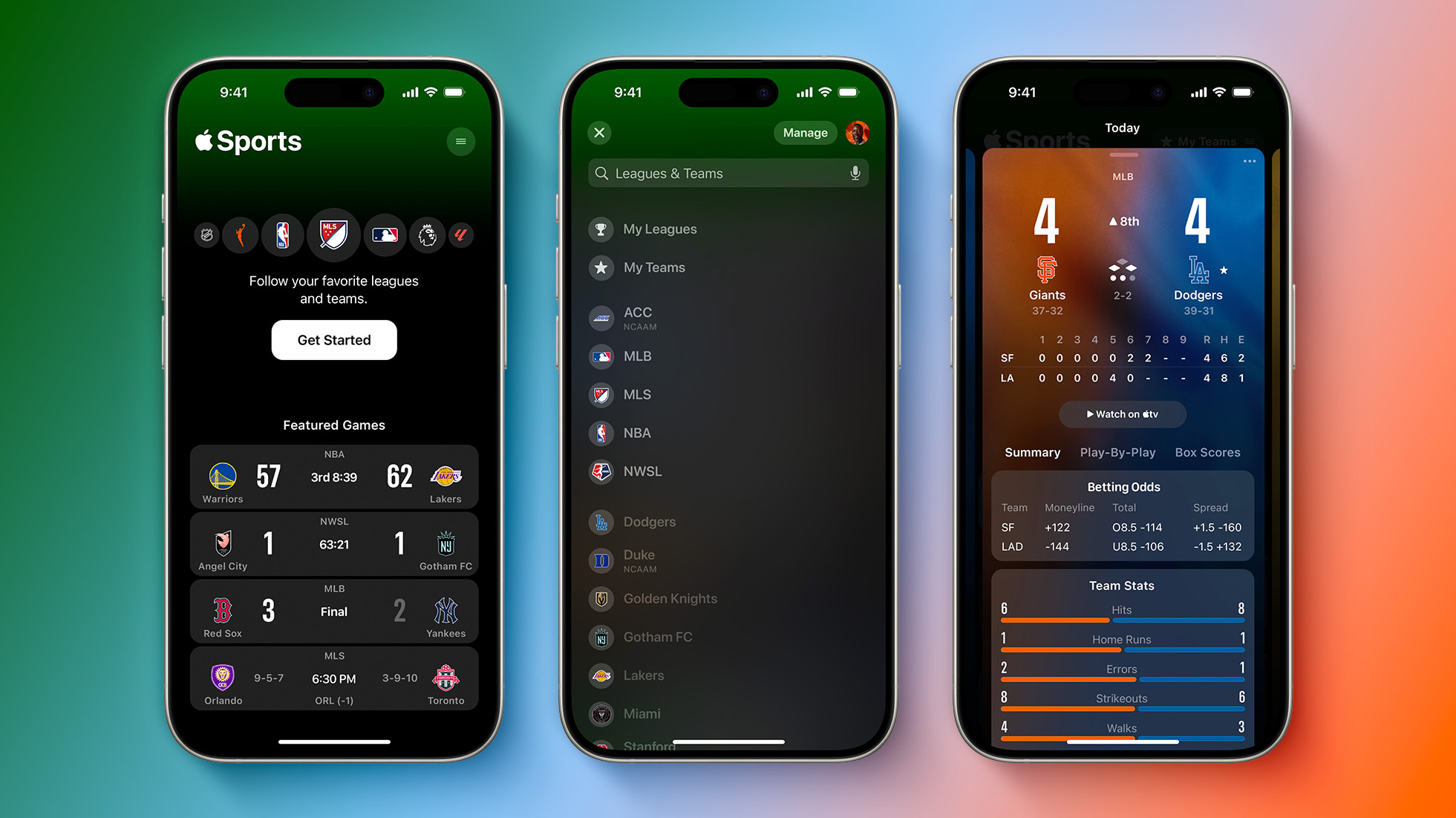
As noted by Apple enthusiast Parker Ortolani, both the Apple Sports app from last year and the new Apple Invites app have a more visionOS-like design language with translucent or "glassy" buttons and user interface elements.

"The last new Apple app, Apple Sports, already felt out of place in iOS 18," wrote Ortolani. "It has a more visionOS or watchOS-like design language utilizing colorful backgrounds, glassy floating UI elements, expanding buttons, and lots of layered shapes. Apple Invites takes it all even further. It's got big beautiful cards, translucent cells, big bold buttons, and an emphasis on content. It feels so clearly like a hint of what is to come in a future iOS update."
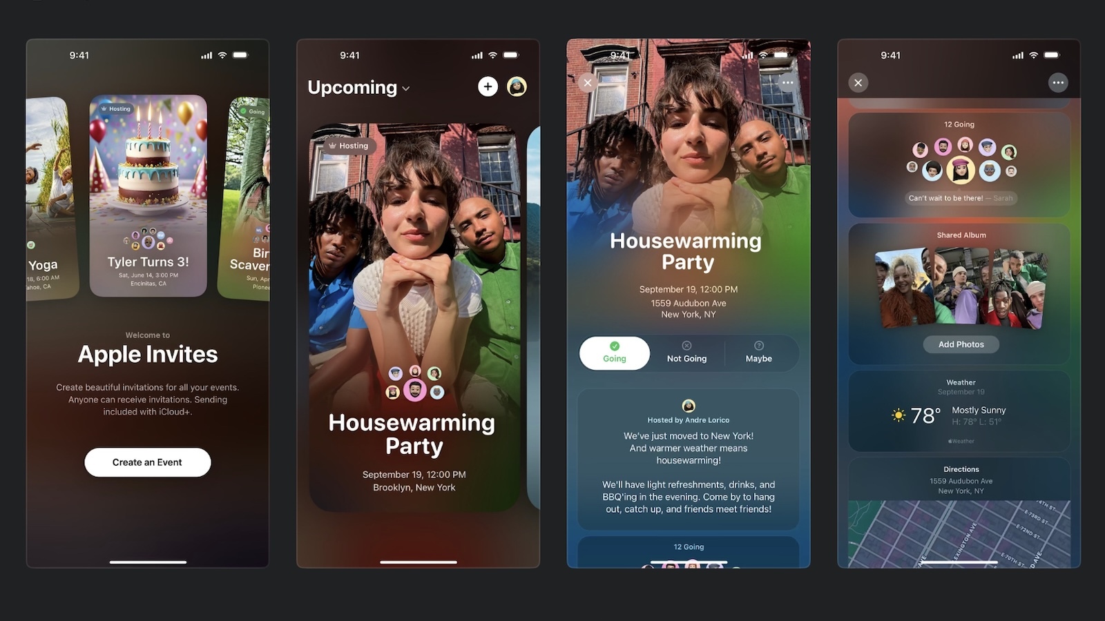
apple-invites-screenshots.jpg
Apple-Sports-App-Preview-Feature.jpg

It seems like a reasonable possibility that this "glassy" design could extend to other iOS 19 apps and interfaces, although this is purely speculation for now.

Apple should announce iOS 19 at WWDC 2025 in June.

Article Link: Apple's New Invites App Hints at iOS 19's Rumored Redesign
 
  • Like
Reactions: Michaelgtrusa
It's got big beautiful cards, translucent cells, big bold buttons
I'll be glad if that's true. Ever since iOS shifted to their text-as-buttons aesthetic, I've had numerous problems navigating, often by hitting the wrong area of the word (which produces nothing, with no feedback). There's a reason Steve Jobs liked the work of Scott Forstall; he understood intuitive interfaces.
 
The Invites app screens in the article I find to be way too busy and too much text, most of which is thus difficult for those with vision issues to see.

Usability should be primary, instead with larger phone screens it seems now that everyone is cramming as much as they can onto a screen, visually overwhelming the customer and making text difficult to read. (A focus on 'coolness' or having lots of graphics (flourishes) often does not help either. Those should always assist and support the usability and accessibility, not impede.)

At the least Apple really needs to be showing their supposed consideration for those with accessibility issues and using Dynamic Text throughout all of their apps, with layouts and interfaces that can handle such dynamism.

-R
 
I am old. Or I guess most of us are old? By 2027 we will be at year 20 of iPhone. From iOS Skeuomorphic design to iOS 7 where everything is flat, only to spend at least three iOS revision to walk back a lot of the design elements and anther 2 to improve on it. I remember there was another version that made the icons different to iOS 7 design but cant find which one was it. And we have the same design since then.

If we count Dark Mode / Icons design as one major changes we already had 3 graphics design over the past 19 years. However the Design of the whole iOS remains pretty much the same. The Home Screen still sucks. App drawer doesn't work as well. We need usage Design improvemnets, not graphics design update for the sake of it.
 
Register on MacRumors! This sidebar will go away, and you'll see fewer ads.