Got a tip for us?
Let us know
Become a MacRumors Supporter for $50/year with no ads, ability to filter front page stories, and private forums.
Apple's New Invites App Hints at iOS 19's Rumored Redesign
- Thread starter MacRumors
- Start date
- Sort by reaction score
You are using an out of date browser. It may not display this or other websites correctly.
You should upgrade or use an alternative browser.
You should upgrade or use an alternative browser.
tonywalker23
macrumors 6502a
Id rather have aqua and pinstripes
platinumaqua
macrumors 65816
I have it auto switch based on sunrise/sunsetthere are people who don't have there phones on dark mode 24/7?🤯
AppliedMicro
macrumors 68040
Forstall's skeuomorphism was the the worst interface design Apple has had over the last 30 years or so:There's a reason Steve Jobs liked the work of Scott Forstall; he understood intuitive interfaces.
Tacky and garish.
AF_APPLETALK
Suspended
AF_APPLETALK
Suspended
Yeah they didn't nail those designs, I wasn't sad to see them go in 10.9. It was trying too hard, people don't think about computers like that.Forstall's skeuomorphism was the the worst interface design Apple has had over the last 30 years or so:
Tacky and garish.
10.9 had a good balance between aqua, photorealism and being clean/clear. I wish they hadn't replaced it so soon.
platinumaqua
macrumors 65816
Another supporting point for why Mac OS X Snow Leopard was (is) the best version of Mac OS X - intuitive Aqua UI without too much skeuomorphism and not sterile flatForstall's skeuomorphism was the the worst interface design Apple has had over the last 30 years or so:
Tacky and garish.
johnsawyercjs
macrumors 68000
I hope Apple doesn't make transparency an unchangeable default in too many parts of the interface, which can make some things a little harder to read, but instead still allows you to turn off much or most of the transparency elements in Settings.
Cupertino, start your photocopiersWelcome back, Windows Aero
I theorize there’s a physiological reason for this. In the natural world, when there is a lot of ambient light (daytime), our pupils constrict to protect our retinas from too much light—but we can still easily see small dark objects in the lit area no problem, no strain. But when the environment is mostly dark (night), our eyes dilate to let in as much light as possible (for survival), so then when we stare at small bright objects—ie. bright screens at night, or to a lesser extent white text on black background, our dilated pupils get hit with high contrast light, so they get strained. I don’t think our eyes are adapted to stare at small bright things in dark environments because it’s an uncommon situation in nature.Dark mode is actually harder on my eyes than light mode. Go figure!
I liked it. It’s all subjective.Forstall's skeuomorphism was the the worst interface design Apple has had over the last 30 years or so:
Tacky and garish.
Maybe they just want their non-system apps to have their own design language! Maybe they don’t want their apps to all have a cookie cutter feel. Just because the sports app and invites app look a certain way does not mean that the entire operating system is going to be suddenly changed to look that way. Remember a few years ago when Apple made some new icons for its App Store Connect app, developer app, and a couple other non-system apps, and the entire internet blew up with news articles like this saying: “Apple is going to re-design all of their icons!”. Or remember when Apple made a UI update to the Apple TV app ahead of iOS 18, and click bait news articles came out all over the web telling people Apple was making a major redesign of their apps? As for Invites and Sports, maybe they just want their downloadable lifestyle apps to have a fun and unique look to them! I mean, it’s a party planning, app…do you really want that to have the simple, plain, boring look of the Mail app? I’m a Software Engineer and a Designer. We like to give our apps voices that reflect the intent and purpose of the app.
Haiku_Oezu
macrumors 6502a
Remember when the WWDC app was updated with flat design and everyone thought that was the new iOS look and then iOS 7 happened?
Apple_Robert
Contributor
The majority of MR members are Apple enthusiasts, with many making predictions and speculations every day about a new OS design and yet, no article is made with such posts. We get an unknown enthusiast to most of us with a short blog post. How is what he wrote any different than what happens here every day?
I don't mind the speculated design. I am also content with leaving as is for now.
I don't mind the speculated design. I am also content with leaving as is for now.
Last edited:
uacd
macrumors 68000
Because they are lazy or stupid, or both. Recently I have got an iPhone 4 with iOS 6 in my hands and it was… fresh! While phone is small, I could read, see and find everything on the screen, something I cannot do with any modern iPhone due to tons of space wasted and tiny fontsSo much wasted space by excessive padding...
What's the point of putting bigger screens if they're going to put the equivalent of software bezels so it can display the same amount of information as a smaller screen on an older iOS?
Right? Please save us Aero haha. It looked so good and still doesWelcome back, Windows Aero
turbineseaplane
macrumors Penryn
So much wasted space by excessive padding...
What's the point of putting bigger screens if they're going to put the equivalent of software bezels so it can display the same amount of information as a smaller screen on an older iOS?
Mediocre designers who think "just add space to everything" = "good design"
ignatius345
Suspended
It's an accessibility thing, so I suspect "reduce transparency" likely to be safe. Some of Apple's best interface tweaks are hiding in Accessibility on all the platforms (including Apple TV).I hope Apple doesn't make transparency an unchangeable default in too many parts of the interface, which can make some things a little harder to read, but instead still allows you to turn off much or most of the transparency elements in Settings.
ignatius345
Suspended
Let's remember that iPhones were a lot of people's first introduction to a multi-touch interface. I think skeuomorphism was a really helpful half-step from physical interfaces. If your previous tech experience way back then involved only devices with physical buttons and switches and even the odd knob or two, seeing that stuff replicated on your fancy new all-glass iPhone let you know very quickly what an interface element was and how you were expected to touch it.
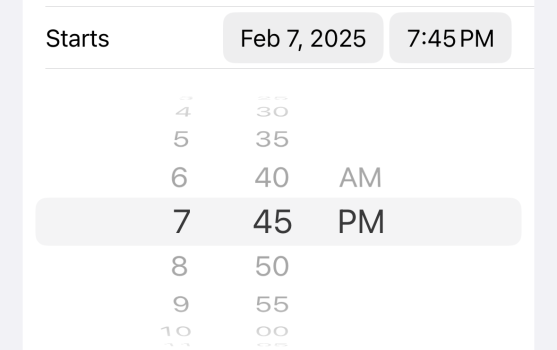
Remember this guy? Looks a bit much now, but you could hand this to pretty much anyone back then and they'd have a solid idea where to put their finger and how to "rotate" the dials.

Nearly 20 years in, the average user (I'd argue) is a lot more adept at picking out UI elements and we don't need as much of a visual crutch. We've been training on multi-touch interfaces for a couple decades now, but a bit of skeuomorphism still helps today:

I don't think it's an all-or-nothing affair. We no longer need all that trompe l'oeil stuff like that old date picker with its shading and opacity tricks, but a few visual cues from the physical world can still be helpful IMO.
Remember this guy? Looks a bit much now, but you could hand this to pretty much anyone back then and they'd have a solid idea where to put their finger and how to "rotate" the dials.

Nearly 20 years in, the average user (I'd argue) is a lot more adept at picking out UI elements and we don't need as much of a visual crutch. We've been training on multi-touch interfaces for a couple decades now, but a bit of skeuomorphism still helps today:

I don't think it's an all-or-nothing affair. We no longer need all that trompe l'oeil stuff like that old date picker with its shading and opacity tricks, but a few visual cues from the physical world can still be helpful IMO.
ThomasJL
macrumors 68020
The rumored iOS 19 "glassy" look sounds like yet another variant of that abomination known as flat design. Flat design is tasteless, which is not a surprise considering that it was pioneered by Microsoft. Yes, Tim Cook allowed Apple to copy Microsoft. His new nickname should be Tasteless Tim.
Please, Apple, rehire the most Steve Jobs-like visionary, Scott Forstall, and go back to iOS 6's full-fledged skeuomorphism. Skeuomorphism gives visual cues that make it the most intuitive for people who've never used a computer or smartphone, like many children and elderly. iOS 6 and Mac OS X Mountain Lion were the pinnacle of skeuomorphism, and were based on three decades of painstaking user-friendliness research.
Please, Apple, rehire the most Steve Jobs-like visionary, Scott Forstall, and go back to iOS 6's full-fledged skeuomorphism. Skeuomorphism gives visual cues that make it the most intuitive for people who've never used a computer or smartphone, like many children and elderly. iOS 6 and Mac OS X Mountain Lion were the pinnacle of skeuomorphism, and were based on three decades of painstaking user-friendliness research.
Last edited:
but a few visual cues from the physical world can still be helpful IMO.
like many children and elderly.
These, but think children are OK with flat as that's all they know when introduced to their e-devices. They seem to always pick up "how" quickly.
Elderly is where I see problems with flat. Good example is Phone app: keep having to show older individuals how to mass clear their Recents list. If the options ("Edit", "Clear") were more button like, might be more obvious.
The elderly I deal with have little desire to learn how their devices work, just want it to happen and not have to deal with the details. In these cases, not much a redesigned UI can help as there's ten pounds of functions crammed into five pound sacks of buttons, menus, share sheets, etc.
I guess then I'd be more in favor of massive cleanup of menus etc. A little more intuitive/cleaner/simpler. I like that in 18 that all apps are under Apps in Settings vs prior some apps listed first and in different blocks and then all other apps at the end (ie. no longer have go to this chunk of settings for Safari, go to the list for some other app).
ignatius345
Suspended
Skeuomorphism gives visual cues that make it the most intuitive for people who've never used a computer or smartphone, like many children and elderly.
Children are coming up in digital-first enviroment and pick things up shockingly fast. I've watched a 5 year-old who can't read at all suss out which button does what in an app just based on color and positioning. They're going to be fine.
Register on MacRumors! This sidebar will go away, and you'll see fewer ads.

