Become a MacRumors Supporter for $50/year with no ads, ability to filter front page stories, and private forums.

Rokach

macrumors member
Original poster
Nov 22, 2013
52
37
iOS 11 could have been a iOS breakthrough but Apple made a wrong choices especially in design.

Look the keypad is so ugly and like as Windows 98

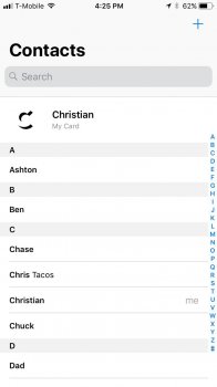
The contacts is same since iOS 4
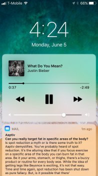
Still iOS 10 notifications without grouping feature.
No 3rd default apps
No dark mode
No app labels on dock
Ugly icons for iTunes and AppStore
The AppStore is beautiful but with small content in one look
What I love in iOS 11?

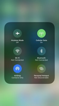
1.The control center can be awesome I know that looks strange but I need to test it but again we can't replace all toggles.
2.The new signal bar looks great!
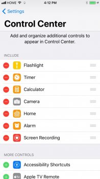
3.Screen recording is a great feature.
4.The all features in iPad

Why Apple? Why you can can't make a better notifications? Why you remove the labels on dock?! Why you replaced the iTunes and AppStore icons?! The calculator looks so ugly,
You can't add a toggle for "slide to unlock"?

I hope iOS 12 will make iOS better and more beautiful.
 

Attachments

  • IMG_0076.JPG
    IMG_0076.JPG
    68.6 KB · Views: 413
  • IMG_0072.JPG
    IMG_0072.JPG
    81 KB · Views: 367
  • IMG_0073.JPG
    IMG_0073.JPG
    220.1 KB · Views: 343
  • IMG_0074.JPG
    IMG_0074.JPG
    79.2 KB · Views: 318
  • IMG_0078.JPG
    IMG_0078.JPG
    133.8 KB · Views: 316
  • IMG_0079.JPG
    IMG_0079.JPG
    71.2 KB · Views: 322
Last edited:

macduke

macrumors G5
Jun 27, 2007
12,425
17,860
Central U.S.
Yeah, some things might change between now and launch. Send feedback to Apple. They also sometimes introduce new features with iOS X.1, X.2, and X.3. Furthermore, dark mode seems to be partway implemented with the new accessibility option. We might hear more about it when the iPhone Pro/Edition/8/whatever launches with the OLED display.
 

roland.g

macrumors demi-god
Apr 11, 2005
7,261
2,862
Based on the preview what we got was 10.5 at best. This is not worthy of being called iOS 11.
 

AppleFan91

macrumors 68000
Sep 11, 2012
1,757
3,580
Indy, US
“Smart Invert” is the closest we’ll get to Dark Mode for LCD iPhones probably. That being said, it does a very good job so far.
 

itsmilo

Suspended
Sep 15, 2016
3,985
8,728
Berlin, Germany
i feel like the UI is all over the place. Some stuff is bold and not transparent as if i have both settings en/disabled. e. g. that ugly keypad
 
  • Like
Reactions: Feyl

sibcc

macrumors member
Oct 5, 2015
66
35
La Jolla CA
iOS 11 could have been a iOS breakthrough but Apple made a wrong choices especially in design.

Look the keypad is so ugly and like as Windows 98

The contacts is same since iOS 4
Still iOS 10 notifications without grouping feature.
No 3rd default apps
No dark mode
No app labels on dock
Ugly icons for iTunes and AppStore
The AppStore is beautiful but with small content in one look
What I love in iOS 11?

1.The control center can be awesome I know that looks strange but I need to test it but again we can't replace all toggles.
2.The new signal bar looks great!
3.Screen recording is a great feature.
4.The all features in iPad

Why Apple? Why you can can't make a better notifications? Why you remove the labels on dock?! Why you replaced the iTunes and AppStore icons?! The calculator looks so ugly,
You can't add a toggle for "slide to unlock"?

I hope iOS 12 will make iOS better and more beautiful.

Apple has been going backwards since Job's death. The current crew keeps foisting buggy and design for form over function. If I seek style I'll see a tailor. The whole UI paradigm with hidden functions and difficult to read overly bright backgrounds is bad for users. Unfortunately, due to Apple's market penetration, their idiotic design aesthetic is often copied by web designers and other manufacturers. Apple and Google are the new Big Blue and Microsoft and it's time for a market correction to occur.
 

Ralfi

macrumors 601
Dec 22, 2016
4,160
2,812
Australia
I don't like how the Music section of the Control Centre has lost its dedicated page & recurring pop-up for when you next access Control Centre.

You can expand it by holding the music player, but the next time you want to flip up Control Centre, it doesn't remember that & you need two motions to get to the larger sized player.
 
Register on MacRumors! This sidebar will go away, and you'll see fewer ads.