Become a MacRumors Supporter for $50/year with no ads, ability to filter front page stories, and private forums.
Nor can you know that it did. With the design and updates of the other Google apps (again, even before iOS 7 was revealed) it seems more likely that the YouTube design update was to bring it more in line with that than with anything specifically iOS 7 related.

I never said it did. Just that it seemed to be reflective of the flatter icon design that the iOS 7 UI has. It was someone else who seemed certain that it didn't, which no one has cited a source that indicates that.
 
I never said it did. Just that it seemed to be reflective of the flatter icon design that the iOS 7 UI has. It was someone else who seemed certain that it didn't, which no one has cited a source that indicates that.
I think it's more that it fits in with the overall iOS 7 design concept, which is similar, but not that it's related to it in any way necessarily (beyond simply being similar in the overall design concept). Perhaps iOS 7 was somehow influenced by the design of Google's apps and now that YouTube has updated to be more in line with Google's latest general iOS app design it could be said that iOS 7 is more reflective of its (and Google's latest general iOS) design, than the other way around.
 
I disagree. iOS 7 has a unique design language, and I think the new app icon is reflective of the direction that Apple took iOS 7.

I don't care about the icon, but the app design itself has NOTHING to do with iOS 7. If you have ever looked at Google's apps (Google Now, Keep, Music Player, even the Play store) they all use the same white "card" UI and the three little squares as a menu. The people that think Google changing the Youtube app to cater to iOS 7 are just looking for a connection that isn't there.
 
Wow. People on here aren't much for reading. I don't see where anyone has said the app design was about iOS 7. Just that the icon update fits well with iOS 7's design language.
 
Wow. People on here aren't much for reading. I don't see where anyone has said the app design was about iOS 7. Just that the icon update fits well with iOS 7's design language.

Yeah, that was all I was referring to. I don't think we'll see many apps changing their UI to be just like iOS 7, but I think most will at least change their app icon.

Drop Box is another app icon very flat and iOS 7-like.
 
Wow. People on here aren't much for reading. I don't see where anyone has said the app design was about iOS 7. Just that the icon update fits well with iOS 7's design language.

Just some miscommunication. I thought (and others, too) that's what you meant when you said it was "reflective" of iOS 7.
 
Wow. People on here aren't much for reading. I don't see where anyone has said the app design was about iOS 7. Just that the icon update fits well with iOS 7's design language.
You did start with this:
I disagree. iOS 7 has a unique design language, and I think the new app icon is reflective of the direction that Apple took iOS 7.
In that context, and the context of the the thread, "reflective" isn't really the same as simply "fitting in" (there's more of an implication of influence). Furthermore, even if does "fit in" in can very easily, again given the general Google iOS design principles, be more of a coincidence, or even more that iOS 7 "fits in" really nicely with the design of Google's iOS apps.

----------

Yeah, that was all I was referring to. I don't think we'll see many apps changing their UI to be just like iOS 7, but I think most will at least change their app icon.

Drop Box is another app icon very flat and iOS 7-like.
But Dropbox also had that before iOS 7 too as I recall. So, it's more of iOS 7 fitting in with it, than the other way around really.
 
But Dropbox also had that before iOS 7 too as I recall. So, it's more of iOS 7 fitting in with it, than the other way around really.

I'm not sure on this, but was the Drop Box app icon updated during this Beta release, or was it before? Maybe I just noticed it during the Beta because it was similar to the flatness of iOS 7.
 
Wow. People on here aren't much for reading. I don't see where anyone has said the app design was about iOS 7. Just that the icon update fits well with iOS 7's design language.

No one even mentioned icons until you brought it up for no reason. This thread was about app design, not ICON design. You then quoted me for some reason to talk about it even though I clearly quoted someone who was referring to the app. Seems you're the one that lacks reading comprehension.
 
I'm not sure on this, but was the Drop Box app icon updated during this Beta release, or was it before? Maybe I just noticed it during the Beta because it was similar to the flatness of iOS 7.

I'm not sure when it was last updated, but it's been like that for quite a while.
 
I'm not sure on this, but was the Drop Box app icon updated during this Beta release, or was it before? Maybe I just noticed it during the Beta because it was similar to the flatness of iOS 7.
While I might not be 100% certain, I'm pretty sure it was like that for a while before iOS 7 was relieved (along with at least a number of various other apps that decided to go into a more flat/simple design direction, at least as far as their icons, even before iOS 7).
 
That design looks more like Google/Android design that iOS 7. Furthermore, CraigsList has always been a simple/flat web site, so nothing unusual for an app for it to be similar in that respect, unrelated to iOS 7.

not really i had the previous craigslist version and it wasnt that flat.
 
That's what I meant to imply. Developers can't update apps to use iOS7 APIs until iOS7 has been released.
Right. I think this thread (and the other one I mentioned) seem to come at it more from the look/feel side of things than anything else.
 
Correct. The icon is different and the performance is better. On the one installed from Xcode, the app would hang when I would open it. Then it would crash. Then I would open it again and it would work. This app I downloaded from the App Store works first time every time (in my limited tests).

just deleted my developer version and installed the one from the store, you're 100% correct, this one works properly (no more hangups), the new icon is cool too. Interestingly enough I did the same on my iPad mini and this version works well too, but the icon is still the same old one...maybe on the next update they will update it.
 
The Find iPhone app was apparently updated, but isn't compatible with iOS 6.

Not at all.

For about 20 minutes right after the update posted there was an iCloud issue that caused an error message for a few people. Most of whom were likely opening it just to see what changes there were and didn't actually need to use it
 
I'd really love it if Google would add volume control to the app as well as the ability to go forward/backwards 30 seconds.
 
The new YouTube app has some grey text on grey background when you type in a search. Not very attractive or smart
 
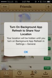
Todays update to Find My Friends told me that I have to turn on Background Apps in settings on iOS 7 (I had it off to save battery) for people to see me on the map. It looks like Apple is doing some iOS 7 updates already.
 
Todays update to Find My Friends told me that I have to turn on Background Apps in settings on iOS 7 (I had it off to save battery) for people to see me on the map. It looks like Apple is doing some iOS 7 updates already.
Haven't had to do that on mine when I used it after it was updated (still have background apps set to off).
 
Googles youtube app kind of sucks... This one is better, does mach IOS7, and supports downloads, add blocking.

https://itunes.apple.com/us/app/angry-tube-for-youtube/id681880736?mt=8
 
Haven't had to do that on mine when I used it after it was updated (still have background apps set to off).

Attached is a screenshot. If I turn background apps off, it turns off showing my location as well, and tells me to turn background apps back on.
 

Attachments

  • image.jpg
    image.jpg
    143.1 KB · Views: 100
So you cannot know for certain that iOS 7 didn't guide the design of the iOS YouTube app.

Nope. It follows Google's own design language that has existed for a while. Google Maps, Gmail, Google+, and Google apps all have the same style icon design as the newly updated YouTube app. All of those other apps were released well before iOS 7 was announced.

Besides, the icons aren't even 'iOS 7-flat'. There is a strip of drop shadow at the bottom as well as a thin white line at the top to give the icon a slight 3D button-like appearance. It's not completely flat like iOS 7 icons are.

You make it seem like iOS 7 is triggering a revolution in design, but iOS 7 isn't really guiding anything. UI/web/graphic design has been going in the direction of more "flat"/simple/minimalistic for years now. Android, Windows Phone, Windows 8, and plenty of iOS apps and app icons had "flat" designs before iOS 7 was even on the radar. If anything, iOS 7 is playing catch-up to the direction the rest of the industry has already been moving to.
 
Register on MacRumors! This sidebar will go away, and you'll see fewer ads.