Hello,
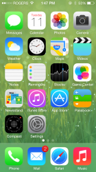
I thought I would share an interesting observation about the icons in iOS 7. Like many of you, my first impressions of the icons were that they were pretty fugly. Earlier today, however, I was watching the iOS7 introduction video on Apple's website. In the video, Ive discusses the grid system in which the icons were derived, during his explanation the icons were separated from iOS and shown in a pure white background, one by one. I thought to myself - "hey! these look pretty good." Then, in the video, the icons are put onto the screen and they went back to looking like preschool artwork. Intrigued, I went on a search to find some screenshots of iOS7 with various wallpapers. In turns out the icons don't always look like crap. I'm not even kidding, the POS Safari icon doesn't look nearly as bad on some wallpapers as it does on some of the default wallpapers. Believe it or not -- the Safari icon actually looked good on a few wallpapers!
Try this for yourself, go to the Screenshots post on the forum here and take a look at the various screenshots with different wallpapers or even do a Google search. You may be pleasantly surprised.
Do the icons need work? Certainly! But I think the some of the default wallpapers clash with the icons in a poor way.