Got a tip for us?
Let us know
Become a MacRumors Supporter for $50/year with no ads, ability to filter front page stories, and private forums.
Are they even serious with these icons?
- Thread starter DDustiNN
- Start date
- Sort by reaction score
You are using an out of date browser. It may not display this or other websites correctly.
You should upgrade or use an alternative browser.
You should upgrade or use an alternative browser.
The default icons still look like crap. Although the darker wallpaper makes it slightly more bearable.
How do all of you live with that silly badge on your mail icon! Would drive me nuts to just have 1 unread, let alone over a thousand 
The wallpaper really changes the whole feel. I wish the Messages App had some more customisation, though, it really is quite bright and stark.
The wallpaper really changes the whole feel. I wish the Messages App had some more customisation, though, it really is quite bright and stark.
seriously how many of these threads do we need?
I am not sure, but I have the feeling you are going to respond to all of them.
The icons do look a bit less Neon-Unicorn with a darker wallpaper.
I am not sure, but I have the feeling you are going to respond to all of them.
The icons do look a bit less Neon-Unicorn with a darker wallpaper.
As are you.
Are they even serious with these icons?
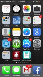
Ok seriously I can't be the only one who find these icons ridiculous. It's like they were done with MS Paint by an intern. Is this for real? I mean look at the notes and reminders icons, they aren't up to Apple's standard at all. I don't care that it's not skeuromophism. It's just plain unattractive.

And what is up with game center? Balls?? How does that even make sense.
The photo icon does not in anyway represent photos. It can be a social network if anyone had to guess.
I refuse to believe these icons were designed by Apple designers. Did they have the programmers design these?
Ok seriously I can't be the only one who find these icons ridiculous. It's like they were done with MS Paint by an intern. Is this for real? I mean look at the notes and reminders icons, they aren't up to Apple's standard at all. I don't care that it's not skeuromophism. It's just plain unattractive.
And what is up with game center? Balls?? How does that even make sense.
The photo icon does not in anyway represent photos. It can be a social network if anyone had to guess.
I refuse to believe these icons were designed by Apple designers. Did they have the programmers design these?
I admit that I was expecting something quite different. And with that direct comparison I feel they put a lot more effort into the previous icons.
Anyway, I'm ok with the UI for now. The added functionality makes up for the "childish" design.
Anyway, I'm ok with the UI for now. The added functionality makes up for the "childish" design.
I'm guessing that you aren't very smart, otherwise you would have seen the numerous other threads of the same page and notice that you have been recycling the same things they said. For someone that's been here since 2007 you should know.
..And what is up with game center? Balls?? How does that even make sense.
It makes complete sense. The icon mimics the Apps' interface which is not games but interacting with people.
Ok seriously I can't be the only one who find these icons ridiculous. It's like they were done with MS Paint by an intern. Is this for real? I mean look at the notes and reminders icons, they aren't up to Apple's standard at all. I don't care that it's not skeuromophism. It's just plain unattractive.
Image
And what is up with game center? Balls?? How does that even make sense.
The photo icon does not in anyway represent photos. It can be a social network if anyone had to guess.
I refuse to believe these icons were designed by Apple designers. Did they have the programmers design these?
the icons are "a work in progress".
https://www.macrumors.com/2013/06/1...arketing-team-in-charge-of-ios-7-icon-design/
It makes complete sense. The icon mimics the Apps' interface which is not games but interacting with people.
But balls aren't even people?
the icons are "a work in progress".
https://www.macrumors.com/2013/06/1...arketing-team-in-charge-of-ios-7-icon-design/
That marketing team is color blind.
They suck to look at. The old ones look much nicer to me, but check the home page. Apple said they took their design cue from their outside marketing people , or are spinning it that, either way, who cares really because they also said it's a work in progress and will change.
So that took like two days since it was released.... neat.
So that took like two days since it was released.... neat.
Register on MacRumors! This sidebar will go away, and you'll see fewer ads.