Since the lock button on my iPhone 5 is broken, I am reduced to using assistive touch to simulate one digitally. I was always impressed with the practicality and aesthetics of the UI, and it is apparently eye-catching as well, promoting rubbernecking and drawing "oohs" and "ahs" from onlookers. Perhaps in iOS 8 a similar mechanism could be used to navigate a nesting control center or settings menu?
Got a tip for us?
Let us know
Become a MacRumors Supporter for $50/year with no ads, ability to filter front page stories, and private forums.
Assistive Touch UI is awesome, need more of it
- Thread starter cleo1
- Start date
- Sort by reaction score
You are using an out of date browser. It may not display this or other websites correctly.
You should upgrade or use an alternative browser.
You should upgrade or use an alternative browser.
Is this different in some way in iOS 7 than previous versions?Since the lock button on my iPhone 5 is broken, I am reduced to using assistive touch to simulate one digitally. I was always impressed with the practicality and aesthetics of the UI, and it is apparently eye-catching as well, promoting rubbernecking and drawing "oohs" and "ahs" from onlookers. Perhaps in iOS 8 a similar mechanism could be used to navigate a nesting control center or settings menu?
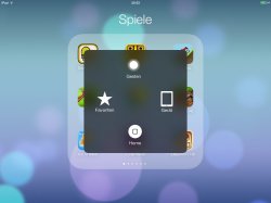
Does that make it really better/different then?Yes the UI background is blurry just like the whole OS.
Just trying to get in idea if there's really something new/different/specific in relation to it in iOS 7, or if this thread is more of an iOS 6 (or even 5) if not just a generic iPhone/iPad one.
Does that make it really better/different then?
Just trying to get in idea if there's really something new/different/specific in relation to it in iOS 7, or if this thread is more of an iOS 6 (or even 5) if not just a generic iPhone/iPad one.
In fact I'd like to have the more info about this really forgotten feature.
I've not my home button broken, but I 've encountered a better way for using my iphone via AT.
J
Does that make it really better/different then?
Just trying to get in idea if there's really something new/different/specific in relation to it in iOS 7, or if this thread is more of an iOS 6 (or even 5) if not just a generic iPhone/iPad one.
There was asked for a difference and there was a difference regarding the background so I posted it. Sorry for contributing to this thread. Other than that, I also posted a screenshot so you could have a look at it. Did you?
I did. I was just trying to find out if there was something significantly new/different about Assistice Touch when it comes to iOS 7 (mainly from the OP) given this thread about it in the iOS 7 forum.There was asked for a difference and there was a difference regarding the background so I posted it. Sorry for contributing to this thread. Other than that, I also posted a screenshot so you could have a look at it. Did you?
I broke part of the top metal band on my 4s early this year, used this option for a while but got tired quickly and spend almost 100 usd for the whole metal housing because i also broke the power button flex.
If you dont know you can make the tripe tap of the hoke button toggle on/off the assist ui.
If you dont know you can make the tripe tap of the hoke button toggle on/off the assist ui.
There was asked for a difference and there was a difference regarding the background so I posted it. Sorry for contributing to this thread. Other than that, I also posted a screenshot so you could have a look at it. Did you?
What I'm wondering (and assume C DM is as well) are there actual functional differences in iOS7 Assistive Touch that's not present in iOS6?
Either one--basically what prompted the thread to be placed in the iOS 7 forum (rather than iOS 6 or iPhone forum)? Is there something significantly new or different about it when it comes to iOS 7?He was talking about the assistive touch UI. Not assistive touch by itself.
That's new.Yes the UI background is blurry just like the whole OS.
Fairly poor thing that I have to quote myself...
Yes, but it's simply being consistent with the new OS design and not something that is specifically new to Assistive Touch individually, nor is it even something that is really meaningfully/drastically new/different that would typically really get someone to post a whole new thread about it, right? Thus the wonder if there is something more to it which prompted the new thread about it here.That's new.
Fairly poor thing that I have to quote myself...
They haven't increased the size or curvature of the corners of the button to match iOS 7 home screen icons, it's still the same as pre-iOS 7 app icons.
Register on MacRumors! This sidebar will go away, and you'll see fewer ads.