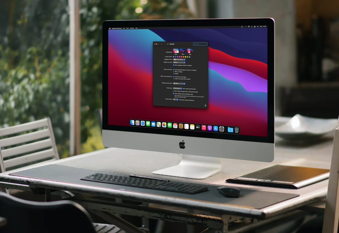
I bought the ASUS PA278QV, good color, solid build and other good things but I HATE!!! how blurry the text looks on the Mac Mini M2 (Ventura OS), Connected via HDMI to HDMI.
I know! that I shouldn't get a "retina" quality like the Studio Display but why the text looks so bad? it looks like my old 2014 NON retina macbook air or even worse.
Please, there's any way to make the text looks better?
I install BetterDisplay https://github.com/waydabber/BetterDisplay I just set the default resolution but using HiDPI, so it make it just a little better but that is? text still looks bad.
I need other cable? DisplayPort to USB-C or something?
Please!!! any owner of this ASUS that use it on Mac? please share your settings to make the text the best or any tip? thanks!


