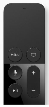
I don't understand why the top 2 buttons are menu and TV input. Since they are the closest to the touch area, it should be buttons most frequently used. It would be better if play/pause was next to menu, like in the previous Apple TV remote. It seems awkward to have the touch area and play/pause on opposite ends.
Got a tip for us?
Let us know
Become a MacRumors Supporter for $50/year with no ads, ability to filter front page stories, and private forums.
Awkward buttons on Siri remote
- Thread starter soberbrain
- Start date
- Sort by reaction score
You are using an out of date browser. It may not display this or other websites correctly.
You should upgrade or use an alternative browser.
You should upgrade or use an alternative browser.
play/pause, is a tap the touch portion, so it's already as close to the touch section as you can get.
menu is used quite frequently.
this isn't a menu button like on your TV that brings up a settings menu, its the back button.
and the home button takes you all the way back, quite useful when you're 20 layers deep in netflix trying to find something to watch
menu is used quite frequently.
this isn't a menu button like on your TV that brings up a settings menu, its the back button.
and the home button takes you all the way back, quite useful when you're 20 layers deep in netflix trying to find something to watch
With the current remote you can just hold down the Menu Button to take you back to the Home screen. So not sure why the extra button. Of course I did not know that for a long time. Maybe simpler to have two buttons.
The top right button is actually the Home button, not TV Input.
You're right. I read the remote could also change TV input and thought that was the button.
play/pause, is a tap the touch portion, so it's already as close to the touch section as you can get.
menu is used quite frequently.
this isn't a menu button like on your TV that brings up a settings menu, its the back button.
and the home button takes you all the way back, quite useful when you're 20 layers deep in netflix trying to find something to watch
Surprised there's 2 buttons for those functions. On the current Apple TV, clicking menu brings you back and holding it down brings you to Home screen.
With the current remote you can just hold down the Menu Button to take you back to the Home screen. So not sure why the extra button. Of course I did not know that for a long time. Maybe simpler to have two buttons.
You can even set up a menu to pop up when holding down. I used this to bring up closed captions when I couldn't understand dialogue. Actually a neat feature on the new Apple TV that you could ask Siri what they said during a show and it will rewind and turn on closed captions temporarily.
Perhaps they think the Home function will be used more often now that the device has real apps and not just a nested menu system of "channels".With the current remote you can just hold down the Menu Button to take you back to the Home screen. So not sure why the extra button. Of course I did not know that for a long time. Maybe simpler to have two buttons.
How do you roll back for a replay?
Do you mean like fast forward and rewind?
If so those are just swiping left and right on the touch pad.
Register on MacRumors! This sidebar will go away, and you'll see fewer ads.


