Become a MacRumors Supporter for $50/year with no ads, ability to filter front page stories, and private forums.

cambookpro

macrumors 604
Original poster
Feb 3, 2010
7,231
3,366
United Kingdom
Hi,

Not sure if this has been discussed before - I use Spotify for 90% of my music playing on my phone so hadn't really taken notice or kept up with news of the new music app. However, I used it yesterday for playing a few local files, and it struck me that the design of the transparent status bar is really awful. I'm all for minimal, simple design, but this is just bad design.

Wondering if anyone's had the same thoughts? I've submitted feedback to Apple. I've attached a few screenshots below to show what I mean after shuffling through about twenty songs. (Apologies in advance for a few of the dodgy music choices!)

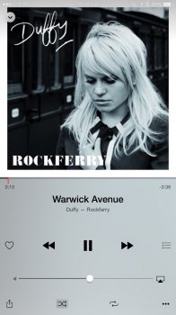
image.jpeg image.jpeg image.jpeg image.jpeg image.jpeg
 
Last edited:
Yeah I thought this was bad too. It doesn't stand out as bad design till you listen to something with art that's busier at the top.

Not that it's my job to worry about this (I'm sure they or someone here can come up with something), but to me (unqualified) it's not immediately obvious what design change could fix this without ruining their aesthetic. Moving the art down slightly and creating a stark contrast between the status bar and the art might not be a good look. Using some average colour of the art to colour the status bar would extend the art in an odd way.

Whilst the album art is at the top it's a tricky one. If they just swapped the two halves of the screen, it's more obvious what to do...
 
But I would like to pick up that number 3 on the right side if signal bar. LOL

I do agree that such design would break some album artworks. But I can get used to that. And the fact is: sometimes I will not notice status bar when I check album artwork. If I were that designer, I would choose to, how to say, highlight, or in other words, pop up status bar by displaying it in black when background is mainly bright colours and displaying it in white when background is mainly dark colours.
 
This was talked about in another thread recently. It's not a bug. The only time it's an issue is when the album art isn't a solid area of color behind the status bar. That's not the fault of iOS, it's the fault of the album art.
 
Last edited:
This was talked about in another thread recently. It's not a bug. The only time it's an issue is when the album art isn't a solid color behind the status bar. That's not the fault of iOS, it's the fault of the album art.

I would say it's a fault of the Music app designers not considering album art isn't all one uniform colour.
 
I would say it's a fault of the Music app designers not considering album art isn't all one uniform colour.
It's the same thing with the home screen wallpaper. If I set something where the status bar blends in with top, I won't be able to see it properly.
 
I used it yesterday for playing a few local files, and it struck me that the design of the transparent status bar is really awful. I'm all for minimal, simple design, but this is just bad design.
You are certainly entitled to your opinion, but you didn't actually say what you think is bad about it.
 
It's the same thing with the home screen wallpaper. If I set something where the status bar blends in with top, I won't be able to see it properly.


You are choosing a wallpaper for your homescreen. You are one, O N E single person who can control how accessible you want your homescreen to be. How can you possibly compare that to an interface that serves millions with no option to customize it? I find it absurd that you blame artwork for it. No, this is a 100% Apple's UI and Interface design department's shortcoming. You can hardly expect billions of art covers to adhere to Apple's love for transparency...

All it takes for Apple is to make a minor design change and decrease the transparency and/or create a function that switches the background color (even a semi-transparent background color) to that of the album and choose a text and UI control button color with accessible and readable contrast. That can't be too much to ask. Not everyone has a 20/20 vision.
 
The transparency of the status bar is a design choice and is found all over the system. How do you suggest to fix it while retaining the current look of the Now Playing screen?

That's the funniest thing I've read all day, thanks.

No problem. :)
 
You are choosing a wallpaper for your homescreen. You are one, O N E single person who can control how accessible you want your homescreen to be. How can you possibly compare that to an interface that serves millions with no option to customize it? I find it absurd that you blame artwork for it. No, this is a 100% Apple's UI and Interface design department's shortcoming. You can hardly expect billions of art covers to adhere to Apple's love for transparency...

All it takes for Apple is to make a minor design change and decrease the transparency and/or create a function that switches the background color (even a semi-transparent background color) to that of the album and choose a text and UI control button color with accessible and readable contrast. That can't be too much to ask. Not everyone has a 20/20 vision.

The point is to see the album art. Press your home button if you want to see the status bar or slide away the now playing screen.
 
  • Like
Reactions: imagineadam
Serious question? Just try reading the time, battery percentage, Bluetooth status etc in each screenshot.
I see what you mean now. I thought you were referring to the transparency of the bottom half of the screen (i.e., the music status - play/pause, next, previous, etc.).
 
The point is to see the album art. Press your home button if you want to see the status bar or slide away the now playing screen.

If you look at the examples (e.g. the Aguilera album cover), do you feel that it looks right the way status bar and controls overlap the cover art design? Why is the status bar not automatically hidden when viewing album art? Or, why not push the album cover a few pixels down so as to not overlap and making the bar entirely inaccessible?

Why have the status bar there when you can hardly see it anyway? Why make a design choice that only works under a certain set of parameters? What's wrong in making improvements to allow for better usability?

I don't understand it.

Apple has some of the most highly skilled designers working for them. I wish they'd utilize the abilities they undoubtedly have.

A design that works only under certain circumstances is a bad design.
 
It's just a bad iOS 7 design decision that's still there, you shouldn't be able to obscure the status bar by putting certain images behind it.
 
Yeah, the statusbar should disappear on the playing and playlist screens.
 
If you guys had not pointed this out I might not have even noticed. When I have music on I'm driving, riding or running so I'm not looking at the artwork. I start a playlist and take off. My car has controls on the wheel so I still don't need to see the artwork. When I'm home and listening its in the background while I'm on another application.

Not saying don't fix, just an observation that I might not have even caught this had it not been pointed out.
 
Two ways of doing it:

1. Remove the status bar completely when in the now playing view
or
2. Move everything down a little and have the status bar above the artwork, with the same blur as the controls below the artwork, which I think would look quite cool.

What way do you think they should do it?
 
I like the album art reaching the top of the screen, but I would add a stronger drop cast from the top edge with a slight blur to give the status bar a nice clean background that isn't disruptive to the album art and increases legibility. It could be a light frosting over light colored album art or a dark shadow over darker album art.

To increase legibility of the status bar icons and text, I would use an overplayed/burned in look, like what's used in the song information below. For the frosted over light colored album art, it would follow the exact same style of the song information text. For darker album art, it would be inverted, still using the album art for consistent color.

I would actually make that the system default 'transparent' system bar over an image. Adapt to the content and follow the UI principles you're already using.
 
There is nothing wrong with how it's done currently. Do people really need to see the time, carrier and battery every waking second? It's so the album art is front and center. If you REALLY need to see status bar info slide the player down or use the play controls from the lock screen.
 
Register on MacRumors! This sidebar will go away, and you'll see fewer ads.