Become a MacRumors Supporter for $50/year with no ads, ability to filter front page stories, and private forums.

GC251114

macrumors 6502
Original poster
Jul 28, 2015
452
243
Good morning.

Im certainly hoping for improvements with the widgets throughout these betas. Tweaks etc & to make them more useful with more information. My annoyance is how little thought (currently) that’s gone into the battery widget. I know everyone’s situation is different & I appreciate this is hardly 3rd world problems , however I expect Apple to move forward not backwards.

In iOS 13 I put my watch on charge. I scroll to the left on my phone & the stock iOS 13 widget tells me what charge my watch is at. Perfect.

Now in iOS 14 (PB2) this widget has gone. It’s gone because we can now have the battery widget added to the home screen. Ok , that’s fine.

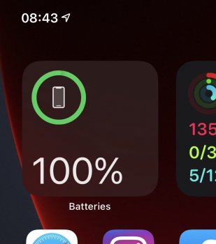
However , Apple give me a choice with regards to the size of the widget I choose. I choose the small one as I don’t like the large one as it takes up too much space & there’s always 2 empty spaces. BUT , if I want to see the battery % of my watch I have to have this one as my preferred small widget does not show the battery % !

So Apple , where is my choice ? You have taken away what was useful with a swipe to the left & replaced it with something that is not giving me the same information unless I want to place a widget that has 50% wasted real estate for me.

Now I want to embrace the widgets , but please give some thought to this small battery widget & get the % on there somewhere , as currently once I’ve finished typing this post , there’s no way for me to see what % my watch is at with one of the options you have given me , without actually putting my phone down , getting off my arse & manually checking.

Cheers
 
I have to agree with you. When you only have 1 or no additional devices connected the widget should make better use of that space and display percentage just like it currently does on the larger widget. It doesn't seem like rocket science. Hopefully Apple will implement this in the future. Have you submitted this as feedback to Apple?
 
I have to agree with you. When you only have 1 or no additional devices connected the widget should make better use of that space and display percentage just like it currently does on the larger widget. It doesn't seem like rocket science. Hopefully Apple will implement this in the future. Have you submitted this as feedback to Apple?

Hi

Yes I submitted my frustrations & suggestions to Apple via their feedback app this morning. I would encourage others to do the same if this also bothers/annoys them.

Cheers
 
  • Like
Reactions: KeanosMagicHat
I'm not really digging the new widgets, firstly you can't reorganize them on the widgets page so they are on the top of the list. Sucks because I use the widgets page more than I will use widgets on homescreen pages. 2nd they are not as nice as the older widgets, on this topic definitely the battery widget isn't as good, it just has too much wasted space. The battery widget I like the most is the list view, but I only have 2 battery devices and the view is much larger than that, you can easily fit 8 or 10 devices in the blank space. The old battery widget would at least change size depending on how many devices there were.

Has anyone else noticed also that the gutters of the widget page are also markedly wider? So now the old widgets are narrower/smaller. Honestly at this point I wish they gave us the option to use the old widget in the widget page.
 
  • Haha
Reactions: PirateP
I also send them my feedback the other day. The small battery widget is pretty useless because it doesn’t even show the percentage, so what is the point?
 
I also send them my feedback the other day. The small battery widget is pretty useless because it doesn’t even show the percentage, so what is the point?
While the percentage is nice, I don’t feel it is a necessity. I don’t keep the percentage on at top of the screen for the battery display because I can always pull down to go to the control panel but that icon is small. The display in the widget to me is large enough to get a decent idea of how much is left, but it would be a nice addition instead of the wasted space.
 
  • Like
Reactions: PirateP
I also send them my feedback the other day. The small battery widget is pretty useless because it doesn’t even show the percentage, so what is the point?

Yea, it's pretty useless that I can't see that the circle is only half full, is that 50%? Or it's less than 20% as it's in red, I have no idea that it's less than 20 percent as what does the red mean?! /S
 
  • Haha
Reactions: PirateP
I don't have iOS 14 PB on my phone, just iPad, but I thought that even though the new widgets can be added to the home screen, you can still also add them to the widgets page. Also, the battery widget has multiple styles and I thought the 1x4 style shows percentages below the circles
 
I don't have iOS 14 PB on my phone, just iPad, but I thought that even though the new widgets can be added to the home screen, you can still also add them to the widgets page. Also, the battery widget has multiple styles and I thought the 1x4 style shows percentages below the circles

Yes you can still add to the widget page , however the small one doesn’t give you the % charge , only the 2 larger ones.

I appreciate we are all different but I would prefer the smaller widget as that just shows me what I want , phone & watch. But I have to select the mid size or large now to see this info. Apple need to change & design this so all 3 sizes offer the same information.

Call me old fashioned Apple , but I always thought an icon for how much charge is in a certain device should actually tell you how much charge was in the device. This green ring business is pretty , however when I look at mine now I guessed 44%. Apparently it’s 33%. There’s my point.

Oh the days when your battery % was actually shown at the top of your phone!
 
Has anyone else noticed also that the gutters of the widget page are also markedly wider? So now the old widgets are narrower/smaller. Honestly at this point I wish they gave us the option to use the old widget in the widget page.

Yes I've noticed this as well with my Launcher widget suddenly showing 6 icons instead of 7 icons per row.
 
  • Like
Reactions: spinedoc77
Surly it can’t be that hard to add battery
Percentage for each symbol, make the icons inside the circles smaller, then add percentage for each symbol on top of the icon.
 
This happened this morning.
 

Attachments

  • F2D1A3F4-73F3-4B04-9575-2C0D790A1E75.jpeg
    F2D1A3F4-73F3-4B04-9575-2C0D790A1E75.jpeg
    123.8 KB · Views: 283
If you are seeing extra circles, that means you have other Apple devices that have been paired with your phone or iPad, such as AirPods and charging case.
I don’t this is the case, as I checked my Bluetooth settings and I only have an Apple Watch paired. It still shows 4 circles, one for phone, one for watch, and 2 ridiculous empty ones
 
Why doesn't Apple ut the % of battery on the widget and where there are 4 circles what are the 4 batteries for?
Could be iPhone, Smart Battery Case, Watch, AirPods; not sure what else can be monitored. What does it do if there are more than four devices you can monitor battery for?
 
I had my Apple Watch connected and my AirPods. It seemed to cycle through them, but screenshotted too late.
I don't think this is the case.

It only shows up with the % if airpods and watch are disconnected. If they're connected, you get the four circles.


That said, we need a 2x1 option for sure.
 
I don't think this is the case.

It only shows up with the % if airpods and watch are disconnected. If they're connected, you get the four circles.


That said, we need a 2x1 option for sure.

So, you're saying that I imagined it? As I saw them both in there before it showed the %.
 
Register on MacRumors! This sidebar will go away, and you'll see fewer ads.