Become a MacRumors Supporter for $50/year with no ads, ability to filter front page stories, and private forums.

Digitalguy

macrumors 601
Original poster
Apr 15, 2019
4,679
4,513
I am testing iPadOS 15 on one of my iPads (the 10.5) and I am really disappointed about several things:

1. they went back to less icons per page... They removed a row (4 instead of 5) and if I keep widgets in the the first home screen just like before, I only have lines of 4 icons instead of 6. They let you put 1 more icon in the dock but this is far from making up for it.... Honestly I only care about a couple of widgets and they were already fine in previous iPadOS versions...
2. I really dislike changes in Safari, the bigger fonts of the tabs mean you can see less and they removed the tab overview, which was a feature I used a lot when I have many tabs open... Also now the downloads are an extra step away, since they no longer have a button but are in the tab menu...

Many of the new features are either useless to me or not a big deal...
1. App library is of almost no use to me, since the icons are grouped in a way that does not work for me....
2. The new quick note is nice but not really game changing since I already use keep notes both in my dock and in slide over....
3. The multitasking icons are nice, but honestly it does not change things fundamentally, so not a big deal...
4. iPhone apps in landscape is a nice feature, but again, I basically use no iPhone app on iPad...

Honestly the only feature I care in iPadOS 15 is live text (which only works for A12 devices or newer) but I really don't know if this is worth the upgrade... At this point I thinking of not upgrading most of my iPads...

I have no doubt many will disagree and really like iPadOS 15, but for me at this point it seems that it only offers small advantages that do not make up for the drawbacks
 
  • Like
Reactions: Antes
1. they went back to less icons per page... They removed a row (4 instead of 5) and if I keep widgets in the the first home screen just like before, I only have lines of 4 icons instead of 6. They let you put 1 more icon in the dock but this is far from making up for it.... Honestly I only care about a couple of widgets and they were already fine in previous iPadOS versions...
Is your view mode "Standard" in Display settings? It may be dependant on the size of the iPad cause I've seen others say this too, but my 12.9" iPad has just as many rows on iPadOS 15 as it did on iPadOS 14. Only difference is that I've hidden loads of apps and replaced them with widgets :p
2. I really dislike changes in Safari, the bigger fonts of the tabs mean you can see less and they removed the tab overview, which was a feature I used a lot when I have many tabs open... Also now the downloads are an extra step away, since they no longer have a button but are in the tab menu...
Fair. I agree with a good bit of this. I don't really use very many tabs so I'd rather have a faster way to the share-sheet button as well. But what do you mean with the tab overview? If you pinch out there's still what I think of as the tab overview :)

Best feature of iPadOS 15 IMO: The keyboard buttons when you have a physical keyboard attached are smaller
 
  • Like
Reactions: alecgold
Is your view mode "Standard" in Display settings? It may be dependant on the size of the iPad cause I've seen others say this too, but my 12.9" iPad has just as many rows on iPadOS 15 as it did on iPadOS 14. Only difference is that I've hidden loads of apps and replaced them with widgets :p

Fair. I agree with a good bit of this. I don't really use very many tabs so I'd rather have a faster way to the share-sheet button as well. But what do you mean with the tab overview? If you pinch out there's still what I think of as the tab overview :)

Best feature of iPadOS 15 IMO: The keyboard buttons when you have a physical keyboard attached are smaller
There is no more the option to choose between More and Bigger in iPadOS 15! Are you certain that in 12.9 iPad it's different?

Thanks a lot, pinch out works, I didn't know it was an option... One less issue....

I am not sure about the last feature, what do you mean?
 
There is no more the option to choose between More and Bigger in iPadOS 15! Are you certain that in 12.9 iPad it's different?
There's not the "More/Bigger" thing in Home Screen settings, but I meant the View mode in Display settings.

I may be misremembering how many rows there used to be though?
I honestly never thought so much about it on the iPad, but I have 4 rows (not counting the dock)
Thanks a lot, pinch out works, I didn't know it was an option... One less issue....
Excellent :)
I am not sure about the last feature, what do you mean?
I'll show you :)
IMG_741D3547D81C-1.jpeg

See that in the lower right hand corner, where it says EN? That's the keyboard buttons for iPadOS 15 when a physical keyboard is attached (minimised). On iPadOS 14 you couldn't make it small. It would always be a bar at the bottom of the screen, about the size of the "332 Notes" label section. Taking up space on any screen. And in some apps obscuring some of the UI.
 
I am testing iPadOS 15 on one of my iPads (the 10.5) and I am really disappointed about several things:

1. they went back to less icons per page... They removed a row (4 instead of 5) and if I keep widgets in the the first home screen just like before, I only have lines of 4 icons instead of 6. They let you put 1 more icon in the dock but this is far from making up for it.... Honestly I only care about a couple of widgets and they were already fine in previous iPadOS versions...
Yeah, 6 x 5 icons on iPadOS14 to 6 x 4 on iPadOS15 is a visual and functional downgrade.

Obviously we’ll get used to it as we do with all changes, but I do hope they have an option to bring back the desktop widget sidebar (Today View) because I like having the clock and 6x5 icons. Also, I don’t really need every widget on my desktop so having quick scrollable access to the Today View widgets allows me to get easy access to more widgets in less space.

iPadOS 14 vs iPadOS 15
9051E50A-97F0-4CC8-906C-18ED48AE4282.jpeg
A0536D36-47BE-4843-8E26-B5B106F6D9BB.jpeg
 
  • Like
Reactions: yabeweb
Personally, I hope they have an option to bring back the desktop widget sidebar (Today View) because I like having the clock there. Also, I don’t really need every widget on my desktop so having quick scrollable access to the Today View widgets allows me to get easy access to more widgets in less space.

Agree with having the clock there and that it'd be nice to have the option for the Today style view as well as the widgets anywhere system.

And I guess maybe I just misremembered the number of rows on 14
 
There's not the "More/Bigger" thing in Home Screen settings, but I meant the View mode in Display settings.

I may be misremembering how many rows there used to be though?
I honestly never thought so much about it on the iPad, but I have 4 rows (not counting the dock)

Excellent :)

I'll show you :)
View attachment 1804124
See that in the lower right hand corner, where it says EN? That's the keyboard buttons for iPadOS 15 when a physical keyboard is attached (minimised). On iPadOS 14 you couldn't make it small. It would always be a bar at the bottom of the screen, about the size of the "332 Notes" label section. Taking up space on any screen. And in some apps obscuring some of the UI.
There were 5 rows in iPadOS 13 and 15 in More mode.... so one is missing and for me this is a big deal since I don't use many widgets and I have all my important icons in the first page.... And now I have 6 less and actually 12 less since now that same widgets that took no icon away (the first page was more compact) take 6 more icons...
As for the last point, I am not sure, I don't have anything in my iPads and they all have a keyboard....
 
I am testing iPadOS 15 on one of my iPads (the 10.5) and I am really disappointed about several things:
You could have used this thread to express your thoughts….


1. they went back to less icons per page... They removed a row (4 instead of 5) and if I keep widgets in the the first home screen just like before, I only have lines of 4 icons instead of 6. They let you put 1 more icon in the dock but this is far from making up for it.... Honestly I only care about a couple of widgets and they were already fine in previous iPadOS versions...
I dislike this as well.. so far, I’ve kept my HomeScreen locked to landscape. I’ve seen a video in the reddit form. That you can have your HomeScreen set up differently from landscape or portrait and it stays that way. I don’t think Apple will change the app grid layout based on that video…

2. I really dislike changes in Safari, the bigger fonts of the tabs mean you can see less and they removed the tab overview, which was a feature I used a lot when I have many tabs open... Also now the downloads are an extra step away, since they no longer have a button but are in the tab menu...
To each their own, I like the Safari changes. I like the combining of the address/tab bar… how it dynamically change.

I have no doubt many will disagree and really like iPadOS 15, but for me at this point it seems that it only offers small advantages that do not make up for the drawbacks
We all have our opinions.. I view iPadOS 15 as a refinement, only major change was to Safari.. and I’ve used it since day one, it took me awhile to adjust to the new features. But I like them… especially the new keyboard shortcut.
 
Yeah, 6 x 5 icons on iPadOS14 to 6 x 4 on iPadOS15 is a visual and functional downgrade.

Obviously we’ll get used to it as we do with all changes, but I do hope they have an option to bring back the desktop widget sidebar (Today View) because I like having the clock and 6x5 icons. Also, I don’t really need every widget on my desktop so having quick scrollable access to the Today View widgets allows me to get easy access to more widgets in less space.

iPadOS 14 vs iPadOS 15
View attachment 1804122View attachment 1804123
It may look cleaner but it's annoying for me... For the reason I mentioned in my previous post....
If I were to decide, I would have even more icons in one page....If the mini can take 30 icons plus widgets, the 12.9 could easily take 50... Not to mention the dock, I would love to have many more icons there, just like on a Mac... But I understand everyone has different views...
 
  • Like
Reactions: KittyKatta
You could have used this thread to express your thoughts….


I dislike this as well.. so far, I’ve kept my HomeScreen locked to landscape. I’ve seen a video in the reddit form. That you can have your HomeScreen set up differently from landscape or portrait and it stays that way. I don’t think Apple will change the app grid layout based on that video…


To each their own, I like the Safari changes. I like the combining of the address/tab bar… how it dynamically change.


We all have our opinions.. I view iPadOS 15 as a refinement, only major change was to Safari.. and I’ve used it since day one, it took me awhile to adjust to the new features. But I like them… especially the new keyboard shortcut.
Fair enough... I must have missed that thread. I looked to see if there were similar one, but couldn't find that and it was not suggested...
 
  • Like
Reactions: Ludatyk
We all have our opinions.. I view iPadOS 15 as a refinement, only major change was to Safari.. and I’ve used it since day one, it took me awhile to adjust to the new features. But I like them… especially the new keyboard shortcut.

Speaking of. I feel like Apple frequently says that they've added more keyboard shortcuts to iPadOS updates... Yet I never feel like there are enough still. For example, why can I still not use cmd+alt+number to go to one of my favourites in Safari?
 
  • Like
Reactions: alecgold
Speaking of. I feel like Apple frequently says that they've added more keyboard shortcuts to iPadOS updates... Yet I never feel like there are enough still. For example, why can I still not use cmd+alt+number to go to one of my favourites in Safari?
Well, I can’t speak on why they haven’t added that specific shortcut to Safari. But compared to iPadOS 14.. they added a lot more. I’m still trying to get familiar with all the shortcuts for iPadOS 15. Because if you hold the command key you get specific shortcuts to a certain app. But when holding the globe key.. you get system wide shortcuts.
 
Well, I can’t speak on why they haven’t added that specific shortcut to Safari. But compared to iPadOS 14.. they added a lot more. I’m still trying to get familiar with all the shortcuts for iPadOS 15. Because if you hold the command key you get specific shortcuts to a certain app. But when holding the globe key.. you get system wide shortcuts.

Yeah. Here's something annoying as well. The shortcuts they show in those views; That's not a complete list. There are hidden shortcuts they don't show in those lists too. Though I do like the new view of the shortcut thingies, with a search field and everything just like the help HUD on a Mac and the overall menu bar layout
The "hidden" ones are, as far as I've discovered, just alternate keybindings for the same thing though. Like going Home is listed as 🌐+H. But ⌘+H works too. Or Show Dock is listed as 🌐+H, but the Mac familiar ⌘⌥D works too
 
The great thing about beta testing is that you can submit feedback directly to apple. Posting your frustrations on macrumors will get you no where in getting apple to add back in the extra row or make it optional to add back.
 
  • Like
Reactions: alecgold and -DMN-
The great thing about beta testing is that you can submit feedback directly to apple. Posting your frustrations on macrumors will get you no where in getting apple to add back in the extra row or make it optional to add back.

Well it might make someone suggest sending in feedback so more people will do so :p - Also I am entirely convinced some Apple engineers occasionally read along here anyway. Not every thread of course, but I am sure some look.
But yeah it should go through the official feedback channels of course
 
  • Like
Reactions: Digitalguy
Yeah, 6 x 5 icons on iPadOS14 to 6 x 4 on iPadOS15 is a visual and functional downgrade.

Obviously we’ll get used to it as we do with all changes, but I do hope they have an option to bring back the desktop widget sidebar (Today View) because I like having the clock and 6x5 icons. Also, I don’t really need every widget on my desktop so having quick scrollable access to the Today View widgets allows me to get easy access to more widgets in less space.

iPadOS 14 vs iPadOS 15
View attachment 1804122View attachment 1804123
I actually personally think that 14 looks cleaner than 15 here. I like the new widgets and their different size options, but the icons having so much space makes it look weird to me.
 
  • Like
Reactions: Digitalguy
I do love the new multi tasking personally.

I agree on the spacing: Maybe 12x8 apps would be better (I know that’s a lot but I feel it may work better)
 
I do love the new multi tasking personally.

I agree on the spacing: Maybe 12x8 apps would be better (I know that’s a lot but I feel it may work better)
wow 12x8 would be awesome, 96 icons per page... And it could just be an option for those that want function over form.... But knowing Apple, there is zero chance... I hope they at least restore the 30 icons per page....
 
I am testing iPadOS 15 on one of my iPads (the 10.5) and I am really disappointed about several things:

1. they went back to less icons per page... They removed a row (4 instead of 5) and if I keep widgets in the the first home screen just like before, I only have lines of 4 icons instead of 6. They let you put 1 more icon in the dock but this is far from making up for it.... Honestly I only care about a couple of widgets and they were already fine in previous iPadOS versions...
2. I really dislike changes in Safari, the bigger fonts of the tabs mean you can see less and they removed the tab overview, which was a feature I used a lot when I have many tabs open... Also now the downloads are an extra step away, since they no longer have a button but are in the tab menu...

Many of the new features are either useless to me or not a big deal...
1. App library is of almost no use to me, since the icons are grouped in a way that does not work for me....
2. The new quick note is nice but not really game changing since I already use keep notes both in my dock and in slide over....
3. The multitasking icons are nice, but honestly it does not change things fundamentally, so not a big deal...
4. iPhone apps in landscape is a nice feature, but again, I basically use no iPhone app on iPad...

Honestly the only feature I care in iPadOS 15 is live text (which only works for A12 devices or newer) but I really don't know if this is worth the upgrade... At this point I thinking of not upgrading most of my iPads...

I have no doubt many will disagree and really like iPadOS 15, but for me at this point it seems that it only offers small advantages that do not make up for the drawbacks

You may not have a choice. Apple is pretty quick to stop signing prior versions. Eventually, 15 will get you.
 
  • Like
Reactions: alecgold
wow 12x8 would be awesome, 96 icons per page... And it could just be an option for those that want function over form.... But knowing Apple, there is zero chance... I hope they at least restore the 30 icons per page....
I could see Apple giving users the option to go back to prior iPadOS 14 layout with no free movement of widgets or the new iPadOS 15 layout.

But to restore it back to 30 icons per page along with free movement of widgets.. I highly doubt it.
 
You may not have a choice. Apple is pretty quick to stop signing prior versions. Eventually, 15 will get you.
Well the beta is beta precisely to test, so you can always go back... Having said that, since the 10.5 is not an iPad I use a lot, I am fine with leaving it on 15 even after the beta... But my daily drivers like the 11 and the 12.9 will probably remain on 14... (there is no time limit for this, I have an iPad mini 2 that is still on IOS 10...
 
I actually personally think that 14 looks cleaner than 15 here. I like the new widgets and their different size options, but the icons having so much space makes it look weird to me.

It seems the exaggerated icon spacing and reduction in rows is to maintain a grid where each app or icon take a 1x1 square. When its a 1x1 widget it looks… good (?:rolleyes:) …. but when its just a lonely app icon it looks kinda silly. Especially on a 12.9.


2106BD44-A8A2-47D9-90D6-970EF0E5E2E5.jpeg
iPadOS-Widgets.png
 
It seems the exaggerated icon spacing and reduction in rows is to maintain a grid where each app or icon take a 1x1 square. When its a 1x1 widget it looks… good (?:rolleyes:) …. but when its just a lonely app icon it looks kinda silly. Especially on a 12.9.


View attachment 1804247
iPadOS-Widgets.png

That sort of makes sense. I guess one possible solution that might be a bit too crammed is to 2x it. So a 1x1 widget would be a 2x2 icon grid wise
 
There's not the "More/Bigger" thing in Home Screen settings, but I meant the View mode in Display settings.

I may be misremembering how many rows there used to be though?
I honestly never thought so much about it on the iPad, but I have 4 rows (not counting the dock)

Excellent :)

I'll show you :)
View attachment 1804124
See that in the lower right hand corner, where it says EN? That's the keyboard buttons for iPadOS 15 when a physical keyboard is attached (minimised). On iPadOS 14 you couldn't make it small. It would always be a bar at the bottom of the screen, about the size of the "332 Notes" label section. Taking up space on any screen. And in some apps obscuring some of the UI.
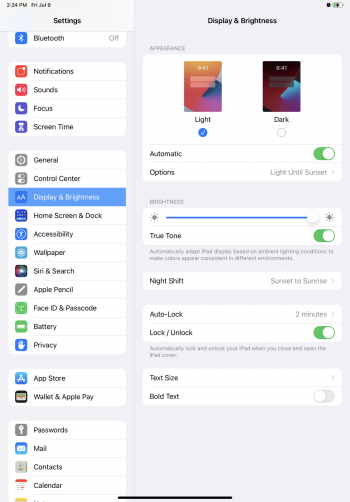
What do you mean by view mode in display settings
I’m on an iPad Pro 11” and im only seeing this:
 

Attachments

  • 034A2419-CC77-4792-8992-6FB145B1C350.png
    034A2419-CC77-4792-8992-6FB145B1C350.png
    1.4 MB · Views: 116
Register on MacRumors! This sidebar will go away, and you'll see fewer ads.