Become a MacRumors Supporter for $50/year with no ads, ability to filter front page stories, and private forums.

rossy100

macrumors 6502
Original poster
Mar 23, 2011
440
194
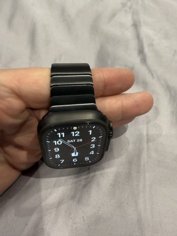
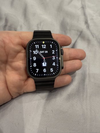
So one of best things about new black Ultra is that I can once again pair it with my original Space Black link bracelet. With the previous Ultra in natural titanium it just didn’t work and looked odd. With the black, it looks great and matches really well.

No idea how compares to the new slate link band but I suspect that would be a little lighter and so not as good a match.
 

Attachments

  • IMG_1843.jpeg
    IMG_1843.jpeg
    333.3 KB · Views: 242
  • IMG_1844.jpeg
    IMG_1844.jpeg
    364 KB · Views: 167
  • IMG_1845.jpeg
    IMG_1845.jpeg
    378.4 KB · Views: 159
Looks good. Mine does not come til next week and I ordered the new Milanese band to go with it. Bought the series 10 in slate titanium with the matching band in slate. It is most definitely not black, so it would look odd on the new black ultra.
 
I think the black on natural is a good contrast and looks great. Not as good as black and black though. 🔥
 
I had Apples link bracelet many years ago and had to return it

When the link closed with movement of my arm, it pinched my skin or pinched the hairs on my wrist.

Very nice though, great looking strap
 
I love the look of the matte black AW Ultra, but those orange buttons and crown ring. Why? I just don't get it. These are buttons and dials you feel, not really look at. What is the point of having to highlight them visually when they already have ample tactility built in? And orange still? At least a nicer red would've been easier on the eyes. Maybe it's just me.
 
  • Like
Reactions: mjpearce023
I love the look of the matte black AW Ultra, but those orange buttons and crown ring. Why? I just don't get it. These are buttons and dials you feel, not really look at. What is the point of having to highlight them visually when they already have ample tactility built in? And orange still? At least a nicer red would've been easier on the eyes. Maybe it's just me.
Not just you, as soon as I saw the black ultra I said that would look great with red button/ring. Not a bright red but darker almost maroon red would look amazing.
 
I love the look of the matte black AW Ultra, but those orange buttons and crown ring. Why? I just don't get it. These are buttons and dials you feel, not really look at. What is the point of having to highlight them visually when they already have ample tactility built in? And orange still? At least a nicer red would've been easier on the eyes. Maybe it's just me.
I actually really like the black mixing with a slight orange, always have liked those colours together :)

Much like the McLaren Senna, or the spec sheet from the DJI Mavic 3 on DJI Website.

IMG_0047.jpeg


IMG_0048.jpeg
 
  • Like
Reactions: Mikeeee
I also have a Space Black link bracelet. Wondering if I should get the Black Ultra like u did or get Jet black regular watch...no sure which would look best
 
I also have a Space Black link bracelet. Wondering if I should get the Black Ultra like u did or get Jet black regular watch...no sure which would look best

I think the jet black would look better. I also have the SB link bracelet and I think it looks a little to thin on the Ultra width wise (just my opinion).
 
  • Like
Reactions: Canadia69
I also have a Space Black link bracelet. Wondering if I should get the Black Ultra like u did or get Jet black regular watch...no sure which would look best
All I can say is that it looks fantastic with the black Ultra colours match very well. I’ve not seen with Jet Black so can’t compare.

Personally I also prefer the Ultra to the S10. Just feels a far more substantial watch and having had an original Ultra before, moving to an S10 felt like a downgrade (I ordered a slate titanium S10 also so could compare and was no contest IMO so went with the black Ultra).
 
  • Like
Reactions: Canadia69
Register on MacRumors! This sidebar will go away, and you'll see fewer ads.