Become a MacRumors Supporter for $50/year with no ads, ability to filter front page stories, and private forums.

geekindisguise

macrumors 6502
Original poster
Jul 22, 2008
297
0
Oklahoma
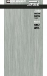
I just started a blog with Wordpress and I decided to replace my old site with the blog. But I wanted to make it my own instead of using the templates. What I want is something Metalically! I made a mockup of what I want, but I wanted to hear what you all thought about it before I make the final design. I haven't started the coding part and probably won't for a while because I have been having a lot of school work lately.

Thanks!
 

Attachments

  • Metal_Blog_Design.jpg
    Metal_Blog_Design.jpg
    211.8 KB · Views: 158
Hmm. Can you put some sample text on there? Given it's a blog and presumably designed to be read, the legibility of the text is going to be its primary goal and not showing any makes judging it kind of pointless.

Minor quibbles: Photos, not Photo's, and the kerning on your navigation titles is all over the place (which is mildly disturbing given that one of them is Design).

The structure of the layout is somewhat confusing also, there's no clear hierarchy for the elements or visual narrative to guide your eye through them.

Otherwise, it's all right I guess, although metallic is not really my thing :p

What does kerning mean? And I know, I am bad at grammar and punctuation kind of things. I didn't think I would need any articles actually inserted because the only thing I wanted advice on was the design. Not the text.

Thanks!
 
Bad grammar is not the end of the world in casual blog text, but it does scream a bit when it's in a title..

and you'll have to forgive my focus on the text - I've seen way too many web site designs where the content (the thing which one might imagine is the whole point of the site, for it's visitors if not the author) is treated as something of an afterthought to be jammed into some space in the middle of the page.

People are coming to the site to read the content, the least you can do is put some thought into their visual experience of doing so. Design is visual communication, not making stuff look 'cool' or pretty.

The stuff around the edges is there to set the mood, provide identity and assist with navigation, which is all important stuff, I'm not saying it isn't, but it's not the focus.

Kerning? the spacing between letters - Design is all squished together and Contact looks like Cont Act. Type composition is an artform just as much as image composition and deserves to be treated as such
 
When it comes to blogs I'm a fan of simple is best. That means black text on a white background and minimal clutter.

When you are designing a blog template you should be thinking "What can I remove from this while still keeping it easy to navigate?" rather than "What can I add to make it look cool?".
 
You might want to take a look at other blogs and designs. Why don't you just start with my one: fifty-eight. (Shameless self-promotion!)

EDIT: I just visited your blog. Why do you want to change the Design? The current one looks good to me.
 
What does kerning mean? And I know, I am bad at grammar and punctuation kind of things. I didn't think I would need any articles actually inserted because the only thing I wanted advice on was the design. Not the text.

Thanks!

Then don't blog.
No I keed I keed.
I am not a fan of the brushed metal myself. It feels like a dated style.
 
You might want to take a look at other blogs and designs. Why don't you just start with my one: fifty-eight. (Shameless self-promotion!)

EDIT: I just visited your blog. Why do you want to change the Design? The current one looks good to me.

Because I want to be a web designer, and using other people's themes won't let me express myself all the way. If I made my own theme it would make it feel more like mine.
 
Because I want to be a web designer, and using other people's themes won't let me express myself all the way. If I made my own theme it would make it feel more like mine.

Find a theme closest to how you want it to look like, and then make changes to make it "your own."

Like, we have the same blog style, but I edited mines to fit it to how I like it. Take a look if you want,http://mfjram.com/wp, as you can see: we both use the same theme, but mines different. (Not exactly same theme, but from the same set lol. Notice the date, comments, and blog text areas)

Know what I'm saying? Unless your fully up to coding an entire theme yourself, then ignore what I say. If your just beginning, its best to start from somewhere comfortable, and eventually you can start from scratch.
 
Register on MacRumors! This sidebar will go away, and you'll see fewer ads.