Got a tip for us?
Let us know
Become a MacRumors Supporter for $50/year with no ads, ability to filter front page stories, and private forums.
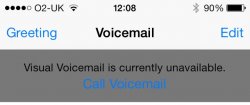
Blue text on a grey background...
- Thread starter davehutch
- Start date
- Sort by reaction score
You are using an out of date browser. It may not display this or other websites correctly.
You should upgrade or use an alternative browser.
You should upgrade or use an alternative browser.
...really?
That's what you get with IOS 7.0. Stinks. I'm waiting to upgrade as the colors are horrible.
It is not a good combination. I agree.
this sort of thing would be solved if apple would give us some control over what colors we see in our phones. Most of us would agree that we want to change it up now and again. Especially text colors. We get tired of seeing that green and blue bubble. Give us the ability to choose something else.
this sort of thing would be solved if apple would give us some control over what colors we see in our phones. Most of us would agree that we want to change it up now and again. Especially text colors. We get tired of seeing that green and blue bubble. Give us the ability to choose something else.
Funny, because the grey on my phone appears much lighter making it much easier to read....
Mine too. Not so sure I see how the OP got such a dark grey. It is totally fine to read on my phone.
Actually, I have just tested it again and mine isn't even blue.

Mine too. Not so sure I see how the OP got such a dark grey. It is totally fine to read on my phone.
Actually, I have just tested it again and mine isn't even blue.
View attachment 441627
It only gives you the blue option to "Call Voicemail" if you aren't in Airplane mode - i.e. when the network radio is active. The one time I tried to get no bars was the one time I got reception everywhere - except the cellar.
Do you think the Original Poster edited the image on purpose, trying to deceive us all just because he's pissed off 'cause he doesn't personally like iOS7?
I actually quite like iOS7 (apart from maybe the calendar list thing). Good move all around, especially the ability to swipe between web pages, email accounts etc.
Plus...I have better things to do
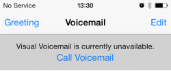
I switched Airplane mode on then went back to the VM screen and saw a flash of the pale grey, before the dark grey was overlaid onto it.
Same happened as I switch Airplane mode back ogg again.
Could this be O2-UK branding?
Last edited:
I actually quite like iOS7 (apart from maybe the calendar list thing). Good move all around, especially the ability to swipe between web pages, email accounts etc.
Plus...I have better things to do
I switched Airplane mode on then went back to the VM screen and saw a flash of the pale grey, before the dark grey was overlaid onto it.
Same happened as I switch Airplane mode back ogg again.
Could this be O2-UK branding?
Erm, dunno.. But I have heard somewhere that the only branding allowed on iPhones is the carrier logo.
Anyway, if the image you posted is an accurate, then I'd have just assumed it's a bug. Expect it to be fixed soon.

Funny, because the grey on my phone appears much lighter making it much easier to read....
...really?
Is your Increase Contrast ON in Settings-> General-> Accessibility?
Could this be O2-UK branding?
I am on O2 but don't get it that dark! I tried by switching to airplane mode! Not really sure why yours appear that dark!!
Attachments

I am on O2 but don't get it that dark! I tried by switching to airplane mode! Not really sure why yours appear that dark!!
Maybe 901 still needs to be available for you to call i.e. an actual fault, rather than simply switching it off with Airplane mode?
Could be worse... how about medium grey on light grey?
Maps is even harder yet to see.
It's twice as bad at night because the white washes out in your eyes from brightness.
I see nothing wrong with that at all. the app store design has been greatly improved over the old one.
----------
It does seem like an overlay f some sort. I understand there's an issue with a local mast so I'll check it once it's available by switching to Airplane mode.
You can tell something's up because all of the alignment is off as well
Yes there is something wrong with your phone it isnt normal. I would try a restore, youve a data connection so functioning visual voicemail shouldnt be an issue, also the alignment is very much off.
I see nothing wrong with that at all. the app store design has been greatly improved over the old one....
The bottom right of the screenshot. It's difficult to read text with those color schemes.
The bottom right of the screenshot. It's difficult to read text with those color schemes.
I see them fine. Perhaps try inverting colours.
I see them fine. Perhaps try inverting colours.
Just because you can read them doesn't mean they're a good choice of colors. It's still medium grey on a slightly lighter grey.
There are more people than us who use iOS. Not everyone has such perfect vision
It was grey on grey before.Just because you can read them doesn't mean they're a good choice of colors. It's still medium grey on a slightly lighter grey.
There are more people than us who use iOS. Not everyone has such perfect vision

Just because you can read them doesn't mean they're a good choice of colors. It's still medium grey on a slightly lighter grey.
There are more people than us who use iOS. Not everyone has such perfect vision
Doesnt mean anyone else has a problem with them though either. Most people just accept how things look unless it retains to people and move on.
Doesnt mean anyone else has a problem with them though either. Most people just accept how things look unless it retains to people and move on.
I personally have no problems reading them but I have to agree with some forum users here, I don't think it is the ideal choice of text colors.
Register on MacRumors! This sidebar will go away, and you'll see fewer ads.