Become a MacRumors Supporter for $50/year with no ads, ability to filter front page stories, and private forums.

HarryPot

macrumors 65816
Original poster
Sep 5, 2009
1,061
515
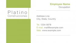
Hi, I'm designing the business card for a construction company that wants to differentiate themselves by doing sustainable home construction (green constructions, environmental-safe materials, etc.).

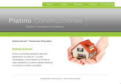
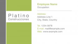
What do you think? There's also a screenshot of the website, which I'm also designing.

Thanks.:)
 

Attachments

  • Business Card.jpg
    Business Card.jpg
    113.6 KB · Views: 186
  • Screen shot 2011-05-20 at 1.41.32 PM.png
    Screen shot 2011-05-20 at 1.41.32 PM.png
    192.1 KB · Views: 169

tobefirst ⚽️

macrumors 601
Jan 24, 2005
4,612
2,335
St. Louis, MO
I'm not a fan of their wordmark at all, but I'm not sure you have any control over that. I'll assume you don't.

The white bar on the left needs to line up, top and bottom, with something from the right side. In addition, I'm not especially fond of the layout on the right, particularly the rules and the left/right align. Pick an alignment, drop the rules, and line the white bar up with some of the text from the right side.

I do, however, like the colors you're working with.
 

HarryPot

macrumors 65816
Original poster
Sep 5, 2009
1,061
515
I'm not a fan of their wordmark at all, but I'm not sure you have any control over that. I'll assume you don't.

The white bar on the left needs to line up, top and bottom, with something from the right side. In addition, I'm not especially fond of the layout on the right, particularly the rules and the left/right align. Pick an alignment, drop the rules, and line the white bar up with some of the text from the right side.

I do, however, like the colors you're working with.

Thanks tobefirst,

I do have certain control over the logo, which I've been trying to modify a little bit to make it more eye catching, while keeping it simple. Tho I think I'll end up recommending to hire someone to make it. I'm good at making web pages, but I lack the creativity to make a logo.

As for the business card, I'll try and move around the text, see what I can get and post it back.

Thanks again.
 

TheGenerous

macrumors 65816
Nov 14, 2010
1,096
405
I'm an Austronaut
The font your using for the company is too light. Maybe choose a bolder font or make your own on pencil.

The hands holding a house seems to imply that you sell "casas pequen~as" and I would think the designer didn't see his work from all prespectives. In this case, looking at the small house photo is quite obvious.
 

HarryPot

macrumors 65816
Original poster
Sep 5, 2009
1,061
515
The font your using for the company is too light. Maybe choose a bolder font or make your own on pencil.

The hands holding a house seems to imply that you sell "casas pequen~as" and I would think the designer didn't see his work from all prespectives. In this case, looking at the small house photo is quite obvious.

Thanks.

The website was done by me.

As for the photo implying small houses, I did thought about it. The goal is making environment-friendly houses, which use the space required for a comfortable living, but don't waste unnecessary construction.

But my real meaning for the photo was a "more human (more green)" home construction. I'll have to see if I can find another photo that makes it look more this way, since I don't really want to imply "economic small houses".
 

citizenzen

macrumors 68000
Mar 22, 2010
1,543
11,786
But my real meaning for the photo was a "more human (more green)" home construction.

Hey Harry. Thanks for sharing your work.

I'm concerned with a couple of points here. One, is the color of green of the business card. It doesn't match the green of the website, which has a nice, bright, sour apple green. I like that color better than the green used on the business card.

Two, if you're trying to put forth the message, "more human (more green)," then I don't see it in the two heavy blocks of green connected by the thinner, vertical green bar. That does not say "human" to me. I would look for something less abstract that conveys the human connection you're trying to convey.

And third, I think you need to use the font Palatino. I don't know why. But whenever I look at the samples, that thought just keeps on popping back into my head.

Hope this helps.
 

HarryPot

macrumors 65816
Original poster
Sep 5, 2009
1,061
515
Hey Harry. Thanks for sharing your work.

I'm concerned with a couple of points here. One, is the color of green of the business card. It doesn't match the green of the website, which has a nice, bright, sour apple green. I like that color better than the green used on the business card.

Two, if you're trying to put forth the message, "more human (more green)," then I don't see it in the two heavy blocks of green connected by the thinner, vertical green bar. That does not say "human" to me. I would look for something less abstract that conveys the human connection you're trying to convey.

And third, I think you need to use the font Palatino. I don't know why. But whenever I look at the samples, that thought just keeps on popping back into my head.

Hope this helps.

Thanks Citizenzen.

I did noticed the difference in the color. Must have been something with the export from Photoshop, since in my computer they looked the same tone when comparing them side to side. I'll have to check that to guarantee when I print them the color is the same.

I like your second idea, I'll look into adding something that makes the business card portray that better.

And I'll definitely try the Palatino font.

---------
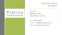
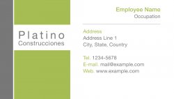
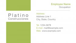
So far this are the modifications I had made from yesterday.
 

Attachments

  • Business Card.jpg
    Business Card.jpg
    119.2 KB · Views: 70
  • Business Card 2.jpg
    Business Card 2.jpg
    118.2 KB · Views: 83
  • Business Card 3.jpg
    Business Card 3.jpg
    118 KB · Views: 75
  • Business Card 4.jpg
    Business Card 4.jpg
    117.1 KB · Views: 75

ezekielrage_99

macrumors 68040
Oct 12, 2005
3,336
19
To me the business cards look good, the site is functional though IMHO the issue being the wordmark it just doesn't seem to pop.

I'm not sure if it's the font, typography, colour, etc but it just doesn't seem to build a strong meaning for the brand.

I would really check out the following resources, because the designs aren't bad (infact the bottom left bcard on the revisions is very good), it's the overall flow of the logo that's letting it down. The sense of scale and typography is out...

Brandnew
Typographic Logos (the best)
72 Typographic Logos
Free fonts

If it were me:
1) Make it caps
2) Use a heavier font (Whitney SC Medium, Helvetica Neue or Gotham comes to mind)
3) Take the emphasis off construction, it's just not unique from a branding POV
4) Creative a few polished options for the client to choose.
 

HarryPot

macrumors 65816
Original poster
Sep 5, 2009
1,061
515
To me the business cards look good, the site is functional though IMHO the issue being the wordmark it just doesn't seem to pop.

I'm not sure if it's the font, typography, colour, etc but it just doesn't seem to build a strong meaning for the brand.

I would really check out the following resources, because the designs aren't bad (infact the bottom left bcard on the revisions is very good), it's the overall flow of the logo that's letting it down. The sense of scale and typography is out...

Thanks.:)

I've been working in some logos.

As for the business card, do you mean the one without the gray border at the left?
 

ILikeTurtles

macrumors 6502
Feb 17, 2010
320
2
I would add the line drawing of the house you used on the web page header, to the green area in the business card. Reverse it out in white. I think that would add something to the bcard, and carry through that design element.
 

ezekielrage_99

macrumors 68040
Oct 12, 2005
3,336
19
Thanks.:)

I've been working in some logos.

As for the business card, do you mean the one without the gray border at the left?

Sorry meant the bottom left on the revisions... Can't tell the difference between my left and right :eek: Seriously ;)
 
Register on MacRumors! This sidebar will go away, and you'll see fewer ads.