Become a MacRumors Supporter for $50/year with no ads, ability to filter front page stories, and private forums.

Kupoback

macrumors member
Original poster
Dec 25, 2009
48
0
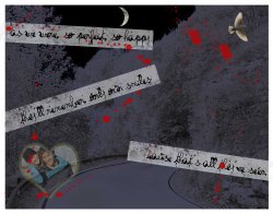
This is my very first time actually trying to use Photoshop, and I did this picture for my Final Project. I am in school for Web Design, but am also thinking of double majoring in Graphic Design, since I really enjoyed making this.

If I can get some critique, no matter how harsh, that would be great. Thank you. Oh, and on a side note, this was considered the best work my teacher has seen in my entire class, which made me feel real good about this work.
 

Attachments

  • Final.jpg
    Final.jpg
    707.5 KB · Views: 247

Kwill

macrumors 68000
Mar 10, 2003
1,595
1
Please don't encourage this forum with the statement "no matter how harsh." :D

Either your teacher doesn't get out much or didn't want to hurt your feelings. You should be able to figure out the most obvious issue by considering: What image does a dark background with spattered red liquid, illegibly written notes and tape suggest? With that in mind, sticking a Valentine heart in there is an oxymoron.

If you want to convey love, a palette of colors and fonts used should be light. Goth is an entirely different genre. There is considerably more to add about composition but I'll leave that for someone else.
 

Kupoback

macrumors member
Original poster
Dec 25, 2009
48
0
I want to improve myself in any and all way, so I can take any criticism.

The quotes are from a song by Rise Against called The Approaching Curve about a couple, possibly teens, who break up while they are out on a drive. So I was trying to capture the darkness of the song. With the red splatters, it was to capture the end of the song when the couple go off the cliff. The dove and the couple in the picture was to go with the lyrics in showing signs of peace and happiness.

I realized when I printed it out, the type was the wrong one to use. They read, "As they were, so happy, so perfect, They'll remember only our smiles, because that's all they seen."
 

robj

macrumors regular
Dec 23, 2009
230
0
Madrid, Spain
I don't understand the purpose of the creation.

What kind of feeling do you want to create?

Maybe it seems a little bit messy with that mix of heart, blood and crime tapes with illegible text.

You would try to mix the elements of the song but instead putting them alone sitting along in the image, You could try to figure out what you want to say and make a unique design element.

However, I'm not an expert artist neither an simple artist ;)
 

baypharm

macrumors 68000
Nov 15, 2007
1,951
973
You can't please everyone...so please yourself. I like it. I also like it from the stand point that you had an idea, designed it, and actually completed the project. There are too many unfinished projects and ideas that never get made.

Some of us here will like it and others won't. The important thing is that you like lt. I like the abstract look and the illegible text. However, sentence structure is wrong. It should be "because it's all they HAVE seen." Works for me.
 

Kupoback

macrumors member
Original poster
Dec 25, 2009
48
0
However, sentence structure is wrong. It should be "because it's all they HAVE seen." Works for me.

While I agree that the sentence has grammatical errors in it, I needed to keep the lyrics from the song true.

The project was to take lyrics and decipher them. I decided to choose the chorus and deciphered them, and the whole song in one go. I was satisfied with the project, but seeing as its my first photoshop project and i got such good reviews from my teacher, I thought I'd hear what everyone else thought who would have treated me as a regular instead of knowing I come from no background in design.
 

bluetooth

macrumors 6502a
May 1, 2007
662
1
Toronto
Hey, once you posted the exercise, it made a lot more sense, otherwise I was kind of lost in terms of message, meaning and overall purpose of the design.

I think you have some good ideas in the piece and some of the elements could work if you were to do some revisions imo.

I find the overall colour too dark, I understand it is suppose to be night, but the dark grey background does not exactly jive with the red you have chosen nor the text (as others have mentioned) as the text is washed out and hardly legible.

A suggestion is to perhaps try going black and white with the background, this would allow for a more subtle background and bring more of a focus to your remaining elements.

Also, what if you were to take one strong line from the song that best represnts the theme and portray it as a statement rather then having 3 lines criss-crossing down the page, it would perhaps make the message stronger and the design not so "wordy" or "scattered looking" for lack of a better term..

I would also try using red text with a font that is more legible. I can't say I am a big fan of the blood drops, hence why if you were to use red text and an appropriate font with proper form, you could very easily portray the message of design through the use of a single line statment which could prove to be more powerful.

I encourage you to really look at type and image and the language of your design. When done effectively, the use of form language can help to convey content. I like your approach with the angled text and overall grunge theme but the message, typography and placement could be presented more effectively. Look at the typography, is it an intended focal point of your design? If so, is it clear, concise or is it washed out? Could a statement tell the story? Is the art, craft and technique representative of the overall theme? Would simplifying it into more of a statment such as "They'll remember only our smiles cause that's all they've seen" allow for a stronger focal point and message?

Below are some good example of typography and form language using similar colours. Angled text, but presented in a way with proper form in relation to the other visual elements.

Strong text that is simple, yet impactful.

Overall again, I like the idea behind your design and the elements, I just think you could revisit placement, colour and most importantly, to ask youself what the focal point of the design is and if it is the text, to try and present it in a way that best represents the content and overall theme.

I am also a junkie for clean, simple, contemporary design but that's not to say that the grunge style and your visual elements cannot be portrayed in this manner.

Also, check this site out for further inspiration regarding this or future "grunge type designs".

http://www.smashingmagazine.com/2008/03/11/the-secrets-of-grunge-design/
 

Attachments

  • ronnie-drew-cover[1].jpg
    ronnie-drew-cover[1].jpg
    177.1 KB · Views: 52
  • 0000020244_350[1].jpg
    0000020244_350[1].jpg
    28.2 KB · Views: 292

MacBoobsPro

macrumors 603
Jan 10, 2006
5,114
6
I want to improve myself in any and all way, so I can take any criticism.

The quotes are from a song by Rise Against called The Approaching Curve about a couple, possibly teens, who break up while they are out on a drive. So I was trying to capture the darkness of the song. With the red splatters, it was to capture the end of the song when the couple go off the cliff. The dove and the couple in the picture was to go with the lyrics in showing signs of peace and happiness.

I realized when I printed it out, the type was the wrong one to use. They read, "As they were, so happy, so perfect, They'll remember only our smiles, because that's all they seen."

The colours make it look like a murder has taken place not an accident. There is no sense of a break up. My approach would of been to have the road in the background of a lamppost with flowers on it to represent the crash. The flowers could be bent to represent the break up.

Thats just off the top of my head. Its not bad what you've done but quite ambiguous and the darkness leads you away from what you are trying to convey.
 
Register on MacRumors! This sidebar will go away, and you'll see fewer ads.