Become a MacRumors Supporter for $50/year with no ads, ability to filter front page stories, and private forums.

Hallouminati

macrumors member
Original poster
Many things look OK to me, but I really dislike the liquid glass. That faint white line around the edge of most things, that moves, really just looks like the designer didn't tidy up the edges and it disturbs me!

Is there a way to completely turn off liquid glass but keep everything else? Only thing I found online was "Reduce Transparency" but that certainly is not a fix.

FWIW, I actually quite like the look on a Mac, just not iPhone/iPads.

Edit" I called Apple and they said no, it isn't possible. He said he would certainly forward my feedback to the relevant team but if this didn't come up in Beta testing I am astounded...yet they chose to continue without a "turn this **** off" button.
 
Last edited:
If you’re not a fan of Liquid Glass, whether for aesthetic or readability reasons, Apple has provided a Settings toggles that can help.

Option 1:
  1. Open the Settings app on your iPhone
  2. Go to Accessibility
  3. Tap ‘Display & Text Size’
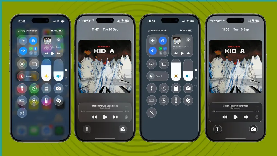
  4. Then toggle on ‘Increase Contrast’
HXe8wbwjQT9higj3E3k35P-970-80.jpg.webp


Regular Liquid Glass interface (left) vs Increase Contrast (right) (Image credit: Future)

Option 2:
  1. Open the Settings app on your iPhone
  2. Go to Accessibility
  3. Tap ‘Display & Text Size’
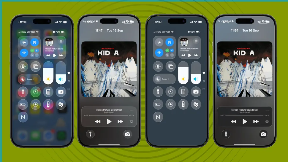
  4. Then toggle on ‘Reduce Transparency’
ehLt2SaNBgUUjCnx6rGriL-970-80.jpg.webp

Regular Liquid Glass interface (left) vs Reduce Transparency (right) (Image credit: Future)

source: https://www.techradar.com/phones/io...os-26-heres-how-to-make-it-easier-on-the-eyes
 
I called Apple and they said no, it isn't possible. He said he would certainly forward my feedback to the relevant team but if this didn't come up in Beta testing I am astounded...yet they chose to continue without a "turn this **** off" button.
 
Thank you for the tips above. 🙂

I have poor eye sight and the reduced contrast makes app icons much harder to see.
Settings icon is like a grey blur.

You’d think Apple would have found this in testing.

My advice is at this stage iOS 26 is not recommended for older folk or with poor eye sight.
 
To me this reminds me of Microsoft and Vista with some of their UI fails. Like they are so big now that they just have teams doing stuff nobody needs and then they thing given the sunk costs they need to roll it out.
Maybe it is an inevitable result in any company of that size.

I ran with transparency off for a bit but its really just a crutch that just looks worse than before. Liquid glass "normal" is just really not a great design language. The worst of it is the notification screen which coincidentally is the one I look at the most (how did they not fix that in beta, I guess we have to use the "correct" background picture now to make it work). They hopefully will bin it and go back to where they were.
I loved googles Material design and a lot of design changes with modern clean looks but this just goes back to let's do something anything at all to make it different.
 
  • Like
Reactions: August West
To me this reminds me of Microsoft and Vista with some of their UI fails. Like they are so big now that they just have teams doing stuff nobody needs and then they thing given the sunk costs they need to roll it out.
Maybe it is an inevitable result in any company of that size.

I ran with transparency off for a bit but its really just a crutch that just looks worse than before. Liquid glass "normal" is just really not a great design language. The worst of it is the notification screen which coincidentally is the one I look at the most (how did they not fix that in beta, I guess we have to use the "correct" background picture now to make it work). They hopefully will bin it and go back to where they were.
I loved googles Material design and a lot of design changes with modern clean looks but this just goes back to let's do something anything at all to make it different.
My eyes aren’t the greatest and with transparency off it looks like iOS 18.
 
  • Like
Reactions: sc00b4s7eve
My eyes aren’t the greatest and with transparency off it looks like iOS 18.
To me it look slike a less polished 18. Just a fair few elements that just look worse. Bearable but still bad and unpolished. The'd also loose those rings around every element and made them proper flat again it would look a lot improved. That is litterally one uneven line of pixels. If they just removed it, would look less like something is wrong with the elements and actually like it should be the way it is.
My eyes still good (thankfully) but therefore to me it looks like it's some knockoff that they didn't quite complete, just made it bearable but not actually clean.
 
  • Like
Reactions: I7guy
Register on MacRumors! This sidebar will go away, and you'll see fewer ads.