Become a MacRumors Supporter for $50/year with no ads, ability to filter front page stories, and private forums.
Yes, I really do need to use whatever icons I want. I don't need Teh Steve or anyone else telling me how to use my computer. Allowing for custom icons would not add noticeable space to the 10.7 installer. I want to use my own icons. Ubuntu has had the functionality of adding custom system icons sets since forever and their installer fits on a CD.

Makes no sense that Apple is making their OS LESS customizable, not more, like they should. :confused:


PS. I signed up to Macrumors just to reply to your asinine line of questioning. Aren't you special!

Asking someone if they really need colored sidebar icons is an asinine line of questioning in your world? Hmmmm

Doesn't seem that many people are bothered by it, very few people have replied to this thread.
 
I too do not like the new sidebar. In fact, given I don't currently need any of Lion's new features but would be bothered working with the new finder, I am not currently planning on upgrading.

I went through this same issue with Tiger to Leopard. I miss the ability to have an icon-only sidebar like found in Tiger. When Leopard came out I did not upgrade, and ended up not needing to upgrade, until Snow Leopard came out.
 
I run my business from my macs. I have numerous folders in the side bar for various customers, projects, invoices, quotations, etc. Having all grey just slows me down and annoys me. So I'm using Snow Leopard again. Keeping Lion on a spare hard drive to see how it pans out. It is not used other than for evaluation.
 
Now I have drive icons Stealth upgrades?

In additions to the shading of the icons in Favorites, the icons that were next to my internal drive, external drives, and CD drive are gone too. While they could duplicate they were different enough to make finding the right drive a lot easier.

I want them back and I want them in color.

I just went through a scary experience. System failed to recognize a portable drive that had been incorrectly removed from a Windows machine and the machine locked up. I did a restart and got a white screen for over 5 minutes. I did an unplug and restart and got the same. I did an unplug for 15 minutes and finally got a boot up after at least 3 minutes. I was almost ready to pack up the machine and bring it to Apple.

Anyway now I have icons next to my drives (Devices) but they are still not color. Does apple do stealth upgrades? Seems mysterious to me.
 
Does anyone know how to get rid of the silhouetted icons in the sidebar of the Finder. Replacing them with the colour version? I can see the colour version when I right click the icon and click 'get info' - however there's no option to switch the finder side bar icon... grrr.... Can you help?

I don't understand why Apple would use silhouettes of the icons here and then not follow the same standard throughout the Finder... Where's the consistency?

Any help would be appreciated!

:cool:

I got so annoyed by this that I filed a bug report. :mad:
If enough people file a bug report, then maybe we get our colors back.

Edit:
Filed two more reports:
One on the icons of custom folders in the sidebar (it defaults to a standard folder).
One on the order of the groups in the sidebar. I prefer Devices as the first group, like in snow leopard. Each to his own, I guess, but why isn't this a user option in the first place?

Also, can I please have aqua back? This monochrome stuff is annoying. :mad:

This is the first Mac OS X system I dislike. It feels more like a step backwards than forwards. Perfectly functional features (spaces for example) have turned into crap.
The animations are slower, booting and shutdown are slower.
Launchpad would be useful if it had keyboard navigation.
 
Last edited:
I got so annoyed by this that I filed a bug report. :mad:
If enough people file a bug report, then maybe we get our colors back.

Edit:
Filed two more reports:
One on the icons of custom folders in the sidebar (it defaults to a standard folder).
One on the order of the groups in the sidebar. I prefer Devices as the first group, like in snow leopard. Each to his own, I guess, but why isn't this a user option in the first place?

Also, can I please have aqua back? This monochrome stuff is annoying. :mad:

This is the first Mac OS X system I dislike. It feels more like a step backwards than forwards. Perfectly functional features (spaces for example) have turned into crap.
The animations are slower, booting and shutdown are slower.
Launchpad would be useful if it had keyboard navigation.

About the colors, I think we just have to get used to it. Its their design decision to move the focus away from non-content.

About launchpad, after i tried to organize it, i have actually started to use it, since i have so many apps i use frequently, that the app's folder in dock becomes too big. Usually I have a huge dock because of this, but with launchpad, i can keep it nice and simple.

Slowdowns, i guess we have to wait for .1, .2, or some other patch.
 
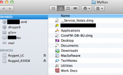
A workaround, at least

Have a look at the following - which is meant to be something a little more livable (from my perspective at least). Not perfect, but another way of dealing with the horribly uninspiring monochrome Finder sidebar:

http://www.coresolutiongroup.com/wordpress/?p=115
 

Attachments

  • MyNav.png
    MyNav.png
    66.6 KB · Views: 247
This move from Apple is beyond stupid. It's not about aesthetics (although even from that standpoint it is a step backwards), but as others have said, it's all about functionality. It's hard to tell grey icons apart. I actually have to read what they are. Previously a quick glance was enough.

I frankly hate just about every interface change they did to Lion. That cheap dashboard background (yes I know how to get rid of it), those boxy buttons - it all looks like a tastelessly modified Windows. I use OSX since 10.1 and this is the first version which disappoints (as far as aesthetics go).
 
the lack of color in the icons negatively impacts function

The same change in itunes made me hunt down a workaround to get the color icons back. I absolutely hate the lack of color. With color (and custom icons) I wouldn't have to read the text to pick the correct folder/item. Now with gray nearly indistinguishable icons it take time to find the correct icon.

It's not an issue of storage space. Why not make the dock icons gray as well? At least give me the option to add in custom icons if I so desired. For a company that prides itself on usability and great design it's mind-numbingly stupid decision.

The color vampire at Apple must die.
 
I have to agree, grey icons are a lot harder to use.

There is a reason good maps are in colors and not shades of gray. Color helps you filter information automatically.
 
I would also like to voice in favor of the colored icons. They were cool and represented the attention to detail I have come to expect in the Mac OS.
I also agree that the " do you really need it" comments are better served on a Microsoft forum.
What will go next........... anyway who asked for the OS to be smaller I wonder. With ever increasing hard drive capacities. I'm not saying the space doesn't matter at all but if this was done just to save space and maybe bump up performance I'd rather take the hit on that front.
Maybe next they'll remove the pictures of the printers from the print and scan interface, I mean do we REALLY need them, think of the space it will save.....I'm almost giddy with excitement.
Lets have our detail back guys.....please
 
I got so annoyed by this that I filed a bug report. :mad:
If enough people file a bug report, then maybe we get our colors back.

Edit:
Filed two more reports:
One on the icons of custom folders in the sidebar (it defaults to a standard folder).
One on the order of the groups in the sidebar. I prefer Devices as the first group, like in snow leopard. Each to his own, I guess, but why isn't this a user option in the first place?

According to apple, inability to change the order of categories is a known issue.
Custom folders in the sidebar that show a standard folder instead of a custom icon behave as intended. Another (small) feature from snow leopard that is lost. :rolleyes:
 
More than a Small Issue to Me

I just thought I'd weigh in here, even though I have absolutely nothing constructive to offer to the issue.
I too find that I'm wasting time and hitting stumbling blocks in productivity when I have to stop and READ the ********** sidebar. You'll be humming along doing work and then suddenly, the needle scrapes across the record when you have to stop and think about HOW to get to a file. It's the most annoying Apple issue that I have ever experienced.
One of the reasons i drank the Apple Koolaid was because they had people who were geniuses with usability. They were geniuses because they not only produced superior interfaces that were simple, usable (and worked), but they were also elegant. The genius in that is that they produced both, simultaneously.
This latest decision departs from usability. Apple seems to be allowing elegance to win over practicality. The true beauty of an interface and a product of any kind, is when the designer can produce art that is BOTH those things.
I suppose it was a matter of time before Apple's quality began to diminish. Is this decision on their part a first symptom of what is to follow?
I hope Apple's paying attention to this.
 
Count me in

Yes. I do.
I really do too, yes. Is faster to distinguish icons for shape AND color than for shape alone, all those folders look all the same.
And BTW, why oh why they didn't make the categories moveable?! I prefer the drives on top!
And what happened to the remote drive?
Good grief
 
I agree, color makes it faster.
My biggest complaint on OSX in general is how drab and boring it looks, ok its down right ugly. But it works and that more important. But sure would be nice to have both.
 
And BTW, why oh why they didn't make the categories moveable?!

I filed this as a bug report (others did as well, apparently). Anyway, Apple has acknowledged this as a bug. So, hopefully this will be fixed soon.

Can't we start a website/petition/whatever on getting some color back into the OS?

As Jazwire said, Lion is just plain ugly.
 
The Lion and iTunes gray sidebar makes me think if the new iOS5 Settings icons will be the same... Hope not (knocking on wood) :rolleyes:
 
Asking someone if they really need colored sidebar icons is an asinine line of questioning in your world? Hmmmm

Doesn't seem that many people are bothered by it, very few people have replied to this thread.

Well, it's 2011 and you argue that "cutting alot of fat in Lion" was the cause of the monochrome icons... If cutting a few colors in icon palettes would ever be part of Apple's fat-cutting measures in Lion I would have to question their ability.

It was a design decision. A decision I don't agree with. We now have a row of samey looking icons leading to and representing very different places.

Having an extra visual aid is a good thing; the more unique characteristics you tie to a concept, the more likely it is for that concept to be instantly recognized. The more complex an interface gets any visual aid needs to be considered more carefully.

Are you for example absolutely certain that you would instantly recognize a :)-smiley on this forum if it one day suddenly became red, as the :mad:-smiley? If no, well...
 
Well, it's 2011 and you argue that "cutting alot of fat in Lion" was the cause of the monochrome icons... If cutting a few colors in icon palettes would ever be part of Apple's fat-cutting measures in Lion I would have to question their ability.

One thing's for sure, they didn't do it to cut any fat. The sidebar programmatically grays out images, which is why 3rd party tools don't work.

I have reported it as mind-blowingly stupid, here: http://www.apple.com/feedback/macosx.html

In Snow Leopard, and before, I would never think about the sidebar - it contained frequently used folders, and that was that. Now I have to go through it very carefully to find anything. Which kind of defeats the purpose of having a list of frequently used folders.

I guess I'll have to find some other way to do this now.
 
Just FYI...

This "cutting the fat" nonsense is complete ********.

You know why?

Because the original icons are still there. Don't believe me? Go check the Finders "Go" menu. There they are, all the old colored icons, precisely as they were before.

For reference, the icons are not generated programatically. They are stored at the following location:

/System/Library/CoreServices/CoreTypes.bundle/Contents/Resources

The original icons are prefixed with "Toolbar". The new icons are prefixed with something else (can't remember- I went back to 10.6 myself). Nevertheless, they are contained in CoreTypes.bundle as a totally separate set of icns files.

So this trimming-the-fat theory? ******** folks. If that were true, they wouldn't have bothered to /include/ a new set of icons, while /keeping/ the old ones around. If anything, this change added a few kB of additional icns files to the system. Nothing was trimmed out in this regard.

-SC
 
Hi,
I am not so worried about Finder sidebar icons, even though I can understand how something that u love is taken away from you for no obvious reason and it drives you mad every time that you look at it. What drives me mad is that the Finder dock icon, no matter what u do to it, stays blue. Have LiteIcon, tried manually - STAYS BLUE! Now u can imagine that in a black and red environment (including wallpaper). This is the only icon in the whole MAC that won't budge. Anyone knows any solution?
 
Wirelessly posted (Mozilla/5.0 (iPhone; U; CPU iPhone OS 4_3_3 like Mac OS X; en-us) AppleWebKit/533.17.9 (KHTML, like Gecko) Version/5.0.2 Mobile/8J2 Safari/6533.18.5)


For all the people that are saying "who cares if the side bar has color" and "do you really need it".

I would say that having a little color associated with an icon or folder makes it's much quicker to hone in on its location among the other icons or folders that surround it.

To me - no difference. The memory is in your hand, you don't need colour same way you don't need to look at you keyboard while typing.
 
Register on MacRumors! This sidebar will go away, and you'll see fewer ads.