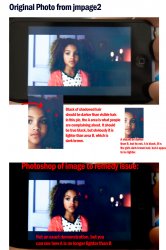
I took this photo from jmpage2's thread here ( https://forums.macrumors.com/threads/355025/ )
I felt his pics showed quite clearly the problem that I (and others) have noticed. At least for my touch. I chose an image that best reflected what I was seeing on my unit as well.
All I want people to look at is the A and B area on the girls hair. That is a perfect example of the issue. The A area should be black, the B area is supposed to be lighter. As you can see, everything renders pretty normal EXCEPT for the BLACK blacks, which appear LIGHTER than their surroundings.
This effect can be more or less pronounced depending on the scene you are viewing. I chose this photo because it was a pretty mid-range example.
Also, I used some tools in photoshop to adjust the image in the bottom a little bit. Was just trying to get the A area darker than the B area.
Anyways, for anyone confused, or for anyone looking for proof, just look at the A area and the B area. A is black. B is brown. A should be darker. It isn't.


