Become a MacRumors Supporter for $50/year with no ads, ability to filter front page stories, and private forums.

MacRumors

macrumors bot
Original poster


The macOS Tahoe 26.4 and iPadOS 26.4 betas that Apple released today reintroduce a compact Safari Tab Bar option for those who prefer that view option.

macos-tahoe-26-4-compact.jpg

Apple removed the compact tab bar option with the launch of macOS Tahoe and iPadOS 26, but there were Mac and iPad users who missed it.

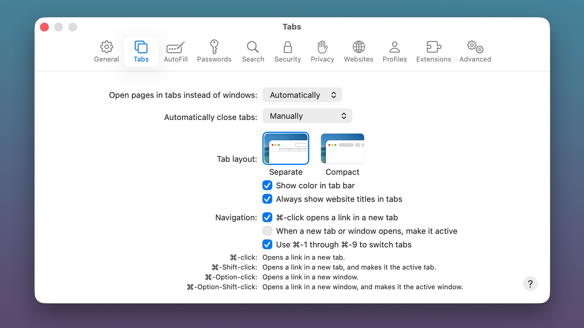
The Safari app on Mac and the Safari section of the Settings app on iPad both now feature an option to toggle on the Compact Tab Bar as an alternative to the standard Separate Tab Bar.

macOS Tahoe 26.4 and iPadOS 26.4 are limited to developers right now, but Apple should release public betas soon. The software is expected to launch in the spring.

Article Link: Compact Safari Tab Bar Returns in macOS Tahoe 26.4 and iPadOS 26.4
 
Last edited:
No joke, this was actually the biggest reason i never "upgraded" to Tahoe. Still on macOS 15.7.4 on both my M1 Pro MBP and M4 Mac Mini

Only thing left is bringing back Launchpad and implementing the previous macOS design without liquid glass (dont mind it on iOS but it looks so cartoony on macOS. hopefully macOS 27 reels the design back in)
 
What I actually want is true vertical tabs. The sidebar almost does it, except it doesn’t hide the horizontal tab bar when it’s open. I guess this might be close enough, but I’d rather just have the usual controls without the redundant tabs taking up precious vertical space
 
No joke, this was actually the biggest reason i never "upgraded" to Tahoe. Still on macOS 15.7.4 on both my M1 Pro MBP and M4 Mac Mini

Only thing left is bringing back Launchpad and implementing the previous macOS design without liquid glass (dont mind it on iOS but it looks so cartoony on macOS. hopefully macOS 27 reels the design back in)
I don’t think it needs to exactly be Launchpad, but something like it with persistent positioning and arbitrary grouping. Alphabetical with the fixed, self-assigned categories is no way to organize apps in a launcher.
 
I don’t think it needs to exactly be Launchpad, but something like it with persistent positioning and arbitrary grouping. Alphabetical with the fixed, self-assigned categories is no way to organize apps in a launcher.
Couldn't you accomplish the same thing by just sorting your Applications folder into whatever sort order and folders/groups you wanted? (Or creating a folder of aliases from the contents of your Applications folder).
 
No joke, this was actually the biggest reason i never "upgraded" to Tahoe. Still on macOS 15.7.4 on both my M1 Pro MBP and M4 Mac Mini

Only thing left is bringing back Launchpad and implementing the previous macOS design without liquid glass (dont mind it on iOS but it looks so cartoony on macOS. hopefully macOS 27 reels the design back in)

There are alternative apps for Launchpad, the first ones appeared when 26.0 still had been in beta. I only tried three of them in an early stage, now there are more and better ones. Some are free, some not.

But I don't really need it. I always liked the Applications and Utilities folders with grid view in my Dock more.
 
What I actually want is true vertical tabs. The sidebar almost does it, except it doesn’t hide the horizontal tab bar when it’s open. I guess this might be close enough, but I’d rather just have the usual controls without the redundant tabs taking up precious vertical space

I agree. I’m about to switch from a Windows PC to a Mac (a MacBook Pro). I’ve watched a lot of YouTube videos about MacOS to prepare myself and I think that the thing that’s going to bug me most is the lack of proper vertical tabs in Safari.

I always prefer to use built in apps if they are good enough and IMO Microsoft Edge does vertical tabs really well. Like you say, Safari’s sidebar is almost there, but as well as the issue you highlight (not being able to hide the horizontal tab bar) as far as I can tell it also doesn’t have the feature that Edge has where the sidebar (vertical tab bar) can be set to icon only so it only takes up a tiny bit of space on the left of the browser window but when you move the mouse pointer over it, it expands so that you can see the first part of the URLs for each tab. That setup works perfectly for me because I can mostly tell what the open tabs are just from the favicons visible when the sidebar is collapsed but when I mouse over to it to actually switch to a different tab I can see the actual URL to be sure I am switching to the tab I want. I really wish that Safari would implement that feature for its sidebar.
 
What I actually want is true vertical tabs. The sidebar almost does it, except it doesn’t hide the horizontal tab bar when it’s open. I guess this might be close enough, but I’d rather just have the usual controls without the redundant tabs taking up precious vertical space
While I can understand tab hoarding, I gag and recoil when it’s with horizontal tabs. No wonder you don’t know where you left off, when all you have are hundreds of tiny slices or favicons to navigate.
 
Register on MacRumors! This sidebar will go away, and you'll see fewer ads.