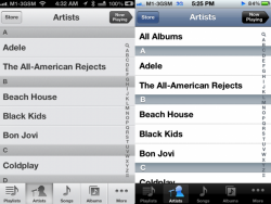
The new grey-on-grey version on the left (IOS6) seems designed to make the music lists difficult to read. There is hardly any contrast between the typography and the background, which is a serious issue on a small screen like an iPhone.
Whereas the old version on the right is clean, clear and easy to read - especially when on the move, or if your eyes aren't perfect.
I doubt that Steve Jobs would have allowed this basic design error to have occurred. He wanted things to be simple to use - which included making text easier to READ - not harder.
Please fix this issue Apple - ASAP.
Attachments
Last edited: