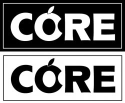
Competion closed: Need a logo, best wins an ipod video!

Status
Not open for further replies.
This thread is being observed by a number of people, I'm working with the OP to ensure that it comes to a satisfactory conclusion, and requests to clarify rules by the OP have been observed. It's not no-spec work, it's a competition with a prize and anyone is free to donate or withhold labour, as I have done.

Comments on this matter have been noted and two moderators have requested that this issue is not discussed further in this thread.

If anyone feels strongly about the overall issue of no-spec work, please start another thread. Thanks. :)
 
Post images of designs?

Sorry if the answer to this question seems obvious to most, but I'm new to posting to this forum...

Andrew, do you want design images posted directly to this forum for all to see (as I've seen anim8or did already, or would you rather have them sent to you first in some other fashion? (In fact, I've sent mine to you another way, but I just thought others might benefit from knowing what you prefer.)

Thanks!

MDARFUS
 
^^^
There are many advantages to submitting them to this forum as I've stated before - 1) proof you've submitted something. 2) so others won't submit the same logo or idea over and over again.

But, ultimately this isn't my contest.
 
Sorry if the answer to this question seems obvious to most, but I'm new to posting to this forum...

Andrew, do you want design images posted directly to this forum for all to see (as I've seen anim8or did already, or would you rather have them sent to you first in some other fashion? (In fact, I've sent mine to you another way, but I just thought others might benefit from knowing what you prefer.)

Thanks!

MDARFUS

Hi

hsotnicaM is right. It would be best if the designs are posted on this thread. But thanks for the submission, I have added it to the flickr page.

Andrew
 
Also a little late to the party.

If interested, I can design all the related swag - business cards, etc etc.

coredelia.jpg


core.jpg


EDIT: I remember an icon would be needed, so I whipped up an Aqua-esqe icon, and slapped it on a folder on my desktop:

coreicon.png
 
Thanks.. Here's mine

Andrew,

Thanks for the feedback... I'll just join the "party" and post my idea to the forum directly. By posted image has two versions, one reversed, one not, I think that's obvious. :)

This is turning out to be quite a telented crowd, so whichever you ultimately pick, you're sure to have a great looking corporate identity! Good luck to all!

Warm Regards,

MDarfus
 

Attachments

  • CORE_logo_MDARFUS.jpg
    CORE_logo_MDARFUS.jpg
    101.5 KB · Views: 99
someone above mentioned designing out the logo as 'coredelia'.
I'm not sure if the original poster had asked for this (I don't believe he did) but just in case I've designed it out below, and of course thrown in the obligatory 'reflective' version of the core logo -- I think the whole 'reflective' logo is way, way overused but what the heck :) - as long as one keeps in mind that the logo should work well on it's own without the reflection.

coredelia.jpg

Although it is a great trendy design, I feel that this design is a little organic or feminine looking. It might just be me, but I think this would make a great logo for a shopping mall clothing type company. It is really great work, but I'm not so sure I get technology or computers out of it.
 
Although it is a great trendy design, I feel that this design is a little organic or feminine looking. It might just be me, but I think this would make a great logo for a shopping mall clothing type company. It is really great work, but I'm not so sure I get technology or computers out of it.

That's a very valid point and I appreciate you making it. At the same time I purposefully chose a more 'organic' feel to it as Apple tends to market their hardware / software as much more of a lifestyle than technology product. Their campaigns aren't about Gigahertz, Megabytes, etc but rather about how a product will fit and enhance your life, how easy it is to use, etc.

Anyways, thanks for the feedback - I'm always open to feedback whether positive or negative as in the end I think it either results in a better design or at the very least gives me something to consider and think about.
 
okay.. same logo as before.. just now with a leopard feel placed on a black background. the typeface, although not a font, (i created as shapes) is based on apples old logo linky

I also think this one works well. Clean and simple and has a definite computer/media feel to it. Nicely done.
 
That's a very valid point and I appreciate you making it. At the same time I purposefully chose a more 'organic' feel to it as Apple tends to market their hardware / software as much more of a lifestyle than technology product. Their campaigns aren't about Gigahertz, Megabytes, etc but rather about how a product will fit and enhance your life, how easy it is to use, etc.

Anyways, thanks for the feedback - I'm always open to feedback whether positive or negative as in the end I think it either results in a better design or at the very least gives me something to consider and think about.

I guess my challenge with it is Apple will change their 'organic' feel at some point and where does that leave Andy? It's trendy now, but in 10 years? Don't get me wrong, it's a nice logo, but I'm not sure I agree with your logic.
 
That's a very valid point and I appreciate you making it. At the same time I purposefully chose a more 'organic' feel to it as Apple tends to market their hardware / software as much more of a lifestyle than technology product. Their campaigns aren't about Gigahertz, Megabytes, etc but rather about how a product will fit and enhance your life, how easy it is to use, etc.

Anyways, thanks for the feedback - I'm always open to feedback whether positive or negative as in the end I think it either results in a better design or at the very least gives me something to consider and think about.

Those are good points. I think it ultimately depends on what sort or image or feel the client is trying to acheive. Lifestyle?, Technology?, A strong association with the Apple brand? I do think it's great that you took a creative and unique approach.
 
I guess my challenge with it is Apple will change their 'organic' feel at some point and where does that leave Andy? It's trendy now, but in 10 years? Don't get me wrong, it's a nice logo, but I'm not sure I agree with your logic.

Good point.
I guess as long as I have known apple they have always been 'lifestyle' company so that's the basis for my reasoning. Even back in the first MacIntosh days they were all about ease of use and not overly "techy". Can't see them changing into a 'Dell' type of company that promotes 'computer specs' anytime soon.
I still think that most people that would go into "Core" the Apple Computer Store would go there to find 'lifestyle' type of products (iPods, iPhone, Macbook with iLife) and not 'spec out' a new system. Not everyone mind you ... but most. And really from a marketing perspective that's who you want to target in numbers - including 'the switchers' who are looking for that 'plug in your digital camera and it just works' experience. I just think it's important to consider target audience as much, if not more than the inventory you carry ... you gotta get people in to your store first before they buy anything.
Could be wrong though :)
 
ok...my final attempt

ok, here is my final attempt. watching everyone strugle with making the "o" look like an apple and not an orange...i tried the "c". and since the name is "core", it actually makes sence for it to be an apple cut in half exposing the "core". anyway, still tired, but this is making more sense. ( reformatting mbp all night..woohoo!!! )


-JE

well, just fixed the "R", because it looked funny.
 

Attachments

  • core3.jpg
    core3.jpg
    59.9 KB · Views: 102
Good point.
I guess as long as I have known apple they have always been 'lifestyle' company so that's the basis for my reasoning. Even back in the first MacIntosh days they were all about ease of use and not overly "techy". Can't see them changing into a 'Dell' type of company that promotes 'computer specs' anytime soon.
I still think that most people that would go into "Core" the Apple Computer Store would go there to find 'lifestyle' type of products (iPods, iPhone, Macbook with iLife) and not 'spec out' a new system. Not everyone mind you ... but most. And really from a marketing perspective that's who you want to target in numbers - including 'the switchers' who are looking for that 'plug in your digital camera and it just works' experience. I just think it's important to consider target audience as much, if not more than the inventory you carry ... you gotta get people in to your store first before they buy anything.
Could be wrong though :)

True, but one could argue that Andy needs an identity of his own. Although he sells Apple products, it may not be in his best interest to market his store in the exact same way Apple does. I think of a reputable preowned car dealership...they may sell Honda's but do they position their company or brand to the market in the same way Honda does? Not likely, they want to have an identity of their own that is not easily confused with Honda but associated with it. I know, it is a very fine line between associating your image with what you are selling without trying to imitate or duplicate that brand image.

In terms of marketing trends, I don't think any trend is ever a "safe" bet. True, Apple will probably never position itself in the exact same manner as Dell, but it will eventually take a different direction. When, no one knows, 5, 10, 15 years.

There are a lot of big name companies that have changed their marketing direction over the years - McDonalds was all about kids and fun when I was younger, Ronald McDonald, Grimice, Hamburgler and the likes, today - kids probably do not even know who those characters are. They have now positioned themselves to Adults with competitive pricing and value menus etc. Sears used to be known for their hardware and tools - now their marketing has switched the focus to Women "Come see the softer side of sears" etc. Anyways, not to ramble , I just enjoy discussing marketing and advertisng in general. My point to all of this is that it would perhpas be beneficial for Andy to have his own identity and marketing strategy that is associated or a reflection of Apple but not so close that if Apple were to change their image, that he would need to follow suite.

All good points .... I guess in the end Andy's store could re-brand if the marketing strategy of Apple changes significantly --- and if that turned out to be true, Apple would probably re-brand too :)
Right now "Core" is an Apple store (or will be one), and wants to be recognized as an Apple store so a tie-in to Apple is of benefit. If that changed, I think no matter what logo was chosen, it would be wise at that point to revisit the branding issue either way.

It's a balance between being prepared for any eventuality, and just staking a claim right now to a brand/feel and championing it . I personally like the latter as it allows you to have a stronger brand personality, and just live with the fact there there is that risk of Apple changing their marketing in the future. I think the risk is low.

I've worked with clients who were more conservative and preferred a safer brand, and I've also worked with clients who are adventurous with their brand and take risks. Really there is no 'right or wrong' in all this. Just a matter of client and brand personality.

Absolutely.
 
I for one am relieved to see there are other marketing people submitting ideas not just iPod wannabe owners. Very nice thoughts and designs. Back to our regularly scheduled contest...
 
Heres my attempt

Hi,

Finally a registered member! Thought I'll join the fun and post two designs. They are basically the same design with different color arrangements. My friend couldn't tell what the logos spell..but yes they spell CORE. Thanks:)
 

Attachments

  • LOGO.pdf
    9.9 KB · Views: 144
Here's my lil submission, done on the train home form work :eek:

Just as a helpful hint, if you're going to be using it as a logo for embroiding/silk screening on shirts, it needs to be fairly basic otherwise the costs will be through the roof. Found from personal experience that any more than 2-3 colors costs a bucket load!
 

Attachments

  • core.gif
    core.gif
    5.5 KB · Views: 106
^^^^
I like the concept. My only suggestion would be to fill the O with a color with no outline. This would give more of an appearing of a CORE.
 
^^^^
I like the concept. My only suggestion would be to fill the O with a color with no outline. This would give more of an appearing of a CORE.

Thanks! Well here are some more variations of it for everyone's scrutiny!
 

Attachments

  • core4.gif
    core4.gif
    5.4 KB · Views: 101
  • core3.gif
    core3.gif
    5.6 KB · Views: 102
  • core2.gif
    core2.gif
    5.2 KB · Views: 109
  • core1.gif
    core1.gif
    5.3 KB · Views: 107
  • core5.gif
    core5.gif
    5.8 KB · Views: 116
Status
Not open for further replies.
Register on MacRumors! This sidebar will go away, and you'll see fewer ads.
Back
Top