Become a MacRumors Supporter for $50/year with no ads, ability to filter front page stories, and private forums.

anti-microsoft

macrumors 68000
Original poster
Dec 15, 2006
1,665
6
Edinburgh, Scotland
Hi all,

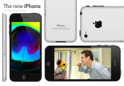
Based on the recent information published by iLounge and the recently posted concept by a forum user at The Verge, I decided to create these images to further illustrate the size of an iPhone with a larger screen and aluminium back.

I am aware that for such a design to work there would need to be an area designated for the antennae but I decided to not add that this particular detail to the design. I might add alterations further on.

Hope you enjoy.

PS: I had originally prepared high resolution images but for some reason Photoshop is exporting them with a stretched aspect ratio. That's why I only have these low resolution screen caps to show you. If anyone knows a solution to the problem I would really appreciate it.
 

Attachments

  • Screen shot 2012-05-06 at 15.48.29.png
    Screen shot 2012-05-06 at 15.48.29.png
    484.9 KB · Views: 510
  • Screen shot 2012-05-06 at 15.48.04.png
    Screen shot 2012-05-06 at 15.48.04.png
    584.1 KB · Views: 494
The unibody design looks nice but is electrically impossible; antennas cannot radiate through metal, and the case could not provide the function of a properly tuned antenna or multiple antennas without at least being segmented.

A display of 1152 x 640 would be wider than 16:9, I doubt Apple would create such a display.
I think 1138 x 640 is more likely for the following reasons:
the ratio is 16:9
there is enough room for an additional row of icons
the display size is 3.96"
the "forehead" and "chin" dimensions can remain the same as other iPhones.
 

Attachments

  • iphone 5 tall.png
    iphone 5 tall.png
    906.9 KB · Views: 167
The unibody design looks nice but is electrically impossible; antennas cannot radiate through metal, and the case could not provide the function of a properly tuned antenna or multiple antennas without at least being segmented.

A display of 1152 x 640 would be wider than 16:9, I doubt Apple would create such a display.
I think 1138 x 640 is more likely for the following reasons:
the ratio is 16:9
there is enough room for an additional row of icons
the display size is 3.96"
the "forehead" and "chin" dimensions can remain the same as other iPhones.

I mentioned the limitations of the design in the original post. Good points you have there regarding screen size and forehead and chin dimensions. I chose to use the 1152 px vertical dimension since it was used by Timothy Collins, the user on The Verge, but the dimensions you mention make more sense.
 
Great mockup. Reminds me of how the iPad looks and I would love the look of an iPad only smaller in a phone for factor. I agree with MacAgnostic, the 16x9 would make more sense than what the user on the Verge said.
 
great work on the mock up. I hope the back turns out to look a lot like this, and brings back the slightly curved back of the 3GS.
 
Great mockup. Reminds me of how the iPad looks and I would love the look of an iPad only smaller in a phone for factor. I agree with MacAgnostic, the 16x9 would make more sense than what the user on the Verge said.

Plus, from a marketing perspective Apple could still say it's a 4" screen. They do it with the iPad: it's screen is a 9.7" but they still say in their presentations that it is a 10". So from 3.99" to 3.96" is not going to make a huge difference in that respect.
 
Looks good but I hope Apples makes it a bit wider and taller instead of just a taller design.
 
Pictures taken with the built in camera would look bad, with two huge black bars when landscape mode

That's funny, I've never been bothered by these two black bars on the sides of my photos:

edges.jpg


You're saying that a different amount of black bars on either edge is going to really make all the difference? I'll also point out that I am not bothered by the black bars on the tops and bottom of the screen when shooting video.
 
Nice work. I like the unibody look, and it looks much more comfortable to hold than the current design.

As for signal problems, what about making the Apple logo larger, and made of a radio transparent material so that the transmissions pass through it?
 
Aerial difficulties with the aluminium backing

Ahh I've just had an idea...

I know this is radical but I know one place on the back that isn't aluminium - The Apple Logo! Could they stuff the aerial behind there?

Problem solved?

EDIT - O someone beat me to it - but the point is a good one.
 
That's funny, I've never been bothered by these two black bars on the sides of my photos:

Image

You're saying that a different amount of black bars on either edge is going to really make all the difference? I'll also point out that I am not bothered by the black bars on the tops and bottom of the screen when shooting video.

That's a lot of black bars or missing picture if zooming in…


Maybe they go the 16:9 route for taking pictures, who knows...
 
I too am not completely convinced on the “tall” screen. The thing is, I’m not completely convinced on a larger screen with the same aspect ratio and resolution either.

Apple would have to change the UI Guideline for iOS since buttons and icons and touch elements would be physically larger. I also don’t see what other advantage this brings apart from a new “spec” to market the newer iPhone. Sure, you’d get larger text that’s easier to read, but apart from that I don’t see any other advantage.

With a taller 4" screen, on the other hand, you would have an optimised aspect ratio for viewing and shooting HD video, more screen space both physically and in pixels, more space for apps on the homescreen, etc.

I think that Apple has enough resources, common sense and sense for “what is right” to make the appropriate decision.

----------

That's a lot of black bars or missing picture if zooming in…

Maybe they go the 16:9 route for taking pictures, who knows...

You have to take into account that the camera interface has a "taskbar/actionbar/whateveryouwanttocallitbar" at the bottom so that could fill the black space at the bottom. Maybe they'll add another "bar" at the top to fill in the black space at the top. They could house the grid, HDR, Flash, Camera-switch options there.
 
I thought the taller 4" design would actually look decent and work, but after looking at the concept art i'm not too sure about it. It kinda looks funky, and not in a good way. They definitely need to adjust the width and make it slightly wider.
 
Register on MacRumors! This sidebar will go away, and you'll see fewer ads.