Become a MacRumors Supporter for $50/year with no ads, ability to filter front page stories, and private forums.

Darkroom

Guest
Original poster
Dec 15, 2006
2,445
0
Montréal, Canada
hi there... i just spend a large part of last year redesigning a board game in Illustrator. i've created the work in CMYK, but i never proofed the images while i was working (oops...), so now when i display the work with proof colors, it's very light, especially the blacks, which are suppose to be rich.

i was never strong with color management and it always seems to get me after a project...

so, i just decided i'd convert everything to RGB from CMYK, but when i proof the RGB it is too dark (as opposed to CYMK being too light)...

ideally, i'd like to just send the .AI files and .PSD files to the printers and have them deal with it, but i'm not sure if they will be able to print exactly (or really close) to what i see unproofed on my screen...

i don't even know if they are going to print offset or not... it's a board game, so any ideas weather it should be in RGB or CMYK? and for whichever, can they handle making the print look like it will unproffed on my screen? isn't that what ripping is for? sorry, i'm really not strong at printing/color management.

any thoughs?
 

TimTheEnchanter

macrumors 6502a
Oct 24, 2004
732
1
Minneapolis, MN
Do you have or can you get a process tint book? You could ask the printer to borrow it before giving over the files. Since you've built it in Illustrator, I assume you're mainly using solid tints (don't post a pic of it for security reasons) so you can compare your CMYK make-up to that of the tint book. Personally, I'd stay in CMYK since that is your target color space. Rich blacks usually have 20-40% cyan (sometimes CMY together or variations) added to the 100% black. Switching to RGB will mess up the solid blacks, be careful. Your best bet is to calibrate, but if you can't, trust the numbers not the screen. You could try a sample test where you take some critical elements of the piece, step and repeat it a few times and make 5% darkening shifts progressively across the duplicates, then have a proof made from that test document. Choose the best shift and make it overall.

BTW, using the tint book is an old school method before cheap proofs and calibrated displays. Find the preferred tints you want in the book and set you colors to the breaks-down given in the book.
 

TimTheEnchanter

macrumors 6502a
Oct 24, 2004
732
1
Minneapolis, MN
and to answer your other questions...

I wouldn't trust nor assume the printer could make the adjustments without a long process. Reason is they have no idea what you want it to look like, so any adjustments will be a guess. It's best to hand them the files already on target.

Adjustments at rip will be for whichever press and paper it runs on and not the time to be guessing at the desired result.

You can get decent calibrators for under $100 that walk you through the process easily. It's not too late to calibrate and then adjust your art. You'll be much more at ease with the project doing so.

Good luck! :)
 

Darkroom

Guest
Original poster
Dec 15, 2006
2,445
0
Montréal, Canada
when i proof the colors on screen, it's not possible to make the black more rich or darker à la RGB mode... i suppose this is normal? in which case i should just leave everything alone?
 

AdeFowler

macrumors 68020
Aug 27, 2004
2,317
361
England
Create all your Illustrator work in CMYK.
Convert any raster images to CMYK in Photoshop, and embed a profile in the images (the Photoshop 5 colour space is good).
Set the same colour space in Illustrator.
Create a Rich Black swatch in Illustrator, using the same CMYK values as black in Photoshop. Replace any vector black in Illustrator with your new rich black.

Lastly insist on a colour proof from the printers.
 

TimTheEnchanter

macrumors 6502a
Oct 24, 2004
732
1
Minneapolis, MN
Working in RGB for CMYK can be deceiving if you're not experienced in proper conversion.

For an experiment, make a small RGB Photoshop document and fill it with pure RGB black then convert it to CMYK and look at the results. You don't have 100% K but you have a ton of CMY which is beyond ink limits on press. You'll get muddy soft-edge results using that conversion. Now make a CMYK doc, fill it with 100% K and convert to RGB and you'll see a weak black in RGB.

Stay working in CMYK since that is your target mode. There are too many color-shifts coming from RGB since it's a bigger color gamut.
 

Consultant

macrumors G5
Jun 27, 2007
13,314
34
You need to work in CMYK in most cases, unless it's going to be printed in a photo lab.

Fastest way is to bring your computer / screen to the printer or a real graphic designer, and have someone adjust the file on their calibrated screen. This will cost you some money.

Otherwise, get screen calibrator, learn about color spaces, and learn about printing on CMYK.
 

Darkroom

Guest
Original poster
Dec 15, 2006
2,445
0
Montréal, Canada
Create all your Illustrator work in CMYK.
Convert any raster images to CMYK in Photoshop, and embed a profile in the images (the Photoshop 5 colour space is good).
Set the same colour space in Illustrator.
Create a Rich Black swatch in Illustrator, using the same CMYK values as black in Photoshop. Replace any vector black in Illustrator with your new rich black.

Lastly insist on a colour proof from the printers.

thanks! you're post really helps... thanks again.
 

JasonElise1983

macrumors 6502a
Jun 2, 2003
584
0
Between a rock and a midget
Definately insist on a color proof from your printer!!! Also, if you are using the "Proof Color" in Illustrator...go into Proof setup and make sure you uncheck "Simulate Black Ink". I've never had good results with this. Always work in CMYK if that is the intended output. Also, Pantone books can be a life saver. I always work with Solid PMS colors for things like this and convert to CMYK later. Pantones Color Bridge is an amazing book to have on hand. As far as Rich Black...It's usually 1 of 2 setups...50-50-50-100 or 60-40-40-100. That should do it....also, i stress again...GET A PROOF FROM YOUR PRINTER!

-JE
 

andy.barron

macrumors 6502
Nov 30, 2006
441
0
Bedford, England
To get an accurate perception of what you will get from your file you will need a contract proof. In Europe this would be run through a tchr of Euro19 (basically a 19% increase at 50% on a Dupont digital cromalin for litho). Although the colour space of cmyk is subjective to the substrate, ink & more specific, the printer in question (but without a proper fingerprint it is impossible to accurately predict the output).
Your best bet is to obtain a proof (cost would usually be in the region of £50.00) that your selected printer can run to (I do not know the standard for Canada), that way you control the print run, as if they do not replicate the contract proof run to the profile they guarantee, you can reject the entire run to no cost to you.
Hope this of use.
 

Darkroom

Guest
Original poster
Dec 15, 2006
2,445
0
Montréal, Canada
Definately insist on a color proof from your printer!!! Also, if you are using the "Proof Color" in Illustrator...go into Proof setup and make sure you uncheck "Simulate Black Ink". I've never had good results with this. Always work in CMYK if that is the intended output. Also, Pantone books can be a life saver. I always work with Solid PMS colors for things like this and convert to CMYK later. Pantones Color Bridge is an amazing book to have on hand. As far as Rich Black...It's usually 1 of 2 setups...50-50-50-100 or 60-40-40-100. That should do it....also, i stress again...GET A PROOF FROM YOUR PRINTER!

-JE

thanks... "Simulate Black Ink" is checked by default for the default Working CMYK US Web Coated (SWOP) v2 profile and it was really messing with my mind...

i'm now curious weather this black ink simulation is really accurate or is it more likely that my blacks will actually be quite rich (as they appear in the soft-proof without black ink simulated)?
 

andy.barron

macrumors 6502
Nov 30, 2006
441
0
Bedford, England
cmyk ink has a colour limit (no more than...(dependant on printer) but usually no more than 260%), colour space has a gamut. Black as it is the most dense colour will overprint others in your file so will be rich. You will not be able to predict the output of your file without a proper contract proof to challenge the printer with should you be unhappy with the result.

Sorry if this is a rant, but printers will usually want to print job, take money & go home.
 

JasonElise1983

macrumors 6502a
Jun 2, 2003
584
0
Between a rock and a midget
andy.barron is dead on. That's exactly how printers are. Without a certified proof from them that you approve...if the color is wrong, it's your loss, not theirs. Trust me...i've seen it too many times. 260% is what i've always heard too, but digital presses can do more than that supposedly (they can also RIP RGB..WTF?), but i'm not going into that. Staying under 260% total will give you better results.

Also, back to the "Simulate Black Ink" selection. What i was saying earlier is that it's crap. It never looks right...make EVERYTHING dull for no reason and is just garbage. I've had numerous printers tell me to uncheck it and it used to not be checked by default (atleast not in Acrobat Pro), so unchecking that will give you closer results. Just remember that your screen will never look identical to a print unless you spend A TON of time and money profiling and calibrating you system to perfectly match the printer you are sending your files too and even then it will just be close. Print proofs yourself on printers you have access too. Find a good laser you can print too (maybe even go to a local print shop and get them to print you a SWOP certified proof) to see what it looks like. That will be a closer match than anything your screen can show you.

-JE
 

Darkroom

Guest
Original poster
Dec 15, 2006
2,445
0
Montréal, Canada
cmyk ink has a colour limit (no more than...(dependant on printer) but usually no more than 260%), colour space has a gamut. Black as it is the most dense colour will overprint others in your file so will be rich. You will not be able to predict the output of your file without a proper contract proof to challenge the printer with should you be unhappy with the result.

Sorry if this is a rant, but printers will usually want to print job, take money & go home.

what do you mean by 260%? i really have no idea what that means...

i'm from the RGB photo world, which i guess isn't so far from CMYK vector world... i actually had to look up what is a "contract proof"... i guess its the same thing as what i call a "test print", and yes i agree this is necessary... wouldn't want to have 3000 board games look bad... ouch.
 

andy.barron

macrumors 6502
Nov 30, 2006
441
0
Bedford, England
what do you mean by 260%? i really have no idea what that means...

i'm from the RGB photo world, which i guess isn't so far from CMYK vector world... i actually had to look up what is a "contract proof"... i guess its the same thing as what i call a "test print", and yes i agree this is necessary... wouldn't want to have 3000 board games look bad... ouch.

260% is the maximum amount of ink advised to be put to substrate to achieve a single colour (400% being the max as there is 4 colors in the process).

cmyk = vector?? OK RGB is what we all deal in, but real life & inks use cylinder to blanket process (offset) and it uses a different method, mode screening, resolution etc. ALL photos in litho use this method bar digital print (using linear) which is short run & expensive.

Don't let them bully you into not having what you what as a result, YOU ARE THE CUSTOMER. If you are not happy with what you get told, pull the run & go elsewhere.

Hope this helps & sorry for the rant!!:)
 

Darkroom

Guest
Original poster
Dec 15, 2006
2,445
0
Montréal, Canada
260% is the maximum amount of ink advised to be put to substrate to achieve a single colour (400% being the max as there is 4 colors in the process).

cmyk = vector?? OK RGB is what we all deal in, but real life & inks use cylinder to blanket process (offset) and it uses a different method, mode screening, resolution etc. ALL photos in litho use this method bar digital print (using linear) which is short run & expensive.

Don't let them bully you into not having what you what as a result, YOU ARE THE CUSTOMER. If you are not happy with what you get told, pull the run & go elsewhere.

Hope this helps & sorry for the rant!!:)

ok... so like 250% would be C: 50% Y: 50% M: 50% K:100% right? that's what i'm using to get the rich black... but what if i have some other crazy color that is C: 75% Y: 80% M: 90% K:85% (or whatever) that is over 260%? what will likely happen? it just won't print? it will be very muddy? what is expected from a color using more than 260%?
 

JasonElise1983

macrumors 6502a
Jun 2, 2003
584
0
Between a rock and a midget
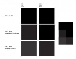
i'm ataching a black diagram. It shows the way illustrator handles black in different preview/proof modes.

a color that is 75-80-90-85 is black and yes it will print, but it could likely be muddy or i've seen ink flake off the paper duuring the run because there was too much ink there to dry. just be careful of that. Photoshop Black is a really bad black for instance. If you build something in photoshop and want the background black...logic tells you to go to "Edit - Fill- Black". But Photoshop's Black is so crazy and out of range that it doesn't make sense. If you have photos that you are worried about they are actually easy to change. Open the photo in Photoshop and use the Eye Dropper tool to select the part you are worried about. Lets say that it tells you that the color is 75-68-67-90 (that's what my Photoshop Black is). Now open the Selective Color dialogue and choose "Blacks" from the drop down menu. Make sure that Absolute Colormetric is selected at the bottom. Now just add/subtract what you don't need from each color. So from Cyan: subtract 25%. Magenta: subtract 18%. Yellow: subtract 17%. Black: Add 10%. does that make sense?

-JE
 

Attachments

  • diagram.jpg
    diagram.jpg
    77.9 KB · Views: 67

andy.barron

macrumors 6502
Nov 30, 2006
441
0
Bedford, England
ok... so like 250% would be C: 50% Y: 50% M: 50% K:100% right? that's what i'm using to get the rich black... but what if i have some other crazy color that is C: 75% Y: 80% M: 90% K:85% (or whatever) that is over 260%? what will likely happen? it just won't print? it will be very muddy? what is expected from a color using more than 260%?

Muddy is a great way of understanding it. It will be oversaturated & past gamut of the desired colour. Monitors are backlit devices and will never be an accurate representation of what the proposed result will even resemble no matter HOW CALIBRATED THEY ARE!

If you use the saturation you mention above you will achieve nothing near a rich black. If you want this then use a 'shiner'. This is usually made up of 30-40% cyan combined with black, but can be used as a magenta instead if the desired black needs to be warmer. I would recommend cyan as this is cleaner in result.

I hope I can help you:D
 

Darkroom

Guest
Original poster
Dec 15, 2006
2,445
0
Montréal, Canada
Muddy is a great way of understanding it. It will be oversaturated & past gamut of the desired colour. Monitors are backlit devices and will never be an accurate representation of what the proposed result will even resemble no matter HOW CALIBRATED THEY ARE!

If you use the saturation you mention above you will achieve nothing near a rich black. If you want this then use a 'shiner'. This is usually made up of 30-40% cyan combined with black, but can be used as a magenta instead if the desired black needs to be warmer. I would recommend cyan as this is cleaner in result.

I hope I can help you:D

oh... i though 50, 50, 50, 100 was fine... maybe i should be conservitive with calling it a rich black, but it's so much more rich than what it looked like 0, 0, 0, 100 which is what i had originally (with simulate black ink)... i suppose i just want it black-black, rich or not, i'll be printed on glossy paper so the blacks should have more presents.

wow... offset printing is hardcore... i've been spoiled with rgb lambda printing where i don't have to calculate percentages and worry about ink falling off of paper...
 

andy.barron

macrumors 6502
Nov 30, 2006
441
0
Bedford, England
oh... i though 50, 50, 50, 100 was fine... maybe i should be conservitive with calling it a rich black, but it's so much more rich than what it looked like 0, 0, 0, 100 which is what i had originally (with simulate black ink)... i suppose i just want it black-black, rich or not, i'll be printed on glossy paper so the blacks should have more presents.

wow... offset printing is hardcore... i've been spoiled with rgb lambda printing where i don't have to calculate percentages and worry about ink falling off of paper...

It doesn't. Don't worry, I or many many more will be here to help you every step of the way (its a Mac question right?) so keep the thread going if you need more advice.
 
Register on MacRumors! This sidebar will go away, and you'll see fewer ads.