Become a MacRumors Supporter for $50/year with no ads, ability to filter front page stories, and private forums.

framingstuff

macrumors newbie
Original poster
Feb 9, 2015
6
0
PIXELMATOR / PAGES OR WHAT?

I am looking to create a piece of art with the lyrics of a song but I want each line to be fully justified.

Any ideas? Here is a small selection of the lyrics and as you can see different length for each line. How can I make each line finish at the same point - can enlarge and decrease size of font but seems a little long winded.

Any help greatly appreciated


Well you done done me and you bet I felt it

I tried to be chill but you’re so hot that I melted

I fell right through the cracks

Now I’m trying to get back
 
It is a matter of both letterspacing (sometimes called "kerning") and wordspacing. Programs like Adobe Illustrator can handle this without any technical difficulty, but these particular lines will never look good fully justified. The first two could be adjusted to match each other, as can the last two, to yield a decent appearance. You'll find that the first pair and the last pair, though, will never look good when they are adjusted to match each other in length.

I would suggest that you consider a rework of you idea and limit it to matching the first two lines and matching the second two lines. Then you could either add some other graphical element to fill the empty space to the right of the last two lines or center the last pair and add smaller elements on both sides.

I have played about with the wording using the line spacing and word spacing with no luck. I have seen artwork on "Not on the High Street" who use this idea so thought it may be a simple software package that could do it. Similar to TAGUL where you can upload images and create word art in this image.
 
...I have seen artwork on "Not on the High Street" who use this idea so thought it may be a simple software package that could do it. ...

I seriously doubt you've seen any similar art that successfully renders a line with 51 characters, including spaces, with one that has only 26.

If the character counts were more similar then any good page layout app, art app, or word processor would be able to justify the lines with the click of a button or two. With the longest line nearly twice as long as the shortest there is no hope for any app to automagically justify the lines in any way that looks even halfway decent.
 
Have to agree with dwig. There is no way you are going to justify the lines properly if there is such a big discrepancy in the amount of characters in each line. It will never look correct. Even with a programs such as Photoshop, InDesign and Illustrator which allow for the most manipulation of characters and paragraphs, it still looks incorrect. My best suggestion will be to center it.

I have taken a look at 'Not on the High Street' and have seen what you are talking about. You have to look at the amount of characters they are using in each line. Plus take a close look at the kerning and scaling that is going on even in a small amount of area. You can not compare what you are trying to achieve with they are doing.
 

Attachments

  • Screen Shot 2015-07-07 at 8.50.22 PM.png
    Screen Shot 2015-07-07 at 8.50.22 PM.png
    237 KB · Views: 190
Have to agree with dwig. There is no way you are going to justify the lines properly if there is such a big discrepancy in the amount of characters in each line. It will never look correct. Even with a programs such as Photoshop, InDesign and Illustrator which allow for the most manipulation of characters and paragraphs, it still looks incorrect. My best suggestion will be to center it.

I have taken a look at 'Not on the High Street' and have seen what you are talking about. You have to look at the amount of characters they are using in each line. Plus take a close look at the kerning and scaling that is going on even in a small amount of area. You can not compare what you are trying to achieve with they are doing.
I am sorry - I seem to have upset the apple cart, so to speak. The text I gave in my original post was only an example. I do appreciate what you have both said and see that the amount of characters is very important and I will now proceed bearing this in mind. I am a relatively newbie at this and just thought I would ask if there was a way of doing it - as with most things these days you struggle along doing something only to find a very simple one click solution.

Thank you for your time and information. It is greatly appreciated.

You have not upset the apple cart in any way. I was just explaining that I have tried your text in PS, AI & Id and could not achieve any neatness to it. Just offering another suggestion to you with centering it. I have been in this situation when creating forms for clients and have had to resort to centering the type. I like justified paragraphs as well because I think they are easier to read and look very neat.
 
You have not upset the apple cart in any way. I was just explaining that I have tried your text in PS, AI & Id and could not achieve any neatness to it. Just offering another suggestion to you with centering it. I have been in this situation when creating forms for clients and have had to resort to centering the type. I like justified paragraphs as well because I think they are easier to read and look very neat.
I had seen so many prints on "not on the high street" doing this type of thing that I presumed there must be an easy way of doing it (always the optimist!). Obviously, they are ensuring that the character lines are pretty evenly matched and where they are not they are amending the "kerning" and word spacing to fit. I have seen some art work with taller and wider letters to make them fit. At least now I can use the character counting to get as near as damn it to fully justified and I will use dwig's idea of filling in gaps with graphics maybe too. Think maybe the centreing may look just as good though as you suggest so may try that too. Thanks again
 
typography is hard. unless you have a natural knack for it, you have to practise before making something like this.

for a good start, read this website:
http://www.thinkingwithtype.com

be cautious with changing the kerning or height/width of the letters - there's a reason why certain fonts look & work like they do.
 
  • Like
Reactions: imaccooper
Thank you so much - very interesting reading. I will study this in more depth over next few days. Just what I needed to understand the science behind it.
 
It is a matter of both letterspacing (sometimes called "kerning") and wordspacing.

Increasing the space between letters across a whole word or line of text is tracking. Kerning is the same thing, but specific to individual letter pairs, to give the illusion of even spacing, usually when the letterforms give rise to unwanted white space.
Kerning_Example_zpszvtcv1fk.jpg
 
Increasing the space between letters across a whole word or line of text is tracking. Kerning is the same thing, but specific to individual letter pairs, to give the illusion of even spacing, usually when the letterforms give rise to unwanted white space.

"Letterspacing" is the general term, while "Tracking" and "Kerning" are special sub-classes of letterspacing. "Tracking" refers to letter spacing across a range of text. "Kerning" refers to letter spacing between individual pairs of glyphs. Traditionally in the metal type days, "kerning" referred only to reducing the space but has evolved in the electronic era to referring to both increasing and decreasing the spacing.
 
... I am looking to create a piece of art with the lyrics of a song but I want each line to be fully justified.

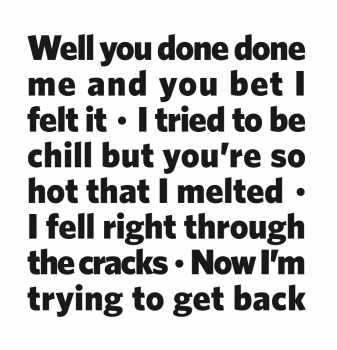
I played around with this for a few minutes and couldn't come up with a satisfactory solution ... until I gave up on the idea of each line being a separate line.

Instead, I separated the lines with a bullet point. This allows for all the text to be justified at the same size.

I think this has some promise ...
Screen Shot 2015-07-10 at 3.06.35 PM.png

Though I want to add another line ... "But then I remembered how bad your butt smelted."

Now THAT'S art.
 
Register on MacRumors! This sidebar will go away, and you'll see fewer ads.