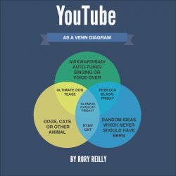
Hi, I was kinda bored and had 15 mins to kill so I decided to play around with Photoshop/Illustrator and create a "Youtube Venn Diagram" showing popular the categories of youtube and how they intersect creating subcategories along with estimating what types of video we shall view in the future. Please don't be too harsh as I am 13 with little design experience.
Become a MacRumors Supporter for $50/year with no ads, ability to filter front page stories, and private forums.
Critique my design
- Thread starter rory.reilly
- Start date
- Sort by reaction score
You are using an out of date browser. It may not display this or other websites correctly.
You should upgrade or use an alternative browser.
You should upgrade or use an alternative browser.
I like it. It appears only to be missing cute cat videos.
Wish I'd started doing graphics when I was 13, I'd be a hell of a lot better than I am now!
Wish I'd started doing graphics when I was 13, I'd be a hell of a lot better than I am now!
Please don't be too harsh as I am 13 with little design experience.
Design Lesson #1: Show some **** confidence!
As for your design, The mechanics are good. I'd suggest a little more contrast between the colors - especially the blues. Also - why did you go with that particular color palette? I associate YouTube with red, white, and black. (That's not a dealbreaker. I'm not suggesting you change it or even mimic the YouTube colors. I'm just curious as to why you chose that color scheme...)
Nice work.
Design Lesson #1: Show some **** confidence!Talent will only get you so far. You'll be surprised exactly how much of design work involves having to talk up your work. Clients will respond much better to confidence than self-depriciation.
As for your design, The mechanics are good. I'd suggest a little more contrast between the colors - especially the blues. Also - why did you go with that particular color palette? I associate YouTube with red, white, and black. (That's not a dealbreaker. I'm not suggesting you change it or even mimic the YouTube colors. I'm just curious as to why you chose that color scheme...)
Nice work.
Thanks, I originally went for the red, white and black color scheme but changed my mind in the sake of aesthetics however I will try again with different shades of red, white and black.
Thanks, I originally went for the red, white and black color scheme but changed my mind in the sake of aesthetics however I will try again with different shades of red, white and black.
Check out kuler.adobe.com. That's a great place for color scheme inspiration.
I like it, but I think it could use some magenta or red color. Maybe on the ribbon itself and one of the circles...
Hey Rory,
I actually like it too.
What would make it better?
Better typography.
Start by losing the all caps look ... and see where that leads you.
I actually like it too.
What would make it better?
Better typography.
Start by losing the all caps look ... and see where that leads you.
Register on MacRumors! This sidebar will go away, and you'll see fewer ads.


