Become a MacRumors Supporter for $50/year with no ads, ability to filter front page stories, and private forums.

Designer Dale

macrumors 68040
Original poster
Mar 25, 2009
3,950
101
Folding space
This is a thread for people who would like some constructive feedback on their photos. You may submit a photo once per week (or up to three in a single post, if you have a set of related images). If you would like feedback about something specific (exposure, cropping, processing, etc.), then be sure to include that information.

Everyone is welcome and encouraged to offer comments and critiques, regardless of whether or not they have submitted their own photos.

Anyone may repost this thread after it has expired.
 
army.mil-2008-10-03-162402.jpg
 
I picked up my 7D on Saturday and this is one from my back yard. I neglected to increase the ISO to get a sharper image, but this is a feature I need to get used to. The full EXIF is included.

EXIF Summary: 1/8s f/8.0 ISO100 100mm


Dale
 

Attachments

  • Screen shot 2012-04-23 at 10.50.41 AM.png
    Screen shot 2012-04-23 at 10.50.41 AM.png
    44.4 KB · Views: 89

Very well done. The photo has a great sense of action and urgency about it (are they carrying a fallen soldier?). I like how you caught the blades of the helicopter with a bit of motion blur, which adds some extra dynamism. The gesturing figure in the foreground is nicely picked out, and it's great how he 'fits' in between two of the helicopter's blades.

The one thing that I would recommend you fix is all of the sensor dust showing up in the sky. The foreground figure is gesturing toward them, which makes these blemishes all the more evident and distracting.

In addition, just something to think about when composing: you've left a large, vacant area in the upper left. Perhaps if you were standing just a bit higher, you could have minimized it somewhat and still retained good isolation of the main figure. That's a niggling point, though.
 
Very well done. The photo has a great sense of action and urgency about it (are they carrying a fallen soldier?).

It is only training - so it is only a simulated casualty.

The one thing that I would recommend you fix is all of the sensor dust showing up in the sky. The foreground figure is gesturing toward them, which makes these blemishes all the more evident and distracting.

I couldn't find my edited version (with the dust removed), so I grabbed this one from an online archive.

In addition, just something to think about when composing: you've left a large, vacant area in the upper left. Perhaps if you were standing just a bit higher, you could have minimized it somewhat and still retained good isolation of the main figure. That's a niggling point, though.

I was lying on the ground and didn't know the exact paths they would take. I had to compose on the fly.
 
I love the dynamics in this photo, especially if it is viewed full size, where all the fine details are easy to see. The movement of the troops to the right and away from the helicopter and the lead soldier pointing back and to the left make for great fluid motion.

The framing is near perfect. space to the right and left of the subject elements is well balanced and nothing important is chopped off. I would like to see a bit more above the first soldiers head, though. Is this framed or cropped?

What's the background on this shot? There are no weapons visible, so I assume it's training. The four soldiers look like they're carrying a litter. Evac drill?

Dale
 
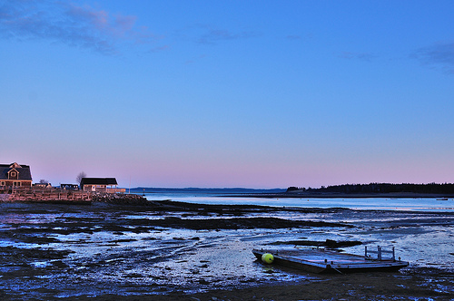
This has potential, but some elements of the exposure bother me. The clouds are too bright (blown out) and the shadows surrounding the water are too dark. I would like to see more detail in those areas. If you have image editing software you can bring up the shadow details with fill light.

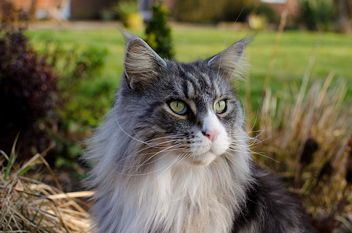
I'm a sucker for cat photos, so of course I like it...:) The main thing to do to improve this type of photo is to set the subject off to one side of the center. If the subject is looking to the right, then keep it in the left part of the frame. This creates visual movement across the frame.

Dale
 

Great colour palette; two simple colours (harmony/contrast) work well for me. The DoF separates the flowers from the background, thought I would probably have moved half a pace to the right, to 'slot' the flowers into the space between the fronds...


Looks OK to me. I don't mind the cat being centred, rather than off to one side. It just 'says' something different...
 
In attempt to emulate Eggleston:


201204220305.jpg by darrylwharrisjr, on Flickr


201204220271.jpg by darrylwharrisjr, on Flickr


201204220315.jpg by darrylwharrisjr, on Flickr

I may be the wrong person to comment on any ode to Eggleston, since I think of him as one of those artists whose work owes much of its importance to its historical context. It was avant garde in his day to put large color prints of any sort in a gallery, and his ordinary subjects furthermore put a considerable amount of distance between his work and that of his contemporaries. Because his photos are the works of a "pioneer," they will retain their importance and some of their initial resonance, but otherwise, his oeuvre is something of a dead end. Anyone wanting to emulate him will have to add a significant new ingredient to give their work comparable impact.

That said, your third photo succeeds at having a good amount of visual interest, regardless of whether or not it is reminiscent of Eggleston's work. It has a nice primary color palette and some interesting textures in the rusted metal. It also has some nice geometric forms in it. The light on the box is quite flat, however, and the bright areas in the background are rather distracting. Perhaps this is a subject that you could return to for further experimentation--to find a better way to emphasize its aesthetic qualities?
 
This has potential, but some elements of the exposure bother me. The clouds are too bright (blown out) and the shadows surrounding the water are too dark. I would like to see more detail in those areas. If you have image editing software you can bring up the shadow details with fill light.


I'm a sucker for cat photos, so of course I like it...:) The main thing to do to improve this type of photo is to set the subject off to one side of the center. If the subject is looking to the right, then keep it in the left part of the frame. This creates visual movement across the frame.

Dale

Another option would be to put it up to the right side of the picture to create some tension. There's something about cat's eyes that is always a little creepy to me.:D
 
Quick question: Should people be required to comment/critique other photos before posting their own? It might help the post to feedback ratio.

----------


Nice colors, it feels very serene. I can't tell if it is in fact a beaver, or any other animal for that reason. But still, I've never managed to get a photo of one!

----------


Ah, I do not know who this Eggleston is. I find the subject matter lackluster... but maybe it's just not my genre.


And now for my photo. I have a trial for some new photo editing software (Capture NX2) that I've been playing with. As with all amateurs, I think I probably overdid it on the editing of this photo. I wanted to make the details in the darker portions of the photo better, and I increased the saturation, but I think it's too much?

Sunset Tidal Flat by Melissa.O.Anderson, on Flickr

Original:

Sunset tidal flat original by Melissa.O.Anderson, on Flickr
 
Last edited:
In attempt to emulate Eggleston:


201204220305.jpg by darrylwharrisjr, on Flickr


201204220271.jpg by darrylwharrisjr, on Flickr


201204220315.jpg by darrylwharrisjr, on Flickr

The first time I saw one of Eggleston’s colour tableaux, I thought “that’s rubbish”. Then I saw another, and another, and gradually realised he was a) serious about what he was doing and b) a master of the everyday, the unconsidered trifle, the indecisive moment. And, crucially, for the time, it was all in colour and, as Phrasikleia says, part of a fine art aesthetic. I can admire the cool detachment in his work, and his willingness to accept our world ‘as is’’: looking - and recording - subjects that most people wouldn’t even notice (or, if they did, wouldn’t think about photographing). He seems to accept that this is the way we’ve constructed our urban and small town environments, with strange juxtapositions of unrelated things. In the process, he makes the ordinary seem a little odd, sometimes slightly menacing.

Not a bad role model to “emulate”, though this kind of photography is now a ‘genre’... rather than the work of a few photographic pioneers (who didn’t ‘buy into’ the pictorial tradition). It looks like a great way to train the observant eye, to find images where others might not be looking. Sorry, not much of a critique, but I think you should just carry on carrying on... and see if you can assemble a collection of, say, a dozen pix that really show what you’re trying to do...
 
Quick question: Should people be required to comment/critique other photos before posting their own? It might help the post to feedback ratio.

That's a good question. Hopefully the limit of one entry per week will help with that ratio. My inclination is to have as few rules/requirements as possible, but if it turns out that commenting is lacking, then perhaps something will have to change.

And now for my photo. I have a trial for some new photo editing software (Capture NX2) that I've been playing with. As with all amateurs, I think I probably overdid it on the editing of this photo. I wanted to make the details in the darker portions of the photo better, and I increased the saturation, but I think it's too much?

Sunset Tidal Flat by Melissa.O.Anderson, on Flickr

Original:

Sunset tidal flat original by Melissa.O.Anderson, on Flickr

I really prefer the edited version. It brings out a lot of visual interest in the foreground. Indeed, the grounded raft with its float rendered useless by the low tide is the most interesting part of the photo. The houses in the background are getting the best light at this moment, however. I wonder if you might be able to revisit this site again during low tide, but when there is some nice light on the raft. I would also recommend including less sky when it's not adding a whole lot to the photo. I presume you included so much of the sky in order to get the clouds in at the very top, but a different framing that included just the nice, pink glow along the horizon might have been more effective.
 
gtownpburg201204223116.jpg


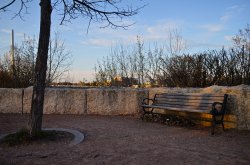
OK, I know this is supposed to be C&C, but I have already C&C'ed myself on part of this picture-the bottom left hand side. The chair leg is cut off. No excuse, just an explanation that I mean to correct in the future. I have the new 5D3 and the viewer finder is supposed to be "nearly 100%." I am still playing with it and trying to get used to it and it's difference from the 5D2 I had and sold. I was fairly certain I had gotten the leg of the first chair in the frame. I chimped the image but I was set at starting at 2x mag, at least I was. Now I'm back to 1x, so I somehow missed capturing what I had intended to do. Other than that, anything any of you have to offer will be greatly appreciated.
 
I'm trying to improve my technique with regards to taking pictures of flowers and other fauna. What do you think I could do better? Any suggestions are appreciated :)

Flower%2520III20120422.jpg
 
I have been looking for a thread that offers criticism. I've started shooting very recently and would love to learn how to take shots like the best of them.
 

Attachments

  • Forks Old Bench 1.jpg
    Forks Old Bench 1.jpg
    1.7 MB · Views: 73
  • Forks Old Bench 2 (1).jpg
    Forks Old Bench 2 (1).jpg
    1.4 MB · Views: 112
I'm trying to improve my technique with regards to taking pictures of flowers and other fauna. What do you think I could do better? Any suggestions are appreciated :)

Image

Nice colors. The flowers in this photo are very small, so maybe zooming in further to fill the frame and show more detail could work better? Also with this depth of field, half of the flower bunch looks out of focus. It would be nice for all of the flowers to be in focus while maintaining the nice blur in the background.

----------

Image

OK, I know this is supposed to be C&C, but I have already C&C'ed myself on part of this picture-the bottom left hand side. The chair leg is cut off. No excuse, just an explanation that I mean to correct in the future. I have the new 5D3 and the viewer finder is supposed to be "nearly 100%." I am still playing with it and trying to get used to it and it's difference from the 5D2 I had and sold. I was fairly certain I had gotten the leg of the first chair in the frame. I chimped the image but I was set at starting at 2x mag, at least I was. Now I'm back to 1x, so I somehow missed capturing what I had intended to do. Other than that, anything any of you have to offer will be greatly appreciated.

I like the perspective of this photo. Looking at it makes me feel drunk. I don't think cutting the chair leg detracts anything from it.
 
I'm trying to improve my technique with regards to taking pictures of flowers and other fauna. What do you think I could do better? Any suggestions are appreciated :)

Flower%2520III20120422.jpg

What f/stop and shutter speed did you use? It looks like the main focus is to the back of the flowers on the leaves and stems. Photos like this are prime candidates for manual focus, as auto focus doesn't always hit the right spots.

The colors and composition are nice, but the flowers are a bit too centered for my taste. If the leaf on the right side of the frame was cropped off it would move the flowers more to the right without cutting off the nice angular lines of the stems and twigs.

Dale
 
1/60, f5.6. I did use autofocus; I was on the move and didn't have the mind to turn it off. Do you think a lower aperture would have helped with the focus, or do you think it was just user error? Thanks for the tips on composition, I really appreciate it. :)
 
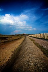
West Wittering, UK

The lines just appealed - have bumped the saturation, sharpness and added some vignette.

Love some c&c
 

Attachments

  • West Wittering 2547.jpg
    West Wittering 2547.jpg
    164.8 KB · Views: 92
I have been looking for a thread that offers criticism. I've started shooting very recently and would love to learn how to take shots like the best of them.

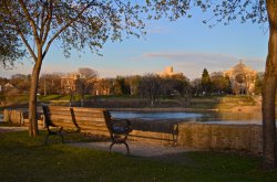
The second one is much better imo, you captured the sunlight better and the trees form a natural frame around the picture.

Also the bench faces towards the view so you can image you are sat there..good stuff!

----------
 
Last edited:
Register on MacRumors! This sidebar will go away, and you'll see fewer ads.